
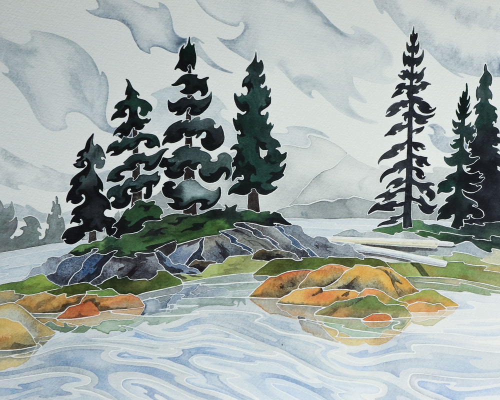
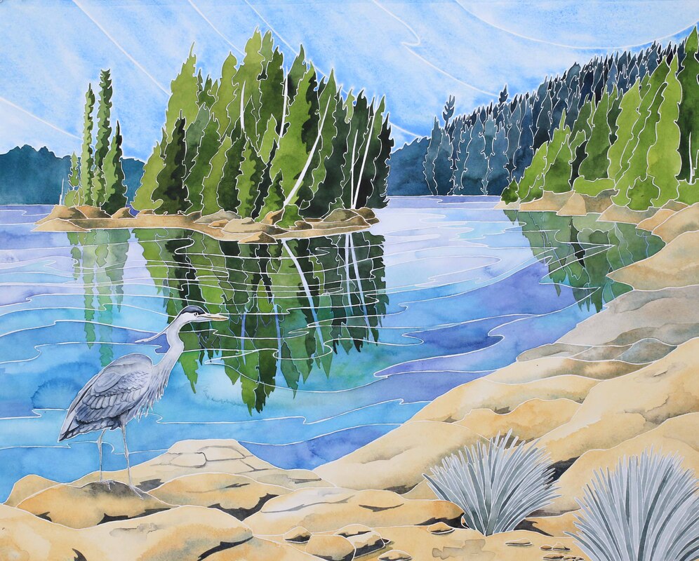
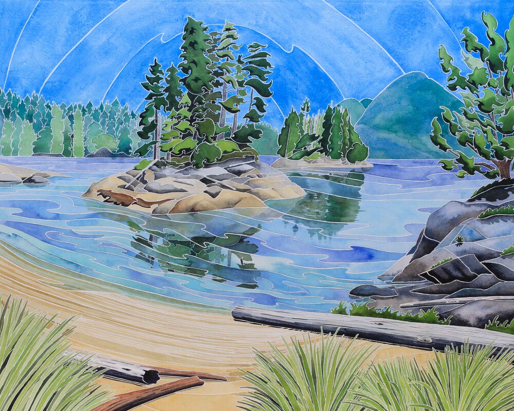
 The Broughton Archipelago is a very special place. Tucked between the North East tip of Vancouver Island and the Coastal Range of mainland British Columbia, the area is a haven for wildlife from sea otters to orca and humpback whales. Wolves and black bears are abundant, whilst grizzlies maintain strongholds amongst the islands and mainland. It's an artist's paradise, and my watercolours and sketchbook were kept busy when we sailed around the region in the summer. 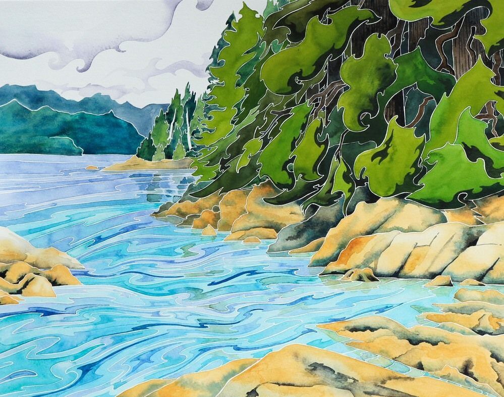 One of the most famous books about the area is called 'Following the Curve of Time'. Written by M. Wylie Blanchett, it tells of adventurous summers cruising with her five children on their 25' boat, 'Caprice'. Six people on a 25' vessel makes our life on 36' Island Prism seem capacious, especially during the summers when they added the family dog to the mix! As we cruised during the summer of 2019, Jim and I dipped into Blanchett's book. Her gentle prose is captivating, and we often found ourselves in the same bays. When we called into Monday Harbour, we even followed her anchoring advice, using her description to track down the lovely, sheltered Tuesday Cove. Named by Blanchett, you won't find it marked on any maps, but we spent days snug and safe, visiting the white shell beach, exploring the forest and watching herons and harbour porpoise in the bay. 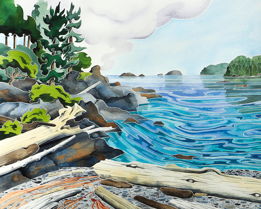 I began a series of large paintings in the summer, based on the sketches I was making as we cruised. The third in the series was of Tuesday Cove, and I titled it 'Following the Curve of Time' in honour of Blanchett, whose experiences ninety years ago still rang true with us. 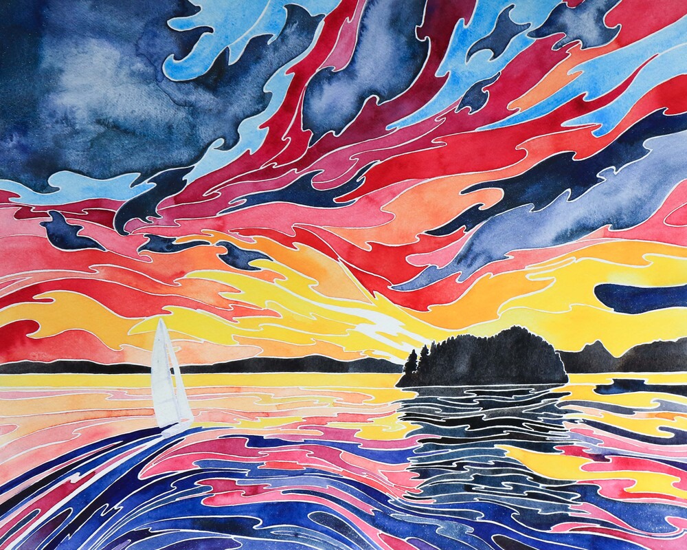 Moored back in Victoria Inner Harbour for the winter, I knew I wanted to do something special with my trio of paintings. At 20" x 16", they were too large for the winter shows I was submitting to. Rereading the Curve of Time once again, lines from the book brought images from my sketchbook to mind. Inspiration hit- I wanted to create a series of paintings inspired by our cruising and Blanchett's writing. I felt a connection with the book- at the risk of sounding overly arty, it was as if the author and I were reaching across that curve of time and sharing experiences in the past and present. From experiences with cantankerous marine diesel engines to descriptions of shimmering schools of herring and wheeling flocks of sanderlings- a wading bird still common in the Broughton- our summers of exploration had a lot in common despite the ninety years that separated us. Returning to my sketchbooks, I played with my paint to settle on a range of colours that could capture the warmth of a summer day or the mystery of rolling banks of fog. Pthalo Blue gave me the bright tones I needed and Indanthrone Blue was perfect for deep waters. Jadeite genuine, a watercolour paint made from the gemstone, created rich greens for trees. When mixed with Amethyst genuine, it made beautiful greys, perfect for mists and clouds. The tiny pieces of Amethyst adds a subtle lustre to some of the paintings, whilst others gain a gentle sparkle from blue-grey Kyanite genuine. Combined with natural siennas and umbers, I loved the idea of using earth and water to create my islands and seas. 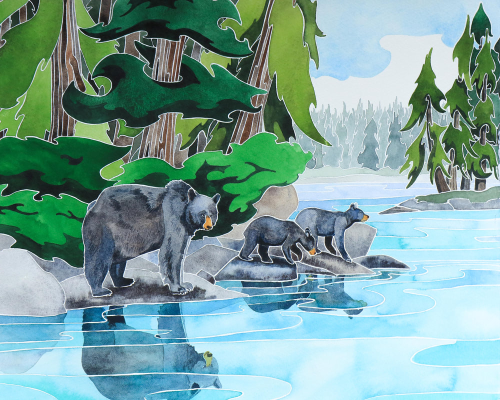 After a summer of inspiration gathering and months of painting, I am delighted to launch the Curve of Time collection. The collection is on display as my solo show in the Cedar Hill Arts Centre Cafe Gallery in Victoria, BC, where it will hang until 17th February 2020. I shall be at the centre demonstrating from 9.30 - 3.00 on Wednesday 3rd, Saturday 8th, Wednesday 12th, and Thursday 13th February. I'll also be participating in the Family Day programme on Monday 17th.
The Curve of Time Collection is also available unframed online- please click here to view available paintings from the series.
0 Comments
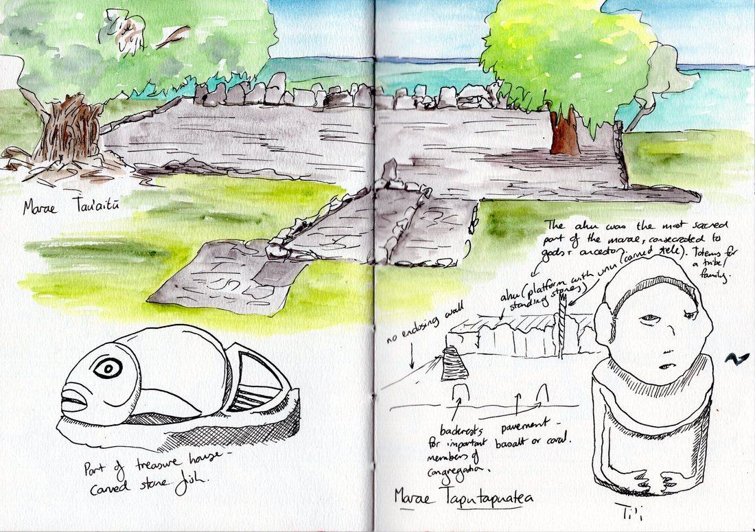 Raiatea- where legend and history collide. Thought to be the launching point for the Polynesian voyages to Rapa Nui, Hawai'i and Aotearoa (New Zealand), it was home to heroes and adventurers. Priests blessed the launching double-hulled canoes and found messages from the gods in the cries of the heron and the kingfisher. When the missionaries came, the old gods were forgotten and the marae, used for centuries of worship, were neglected or destroyed. Today, the ruins of the mighty marae have been restored, though the old deities remain dormant (not a bad thing as one or two of them were rather keen on human sacrifice). Bill, Jim and I found that traveling back in time to explore the ancient civilisation was remarkably straightforward. We motored through the linked lagoons of Taha'a and Raiatea, dodging the occasional reef on our route south until we anchored in sand near to the marae of Taputapuatea. We dinghied ashore and explored coral rock pavements and platforms looking out to sea, ancient walls consumed by banyan trees and a few carvings, last remnants of an ancient artistic heritage. Standing stones in the courtyards marked the spots where the tribal elite would have sat, and modern carved stele recalled the tall wooden totems which would have once decorated each marae. The tables for offerings of food were long gone, but we recreated the feasts of the past with some baguettes, blue cheese and steamed buns with our hunter-gatherer Jim rustled up from a nearby store. 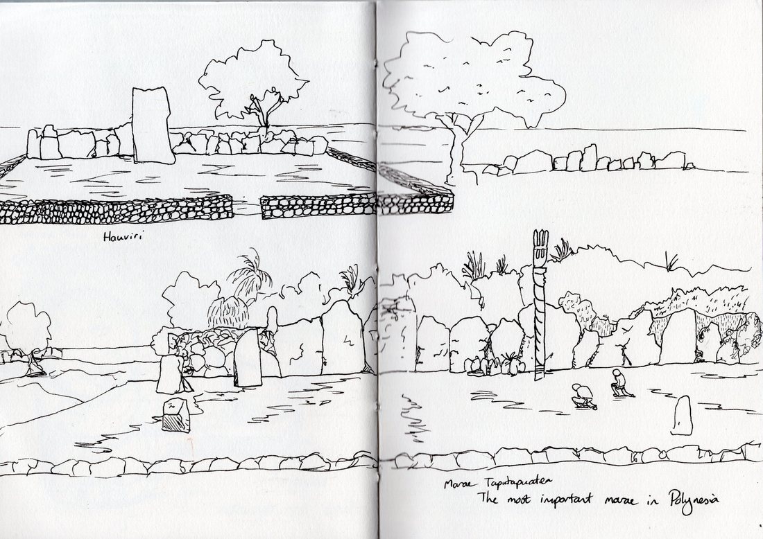 Moving back up north, we anchored near to the Faaroa River. It was wide enough and deep enough for us to access by dinghy, so we motored up, through lush farmland fringed with hibiscus and ginger. The heavens opened, adding to the feeling of tropical adventure and making our later sail up to the main town of Uturoa rather damp.
We delivered Bill to the airport- the only airport I've ever seen with its own dinghy dock- before Jim and I turned our hand to hauling Prism out at the Raiatea Carenage for a few coats of bottom paint and a raising of the water line (apparently all the art supplies have left her sitting a little low in the water). I'm sure I should have been sketching boats sitting in cradles, waterblasters and tools but I just wasn't finding the boat yard inspiring- it probably didn't help that I didn't want to be there. My Sketchbook Skool kourse 'Imagining' was far more inspiring, so I turned my hand to ink blob monsters until Prism was afloat again and Bora Bora called. 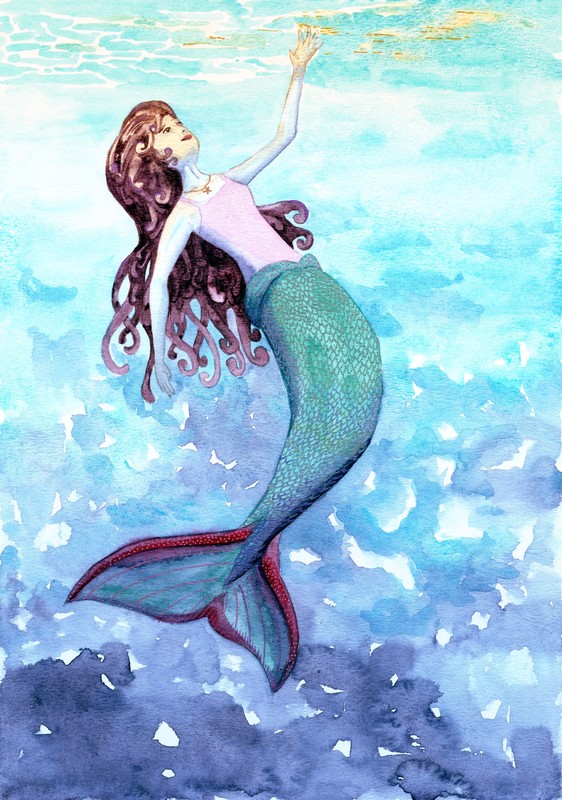 First- I'm trying something new... The links in this post for the art supplies I love are affiliate links to Amazon UK. If you follow them and make a purchase- even something other than art supplies- it will help me to buy Jim the occasional cup of coffee (he deserves it after all this boat maintenance)! Rest assured, my site will remain ad-free and my link posting policy hasn't changed- I'll only ever post links to things I love. Now onto the art... On Sunday morning, I painted a mermaid. The boat was rocking, I woke up early, and I was thinking about mermaids after seeing Colour Made Happy's mermaid challenge over on Instagram. So I decided to get creative, and this is who swam along. Dolphins were a good reference- I used the video I took last week (watch it here if you missed it) to get an idea of how her tail might look. The foreshortening was the trickiest part as I wanted her to appear as if she was swimming up- it took a few sketches to get it looking plausible, and it's not as dramatic as the idea in my head. Something to add to my list of 'skills to practice'! The tail and water were fun, as I got to let my watercolours do the talking. I'm finding turquoise and indigo are great for showing the levels of light in the water, and a bit of yellow ochre seemed perfect for the sun shining through and the reflection on her face. I managed to take a step away from painting things the colour I 'know' they should be, and used the indigo and turquoise again for the shadows on her arms and body. Huge sigh of relief- it added to the sense of depth instead of making her look like an alien (although I guess mermaids could conceivably be blue)! The hair was the most fun to draw (I do like sketching wavy, curly shapes!) and I painted it in a wonderful Daniel Smith paint called Moonglow. This paint is a blend of three colours, which looks like rich reddish grey. Building up layers, removing paint with a damp brush or letting the paint granulate all allow parts of the component colours to come through- this can create surprises but also makes it a very interesting paint to work with. It was another slight gamble, but I've played with it quite a bit when painting whales and the purpley auburn that I got tones in nicely with the rest of the paper. I used Kaiser metallic gel pens for her scales, because of course mermaids need a bit of shimmer! I bought these pens on a whim, but love them- they're great for fine detail, and don't get absorbed by the watercolour paper. They're not waterproof, so washing a damp brush over them results in a sparkly wash! 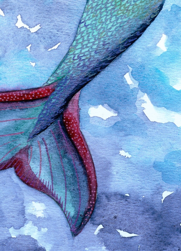 It was a lovely relaxing morning, except for the fact that the boat was still rocking. Here's a small video snippet of liveaboard art (I do normally have the sense to position my brushes so they don't roll around, but I wanted to illustrate the point!). The background soundtrack is Jim fixing one of our leaky portholes. Thankfully things have calmed down a bit today. Jim's been fixing a hatch cover and getting our Raymarine autopilot working, and I've been doing laundry ashore and researching the paperwork required for leaving New Zealand and entering French Polynesia. Things are coming together...
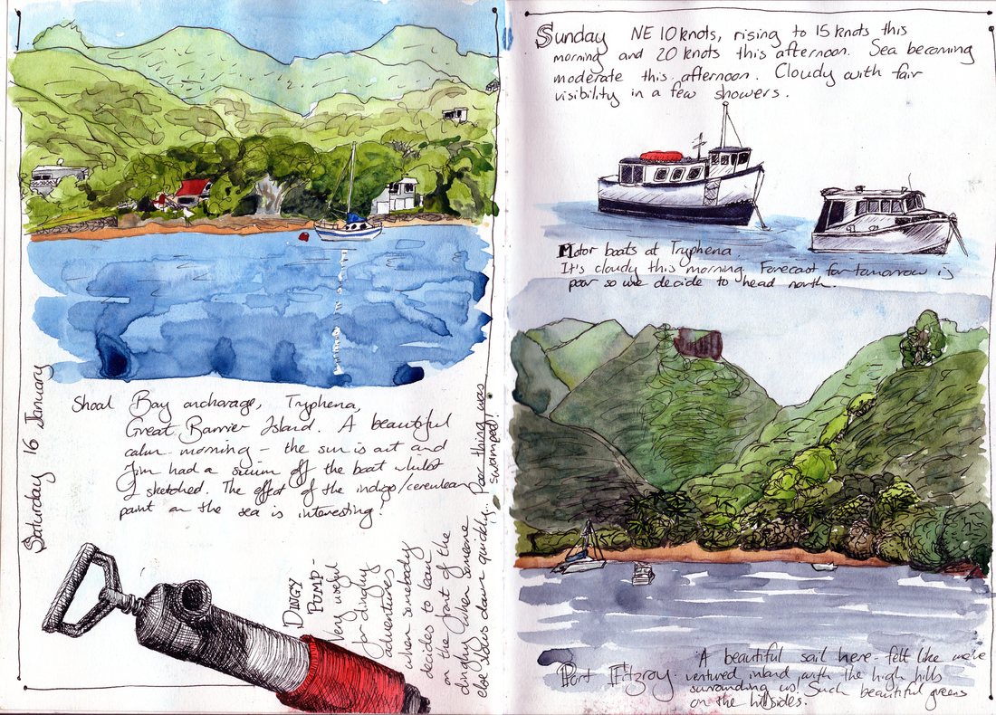 Great Barrier Island, January 2016 Sometimes life comes round in a circle. Right now we're anchored at Port Fitzroy, Great Barrier Island, which is where we spent the end of January last year. I know it's mid February now, but the time and place feel right for a bit of reflection. 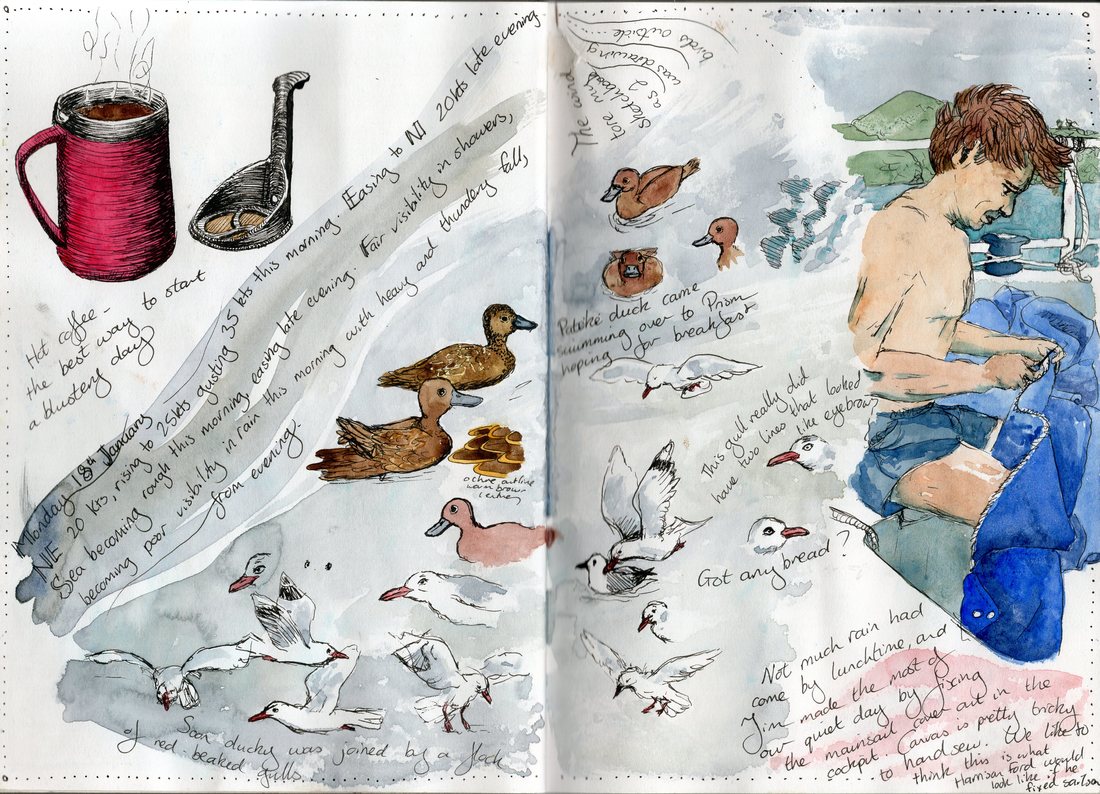 Great Barrier Island, January 2016 I started my first class in Sketchbook Skool a year ago. It was called 'Beginning' (a very good place to start, as Julie Andrews/ Maria would agree). The first week was taught by Danny Gregory, and the homework was simply to draw, every day. It would be the perfect way to start forming a habit. So I drew Great Barrier- anchorages, birds, waterfalls, the store here at Port Fitzroy. Cups of coffee, the dinghy engine, kids playing and my husband mending the sail cover. My sketchbook changed from an occasional companion to a constant friend. I photographed my sketches, posted them and gathered inspiration from the other students as well as from the sketchbooks of our tutors. 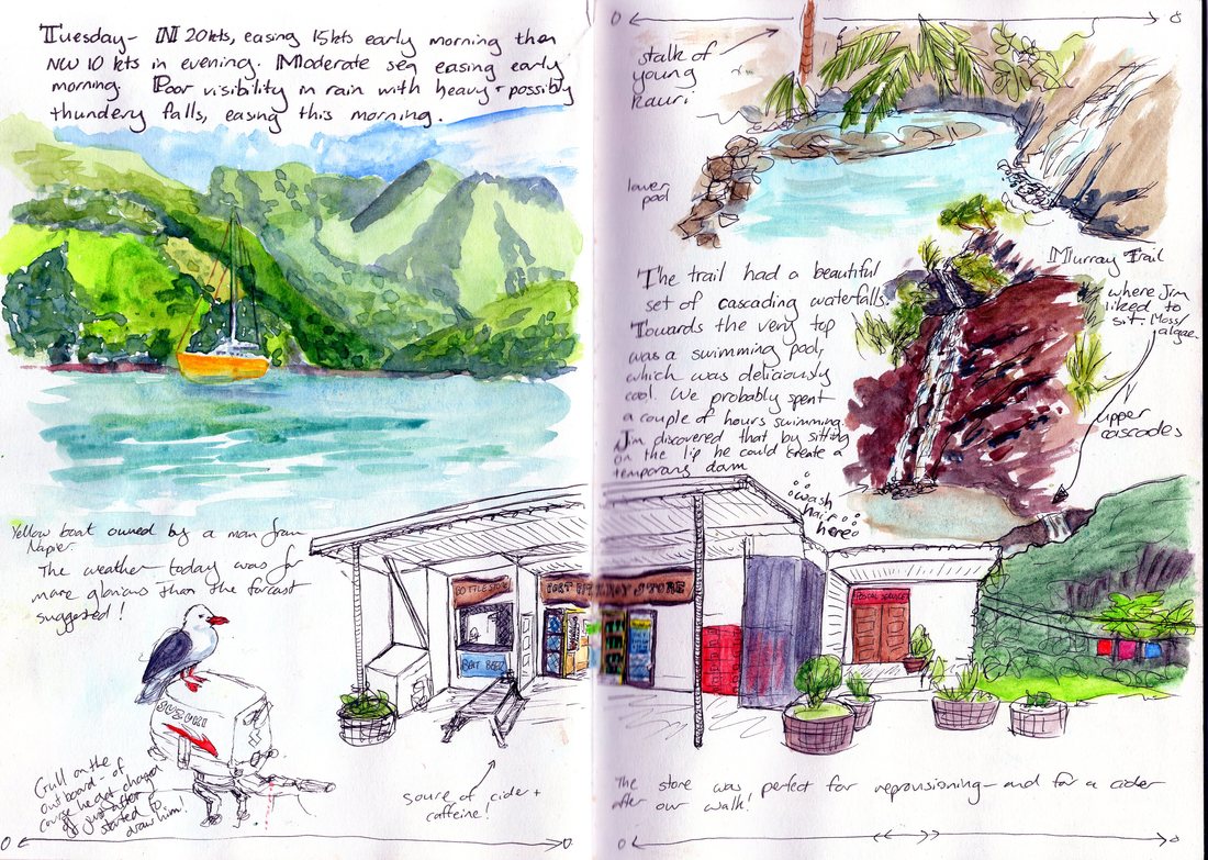 Waterfall walk 2016 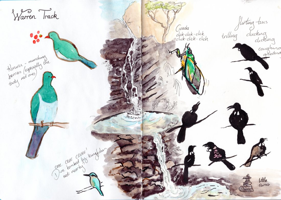 Waterfall walk 2017 A year on, I'm still drawing. The habit I started with Beginning remains, consolidated by half a dozen other classes taken through Sketchbook Skool. I've learned new techniques and, I hope, improved. So I pulled out my sketchbook from a year ago. Have I got better? In some ways, yes. My inner critic wonders if I've lost a sense of delicacy, but I can still draw this way when I choose to, and my line work these days feels more confident. It's good to look back and see lots of things I like in my older work- the page with the birds and Jim stitching the sail is one of my favourites. But my more recent sketches feel more distinctive, more confident, more 'mine'. 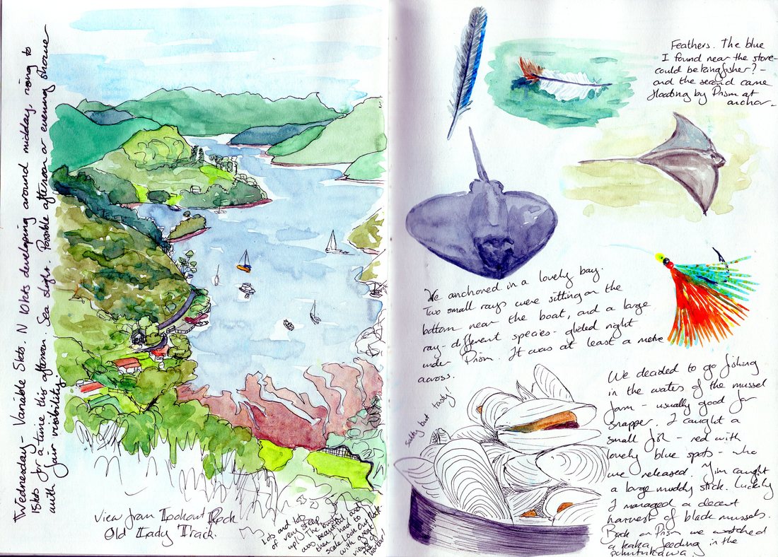 View from Lookout Rock 2016 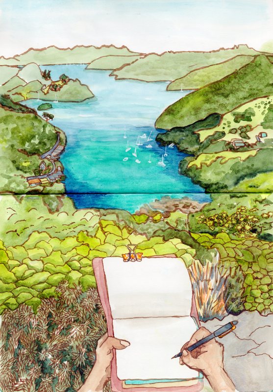 View from Lookout Rock 2017 The most obvious change in my work is the scale. My sketchbook of a year ago had numerous tiny drawings littering a double page spread, with copious notes about the weather and the day. Now I mostly have single images across a double page spread. Words have taken a back seat, though I do like the diary style of my older work. My ultra-fine liner has been exchanged for a brush pen, at least for the moment. I love the expressive lines of the brush pen, and have been determined to actually stick with one medium for a while. Looking back, I like the delicate lines of my fineliners too, but the brush pen is working for me right now. I still can't draw a straight line, but my lines are less sketchy; they flow more and I think they give the drawings more presence. My greatest improvement, I think, is in my use of colour. I've got better at shading with watercolours, introducing a sense of depth into my sketches and bringing in the dark darks that I've struggled with for so long. I mostly use watercolours alongside pen, but I'm making the watercolour do part of the work, giving value (light and darkness) as well as colour. 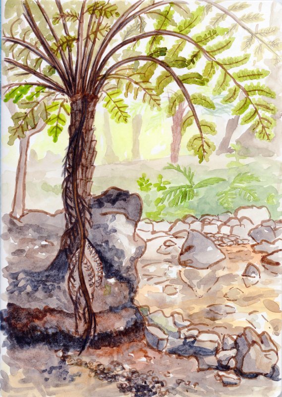 Old Lady Track, 2017 So what next? I'm sticking with the brush pen a while longer, and I'm going to keep improving my watercolour techniques. I'll try and bring back some of the written elements, and drawing the little details in life as well as the big exciting things. My older sketchbooks remind me of techniques that I enjoyed and haven't used for a while- such as sketching in coloured pencils or with ballpoint pens- and I'm keen to pull these out again a little further down the line, perhaps see how I can make them work alongside my brush pen and watercolour. I'm sure there will be more Sketchbook Skool, but it's good to have consolidation time. 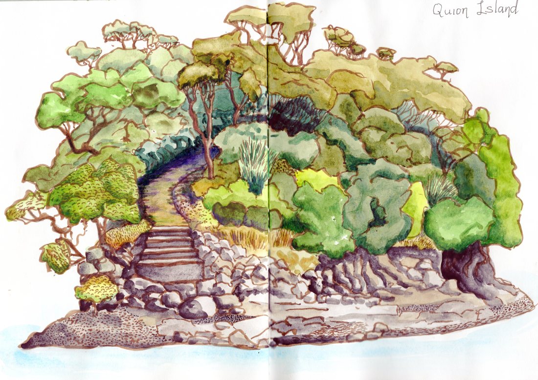 Quion Island, 2017 Quion Island, 2017 My collection of filled sketchbooks is supposed to get exiled off the boat soon- it takes up valuable space and may suffer from the humidity of the tropics. But I might keep a couple of books with me- or at least scan them in, as a reminder of what I've learnt and a source of inspiration for the future. And I'll certainly try to keep up daily drawing, whatever form it takes.
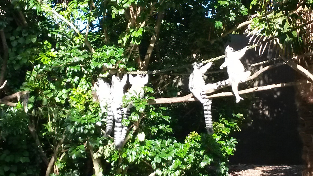
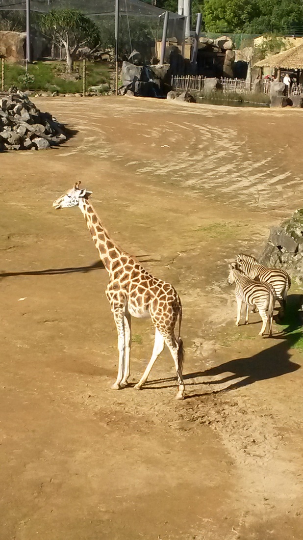
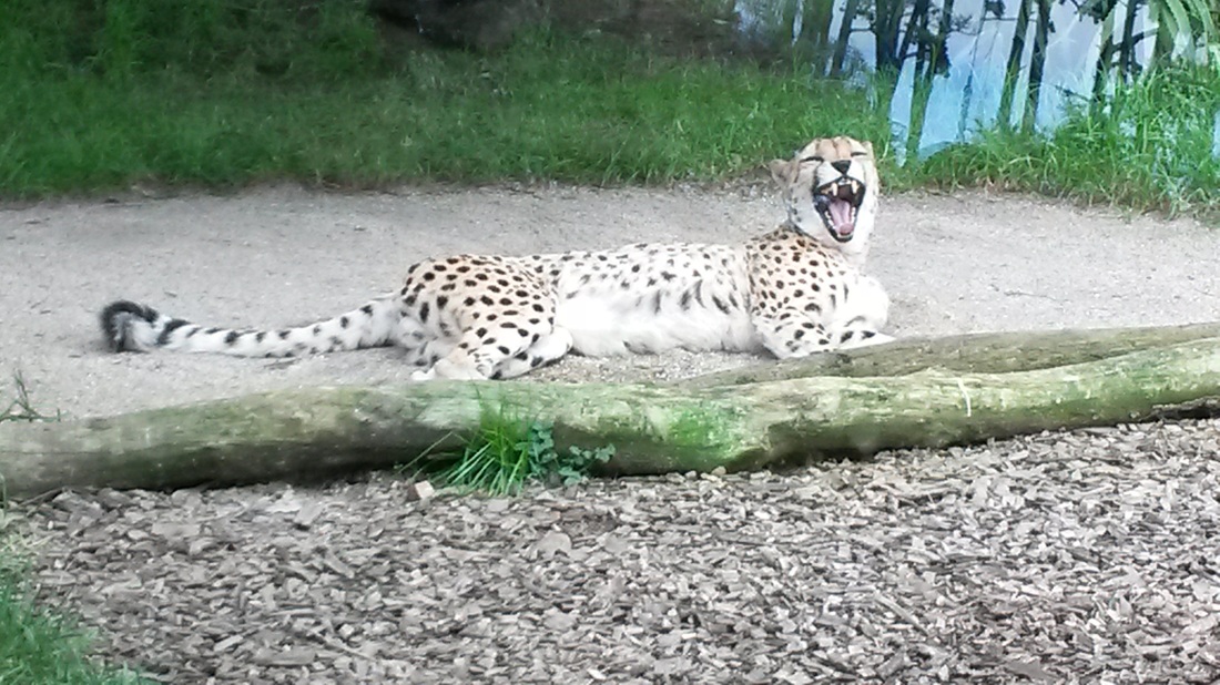
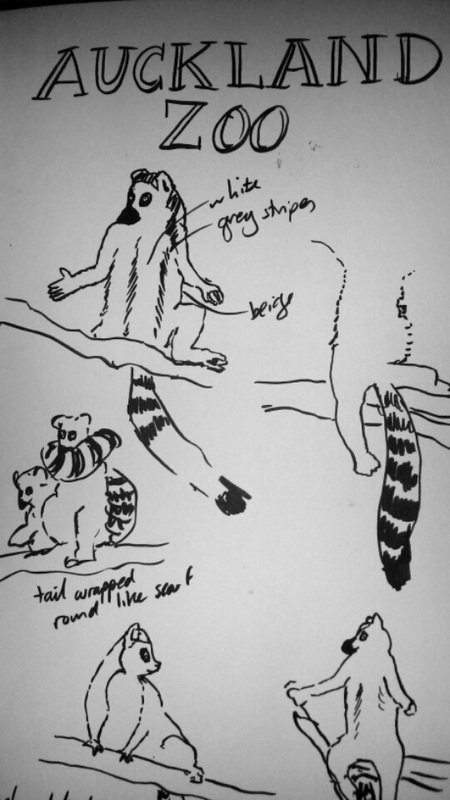
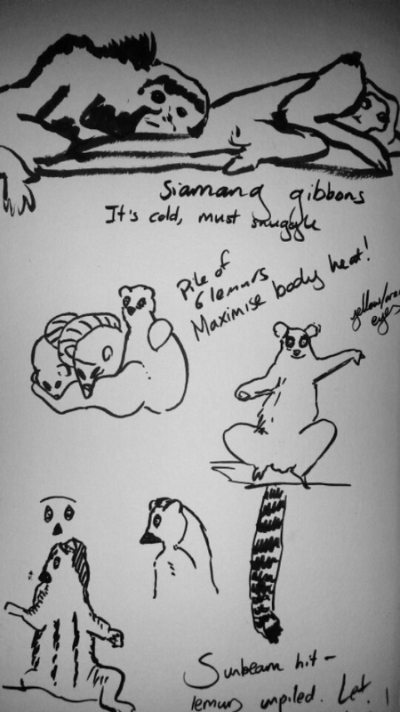
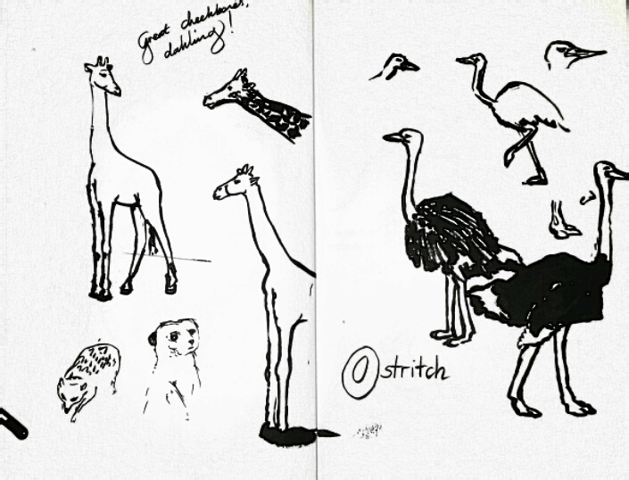
Do you ever look back at your old sketches? What have you learned from them? Do you ever find yourself returning to old styles and concepts? The Tutukaka Coast is alive with birds- we often see and hear tui and fantails I've been playing with layering watercolours, ink, paint markers and gel pens. I put down the watercolour wash first, then overlaid the black ink with brush pen. Posca paint markers and gel pens created the patterns and swirls- the gel pens give the ethereal metallics and the Posca markers are brighter and bolder. Finally, I used watercolour to add shading and a little softness to some of the pen detail. I've uploaded the designs to my Redbubble shop- click each photo for the link. 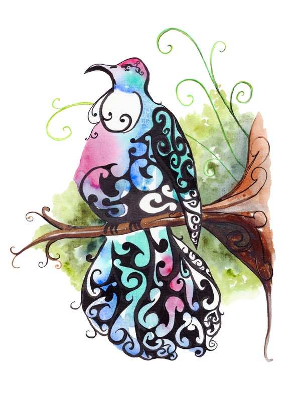 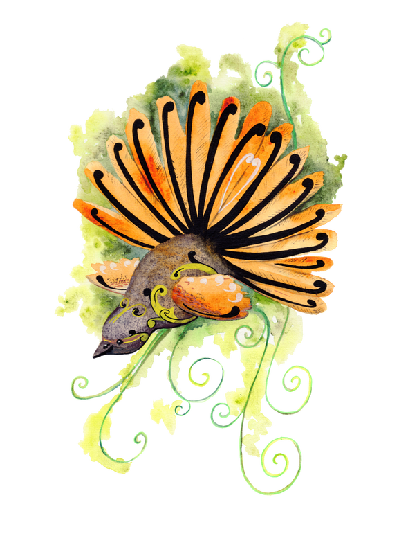 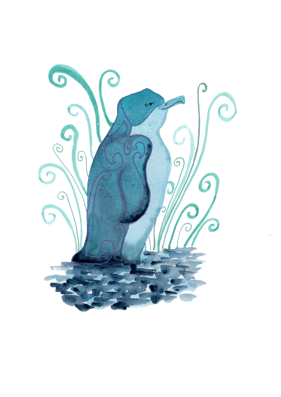 Yesterday we took Island Prism out to the Poor Knights with our friend Gines. He kindly brought along some dive gear, and we spent a couple of hours diving and snorkelling Blue Maomao Arch. It's named for the thousands of blue fish that hide under the arch- at busy times it feels like a highway as a seemingly endless stream of fish makes it way in! The turquoise light shimmering through the archway created dramatic silhouettes of rock and fish. The rocks around the arch were also very interesting, but the rocky passage was the star of the show. The demoiselles and black angels were having a field day as a feast of sea gooseberries and plankton streamed by on the full moon tides. Red moki, pigfish and Sandager's wrasse added pops of colour. Emboldened by the fishing ban in the marine reserve, a school of 30 kingfish cruised through the open water, and three took up temporary location under Island Prism. I couldn't sketch under water (though am now debating whether a dive slate and pencil would do the job), but I got lots of photos to work from! 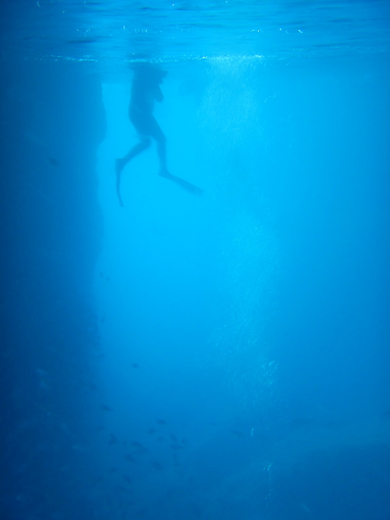 School holidays have rolled around. To kick mine off, I headed to Auckland Zoo with my friends Jill and Ethan. It was a clear and chilly day, with the side effect of upping the cuteness factor as we came across hugging gibbons, huddles of squirrel monkeys and a pile of lemurs. What looked like 3 animals in a tangle of tails and long legs turned out to be 6- who were overjoyed when the sun came out. They swiftly unpiled and began to bask in that wonderful sun worshipping way that lemurs and cormorants share. Despite looking like they were meditating, they didn't keep still for long and my brush pen and I had to work fast to get some sketches done! They weren't so keen when the sun went in. One even wrapped his friend's tail around his neck as a makeshift scarf. The cheetahs and tigers also graced us with appearances, and we were lucky enough to see three kiwi in the nocturnal house (plus an occasional frenzied flurry of bat). The kiwi were also on the move as they scurried round in search of bugs. They were surprisingly quick, but lots of fun to draw. The dark provided an extra challenge! Back home, the meditating lemurs stuck in my head. I drew one in a calm yogic pose, and decided that the monochromatic creature would look good in front of a warm coloured sun. I transferred the drawing onto acetate to create a stencil, then used a bowl to help me draw a circle. Cutting out the stencil was a little fiddly in parts, but no lemur limbs were lost. A lack of ink pads meant I ended up using acrylic paints for the stencilling. Either the material or my technique were not ideal- after three attempts I still seemed to get paint blobs under the stencil! It probably didn't help that I insisted on stroking rather than dabbing the paint- but I liked the effect more. 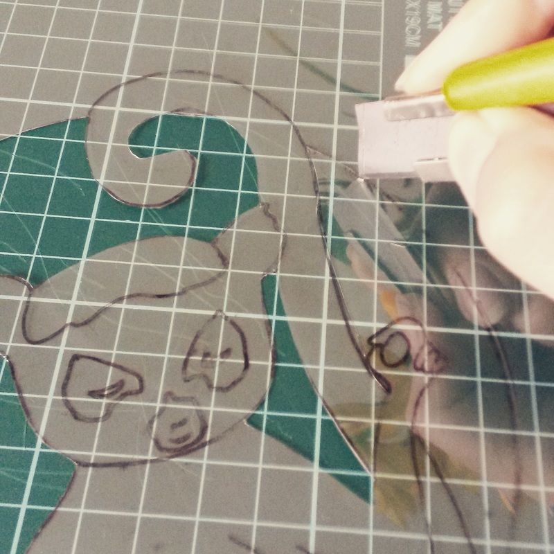 I had intended to try oil transfer printing over the top of my stencils, but the bright red and yellow suns seemed to call for something stronger- plus I wanted to hide the paint blobs if possible! I decided my Pentel pocket brush pen would probably be my friend. As hoped, I got lovely expressive lines and was able to hide the occasional blobby bit of paint. then I reached for my Pitt pens to add a relatively even grey. 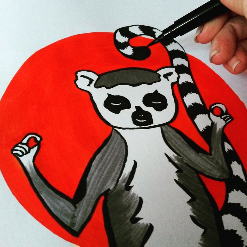 Meanwhile the idea of scarves as tails was rattling round my head. This time I went straight for the pen to create a little hat and scarf-wearing lemur. Somehow, giving him an ice cream felt right. He was also the perfect creation to try out my new wacom tablet- Photoshop is a bit of a learning curve but an extra layer and some playing with brushes gave him a little extra polish. 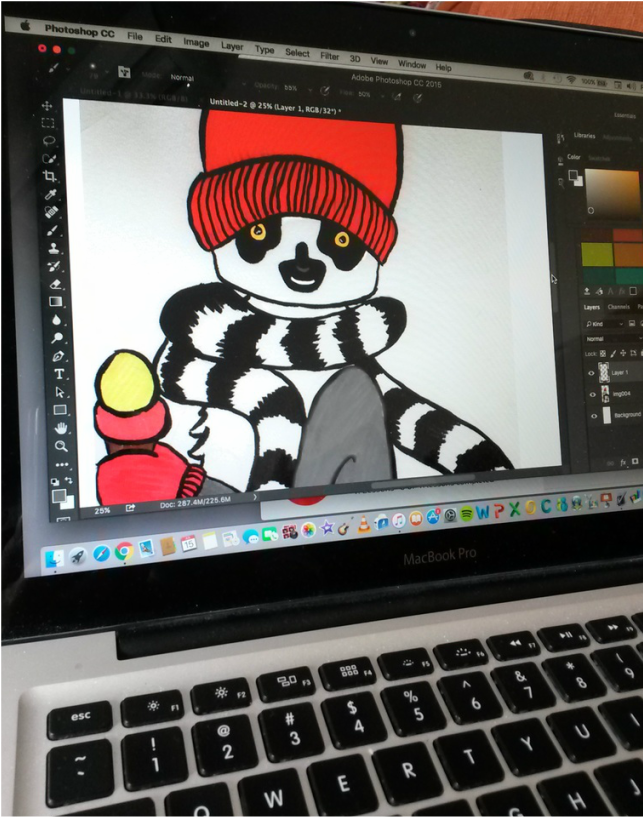 |
Andrea England
An Artist Afloat- Painting the world one anchorage at a time. Archives
August 2020
Categories
All
|


 RSS Feed
