
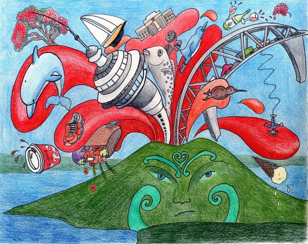
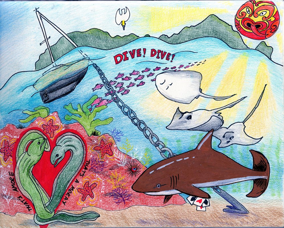
  It's looking like we'll have a good weather window on Friday or Saturday. Departure is getting near, the boat is well-provisioned and leak-free (for the moment anyway), and all that stands between us and French Polynesia is a load of laundry, a last shop for vegetables and rather a lot of sea. I started drawing places I'm saying goodbye to. It's the people who are important, but the places are all tied up with the memories of the special souls I go there with and so it seemed a good way to approach leave-taking. So I've been sketching Pacific Bay and Schnappa Rock, a great little restaurant here in Tutukaka, and remembering fun sailing trips, swimming, post-dive beverages with Jill and delicious birthday dinners. Then along came Brian Butler. He's teaching a class on Sketchbook Skool this week, and shared lively sketchbooks filled with busy drawings of concerts and road trips. He collages images together and paints enormous murals on the side of buildings to celebrate the communities he's painting in. His style is different and original, and you can find him at www.theupperhandart.com/. He challenged us to draw our own collected images of our favourite places. It seemed a perfect way to remember them and say goodbye. His quirky style got me thinking, and gave me permission to be silly. (Why do I feel I need permission to be silly in my artwork? I don't have much problem being silly any other time. Does it all stem from the art teacher who just never got my drawing of the whale weigh station?). The result was an exploding Rangitoto spewing out Auckland landmarks, my running shoes, wine from Mudbrick vineyard and coffee from the shop across from the school where I taught. It's totally daft, it didn't matter that I can't draw a straight line and I had a whale of a time playing with bendy perspective. If I ever redraw it, I'll try so I'm looking into the volcano. I enjoyed it so much that as soon as I was finished, I started drawing a fish-eye view of the Poor Knights. I challenge you to see how many fishy puns you can find. I used coloured pencils, which take a lot of layering but are very relaxing to build up and blend. I wasn't happy with the first shark I drew on the Poor Knights, so obliterated it with a cooler version in Posca pen. One of those mistakes that turns out for the best- I like the solid colour on the textured coloured pencil. There may be more towns and regions to come- it's certainly a great way to reminisce! I'm not so sure about trying to create a mural a la Brian- I'm not much good with ladders- though I could always decorate the side of the boat! I've posted my more sensible watercolours down below too (pretty happy with how the shadows are working out- a big thank you to Natalie Renotte on the Sketchbook Skool Facebook page for her advice on the dark foreground Schnappa Rock sketch)- now I'm off to distort some of the beaches on the Tutukaka Coast,,, 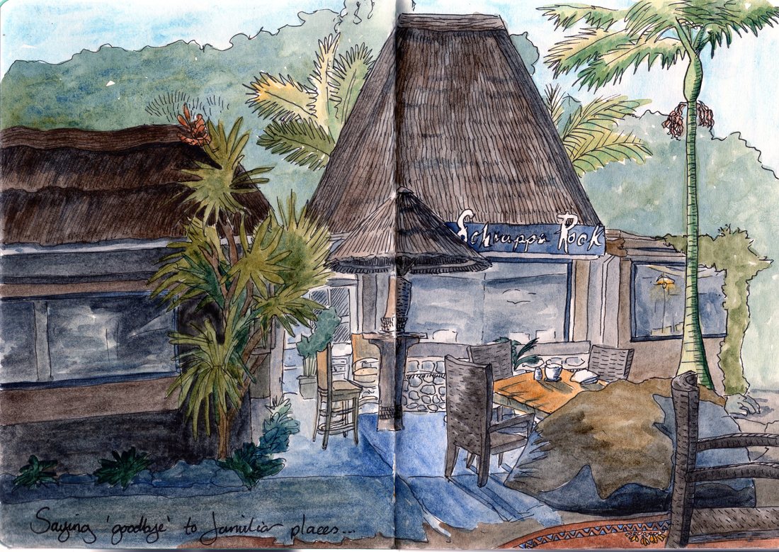 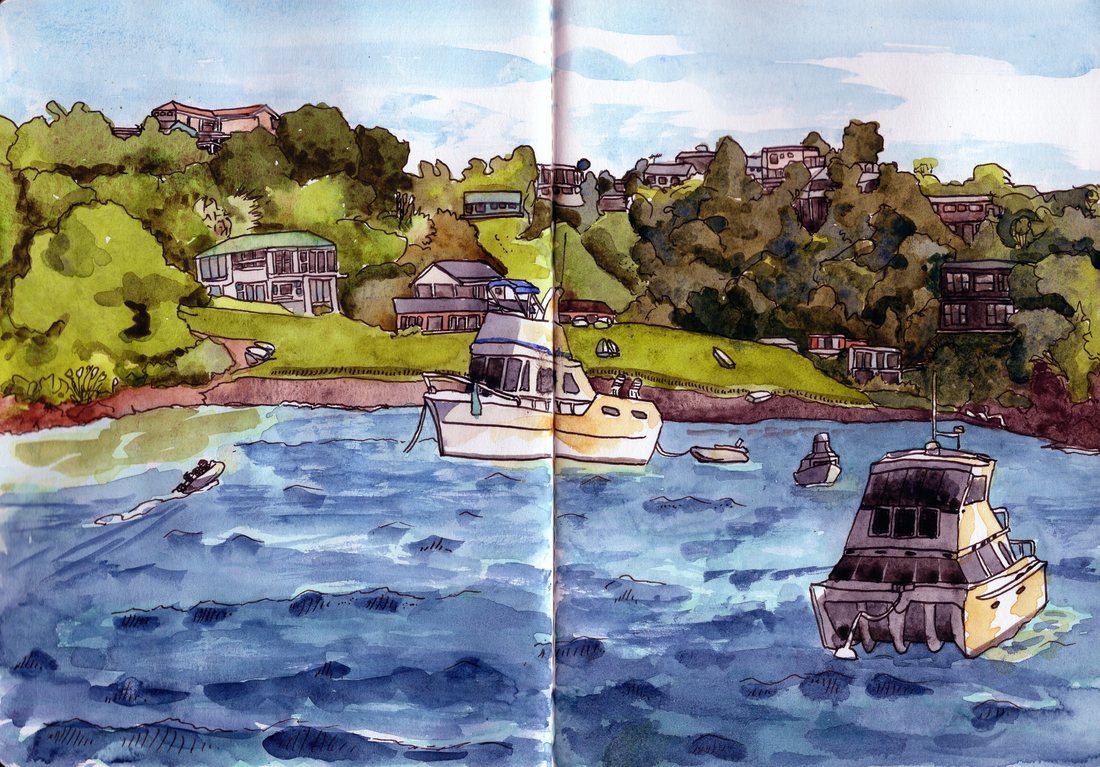 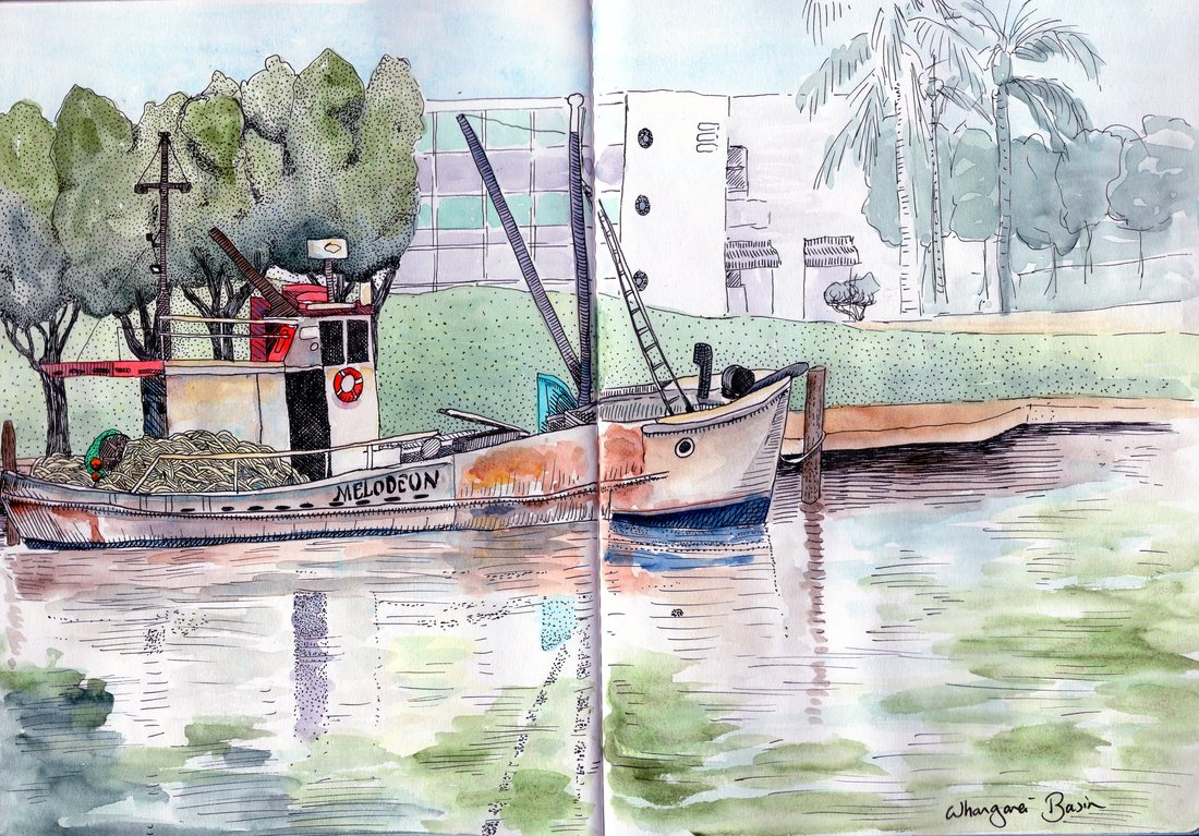
0 Comments
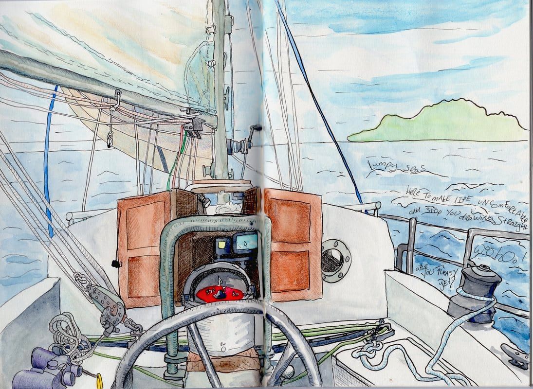 Leigh gave us the chance to grab a coffee and stock up on ice for the fridge. Leaving, we were faced with confused seas, determined to force us in the wrong direction and make our journey as uncomfortable as possible. As we wobbled out towards Little Barrier Island (which is shaped very much like a crocodile), I tried to draw a helm's eye view of the boat. I am going to blame the rolling for some of the very wobbly lines. Things started to behave themselves after a couple of hours, the waves settled down and the wind sped us north. We passed by the Whangarei Heads and anchored at Pacific Bay on the gorgeous Tutukaka Coast, where we will be spending Christmas.
Wonky boat art in Micron fineliners, watercolours and Polychromos pencils (added the next day in a calm anchorage!) 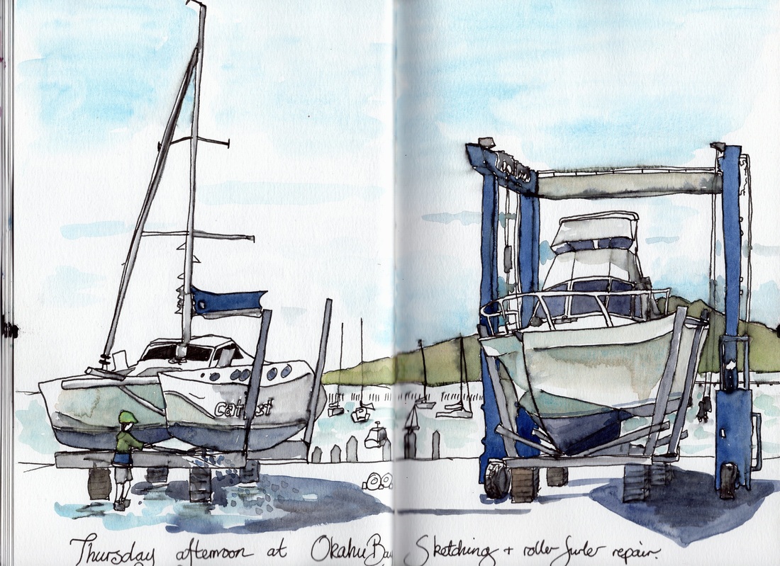 Jim's been working steadily on Island Prism, and I've been going down to the boatyard to take him lunch, sketch and lend a hand. I thought about making a visual record of everything we are (he is?) doing to get the boat ready for launching, but long furlers and small screws don't make for terribly arresting images. The boatyard itself is far more inspiring, so I've been doodling the boats instead. Art-wise, this presents lots of interesting things to draw. It also highlights my inability to stick with exactly the same media for two pictures in row! On Thursday I drew a couple of boats being hauled out using Lamy ink and watercolour. I think I'm supposed to be horrified by the way the ink runs when I add watercolour, but actually I like the effect. 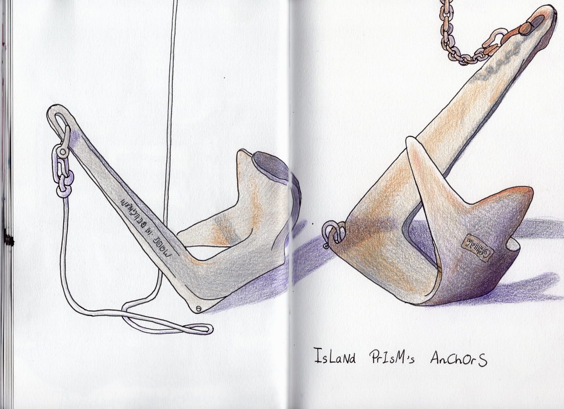 Both Prism's anchors are being stored on the ground. Their shapes and slight rusty patina were interesting so I sketched them in ink. I was going to paint them, but then I remembered I hadn't used my coloured pencils in a while. So I slowly built up the layers of colour in my home-made colouring pages. We spent a little while taking the roller furler apart- some of the plastic wedges holding it together were worn and needed removing. 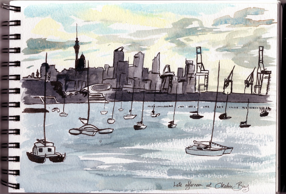 On the drive home, the light over Auckland was absolutely stunning. I wanted my skyline to stay crisp and needed to work fast, so I pulled out my brush pen with de Atramentis document black and drew the view back to Okahu Bay and the city, then added watercolours. My flat water brush was perfect for catching the light reflecting on the sea.
Launch is supposed to be on 17th October. The timing is looking tight and we're not sure if we'll make it. We're planning to move onto the boat in November and have very exciting plans for next year... watch this space! Maybe by that stage I'll even be able to settle down into a signature style and medium. Do you tend to stick with one way of drawing, or do you flit between materials? I'd be interested to hear! |
Andrea England
An Artist Afloat- Painting the world one anchorage at a time. Archives
August 2020
Categories
All
|
 RSS Feed
