
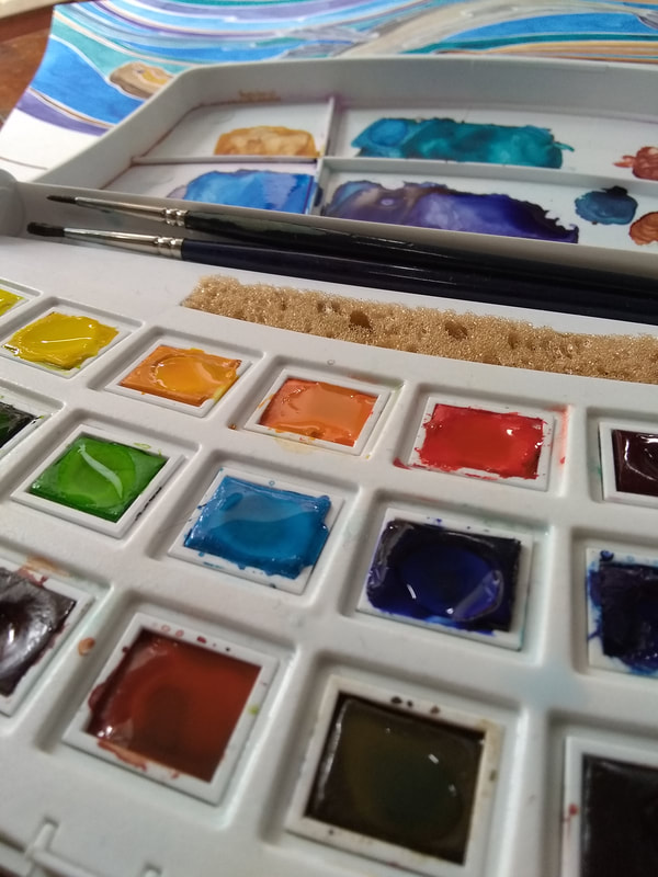
 When I was asked if I'd like to test and review the full range of Van Gogh watercolour paints on behalf of Royal Talens North America and Doodlewash, it was a bit like Christmas had come early. Van Gogh are made in the Netherlands by Royal Talens. They are intended for 'the serious artist', filling a niche for affordable quality paints that are less expensive than their Rembrandt Professional range but of a higher quality than student paints. I received an empty 24 pan plastic palette and 40 pans of colour. The brown box of delights caught up with me on Island Prism during our family invasion of Telegraph Cove, and the family were happy to help me unpack. First out of the box was the plastic travel palette. This is sturdy (an essential feature as it will be spending its life on a boat), and I found the curved design very appealing. The mixing area is large, and easy to clean with a cloth or by gently detaching it at the hinges to rinse. Like most plastic palettes, it gets stained by a couple of the pigments, but the marks are easy to remove with a tiny bit of cream cleaner. The sponge is a nice feature- perfect for removing excess moisture from a brush. I'm inclined to keep this as a studio palette rather than using it out in the field. There's no thumb hole or ring, suggesting that it's intended for table-top use rather than to hold. The palette is a bit on the large side, although that is one of the things I really like about it. The size allows the colours to be nicely separated, reducing the chance of the pans contaminating each other. The pans are a little loose, and fall out if the palette is carried on its side, though this is easily solved by popping a bit of blu-tack on the bottom (I'd imagine double sided tape would work too). If I was looking for something to carry in my bag all the time, I'd pick the metal palette or pocket palette also available from Royal Talens. 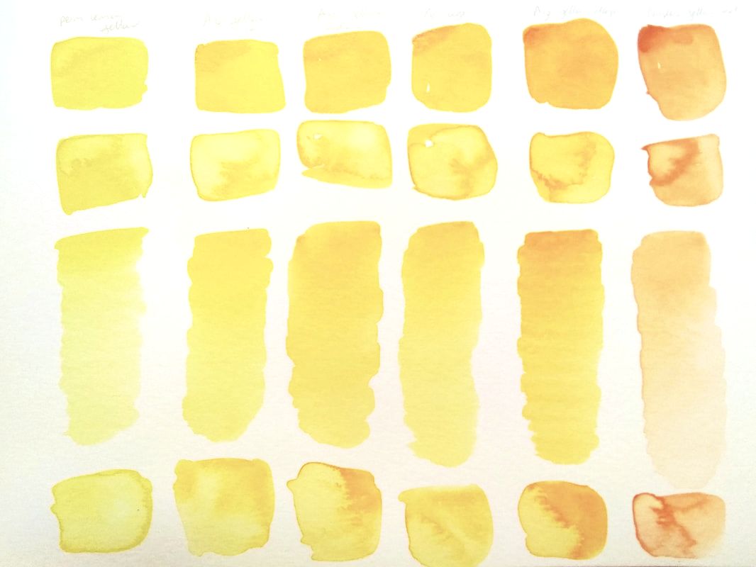 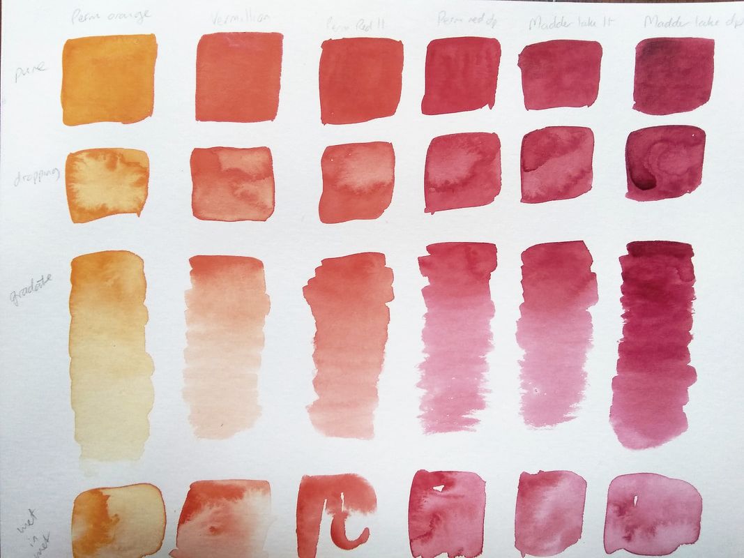 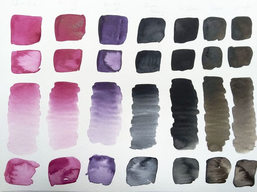 Fifteen of the colours are single pigments. This means that the colour is pure- ideal for mixing. The remaining shades are created from two pigments. Potentially this increases the chances of creating muddy colours when mixing, as it's best to have no more than two or three pigments in a mix. However, Royal Talens have thought carefully about their pigment selection- for example, the blended yellows and greens mostly use PY154, giving a good success rate when it comes to mixing these together. I was also happy to find that the viridian and phthalo greens are both single pigment, meaning I could use these as a base to mix more realistic shades from. I was very happy with the overall results. Most of the colours were bright, intense and translucent. After moistening them, it was easy to lift pigment from the pans and quickly get a rich colour. The yellow ochre and red iron oxide were opaque, as was the cerulean blue. This last pigment was made from phthalo blue blended with white. Although the pan had a slight white bloom when wet, the paint didn't appear chalky on paper. The colour is very intense and needs to be well-watered down for skies. The one disappointment was the phthalo blue pan, which produced a faint and insipid colour, although the Prussian blue made up for it with its warm intensity. 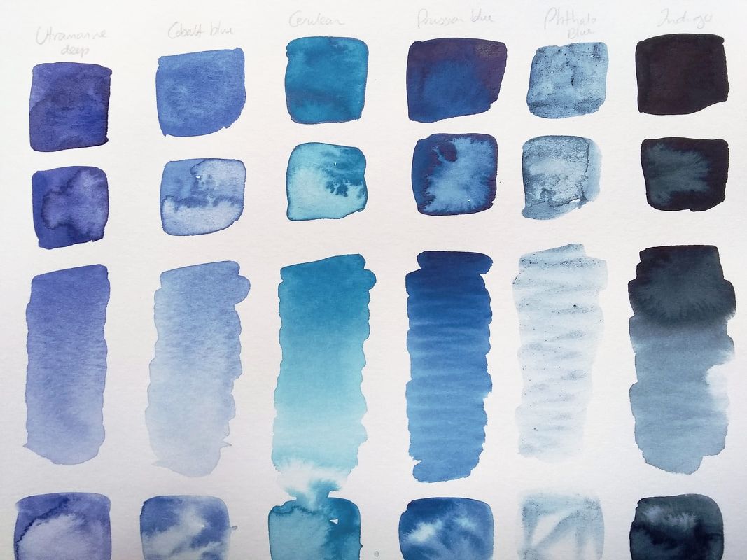 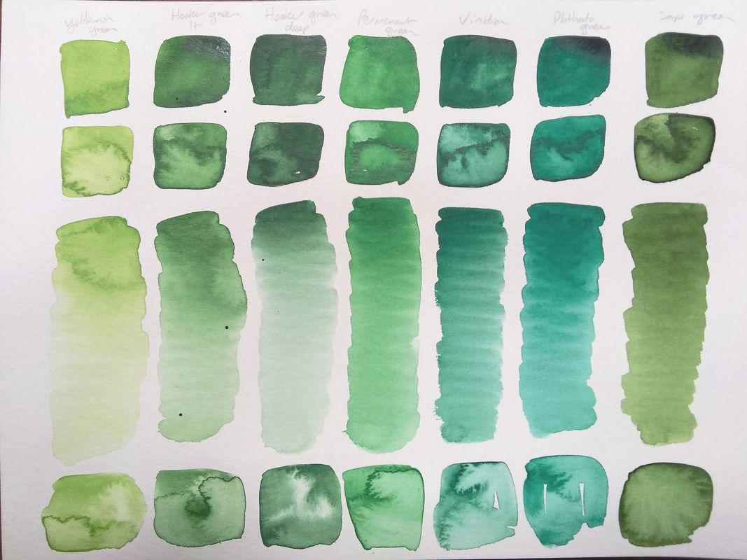 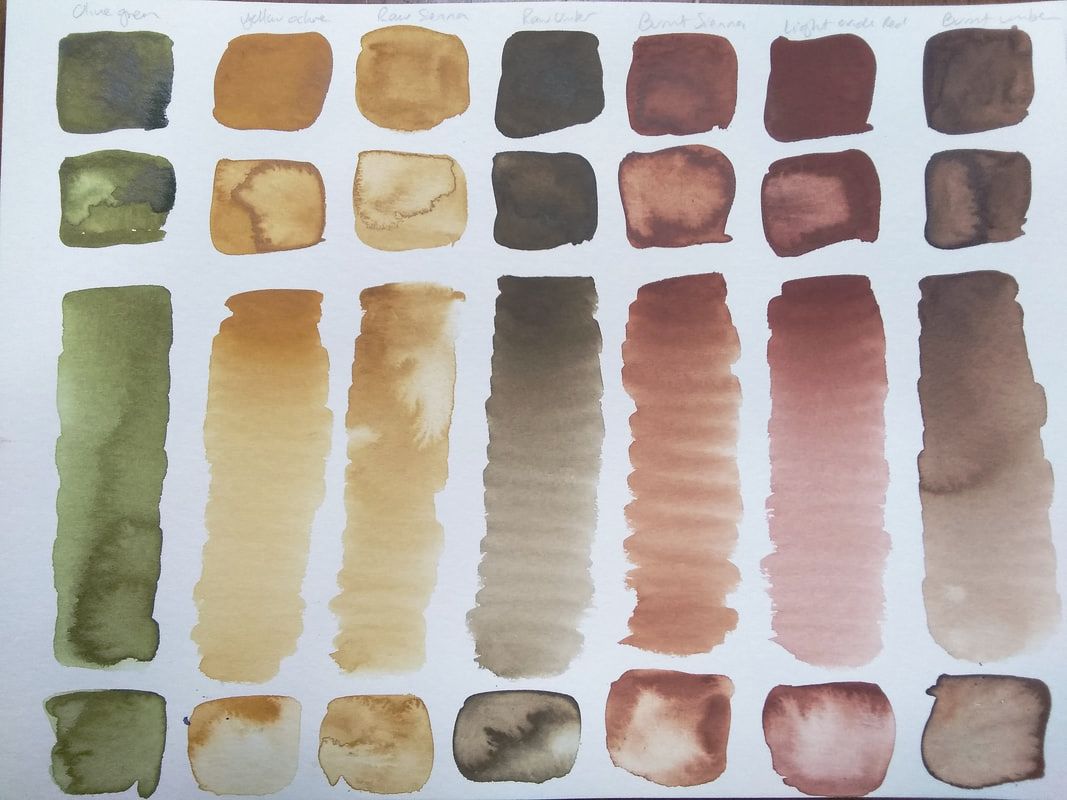 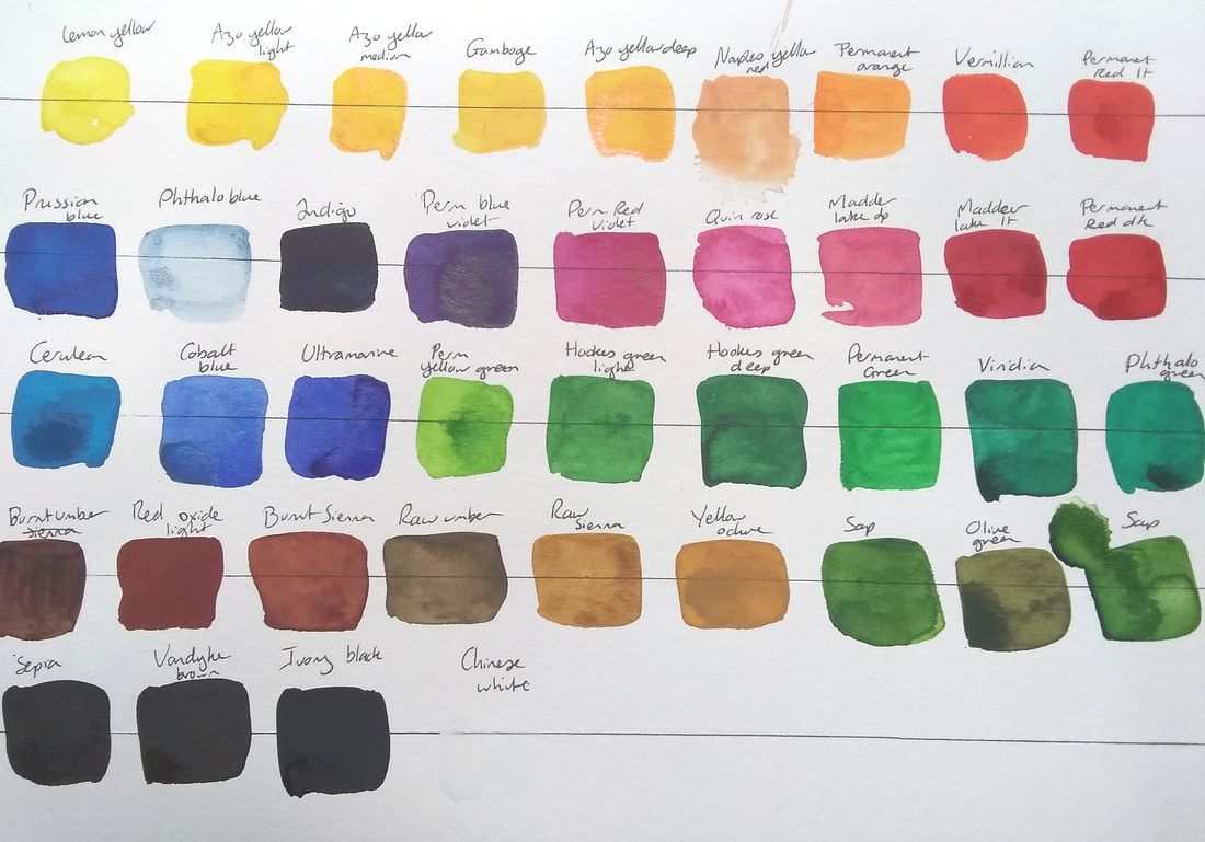 Once I'd tried out the shades individually, the mixing fun could begin. As I often paint the ocean, landscapes and wildlife, I wanted to make sure that I could mix a good range of greens and obtain mud-free neutrals. I started off by choosing some of the primary shades to make triads and see what happened as I mixed them together. Then I moved on to some less orthodox groups of three. I was delighted to find that the Prussian blue and burnt sienna created a wonderful sea foam green, and raw sienna made great greens when mixed with viridian or cobalt. I was extremely happy with the results- these paints let me create bright secondary colours, and I was also able to make gorgeous grays, rich browns and beautiful deep blacks. It's great to know that I'd still be able to mix a huge range of colours even if I was using a more limited selection of pans. 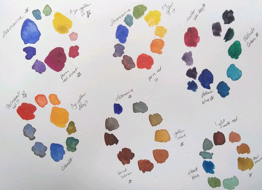 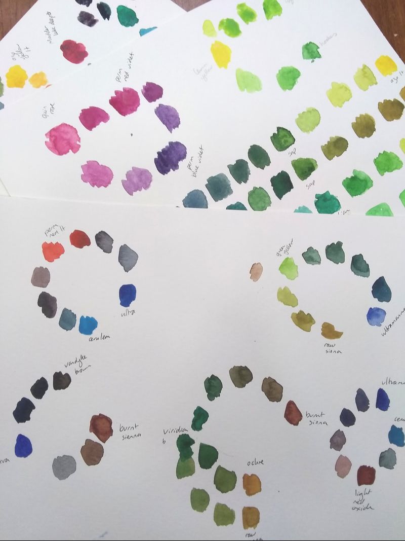 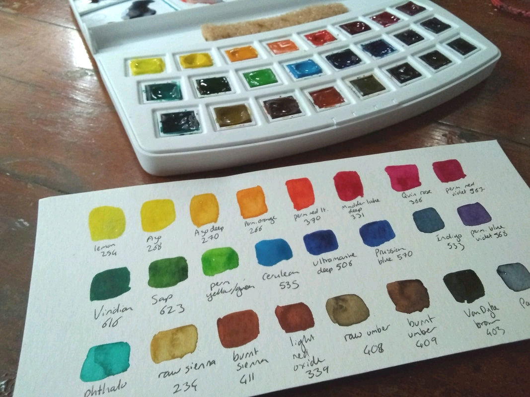 Then it was decision time. I loaded the palette up with the two single pigment yellows, and azo deep was a must-have as it's the same colour as the boat! Permanent red light created some beautiful warm and cool greys when mixed with different blues, and I'd fallen in love with the gorgeous quin rose and permanent red violet. Of course, I needed a good selection of blues and a few convenience greens, then raw sienna and a range of browns. 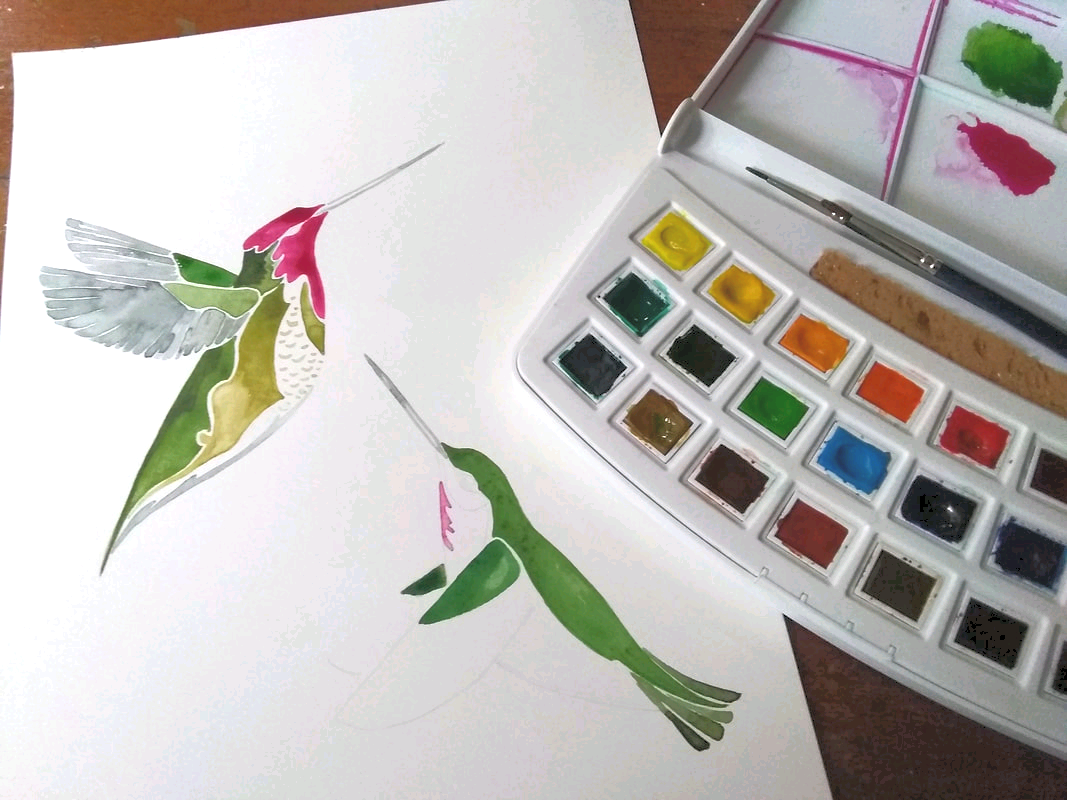 Finally the really fun bit- painting! First I tried the paints out on a pair of hummingbirds and a duo of seals. The paints flowed well, kept giving me the clear bright colours I expected from my trials and were fun to use. The browns gave me a little granulation in the kelp, and the colours of the hummingbirds glowed. 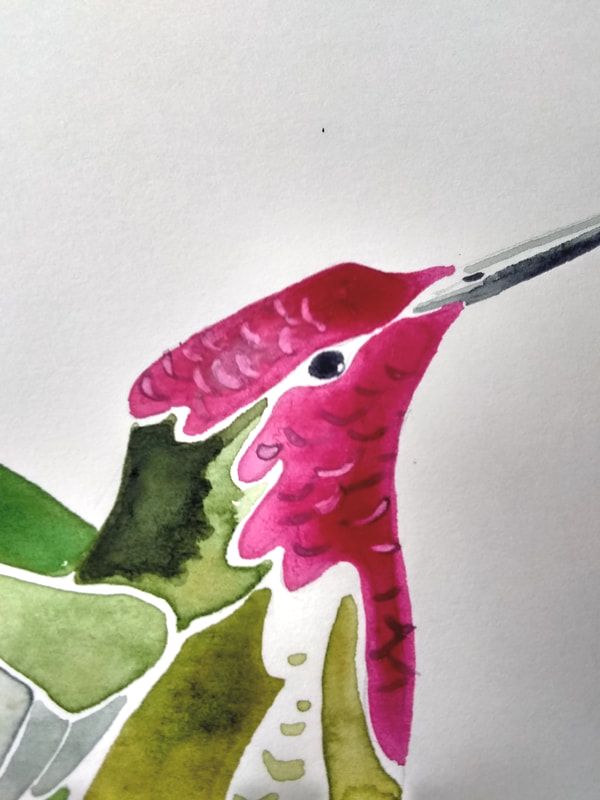 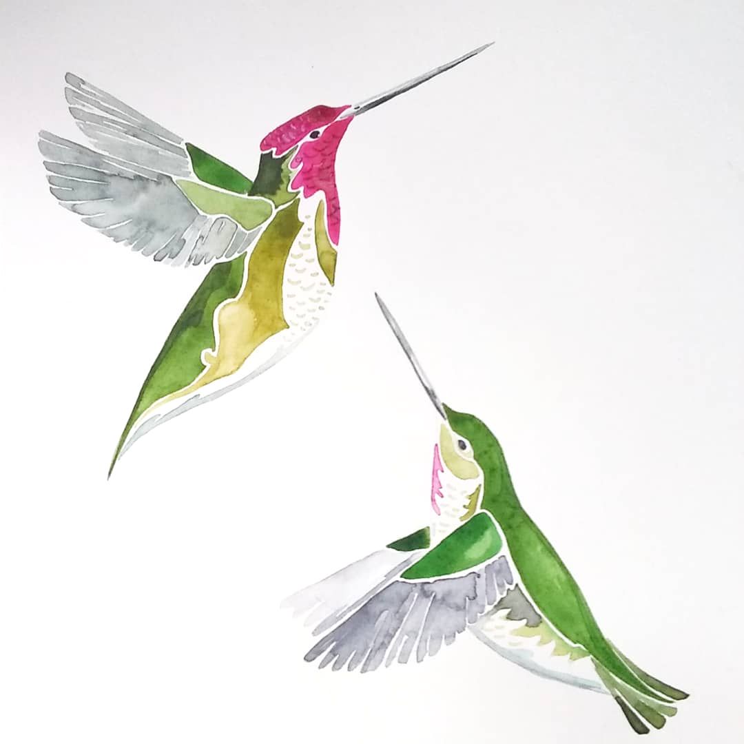 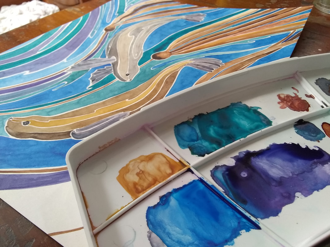 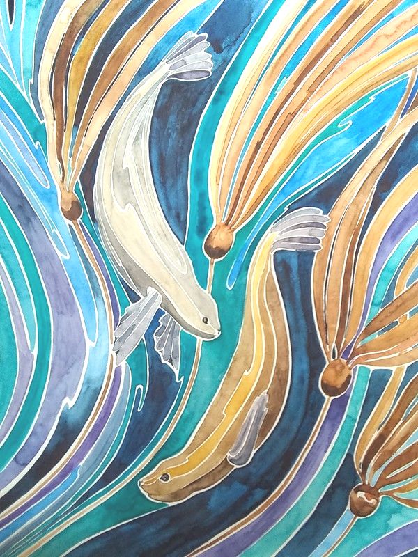 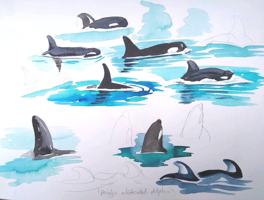 I then put them to the test in my Fabriano watercolour sketch books, colouring some whales I'd drawn. Viridian and madder lake deep created great blacks for the orca, whilst Prussian blue, phthalo green and indigo gave me the perfect shades for the ocean. The following day I took the set outside to paint as we cruised through Green Point Rapids. I mixed up a wide range of greens from viridian. The paints layered well without creating mud. I did fall into the trap of over-saturating the sky when I failed to water the cerulean down enough, but that was user error! 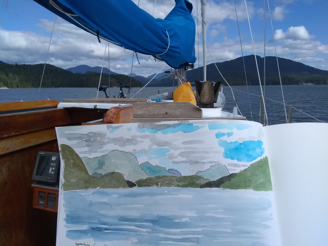 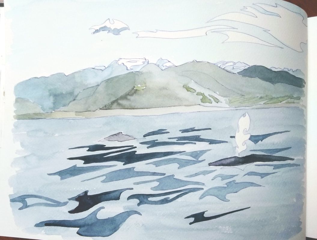 In conclusion, I was very happy with the results I obtained from the Van Gogh paints. Their quality pigments, uniform price and high lightfastness make them a fantastic starting point for students, beginning artists or for artists on a budget. They are far superior to any student line I have tried, which are often weak, chalky or impure. The use of standard artist quality pigments also means they will behave well with other artists' watercolour ranges. I really enjoyed the range of colours I could fit in the 24 pan, but the ease of mixing means that even the smaller travel set is very flexible. I'm not about to cast aside my Daniel Smiths (their vast range of pigments and beautiful granulating paints mean they're still my favourite), but Van Gogh does represent a vastly different price point and makes quality watercolour very affordable. I'm certainly going to enjoy playing with this set more in the future (and have in fact reached for it quite a few times whilst preparing this review)! Whilst I was given the paints to review by Van Gogh, I have not received any payment in return for testing them. The opinions contained within this article are wholly my own! You can find out more about Van Gogh paints here on the Royal Talens North America website. They are available from art stores including Opus, Amazon and Dick Blick. 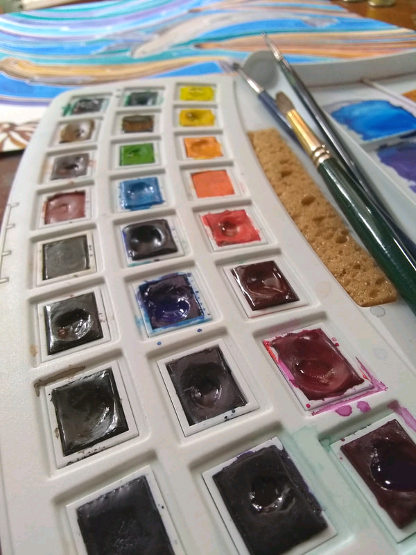
13 Comments
|
Andrea England
An Artist Afloat- Painting the world one anchorage at a time. Archives
August 2020
Categories
All
|
 RSS Feed
