
|
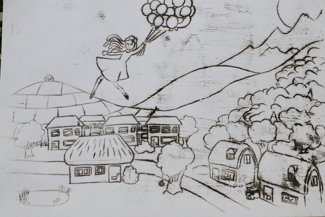
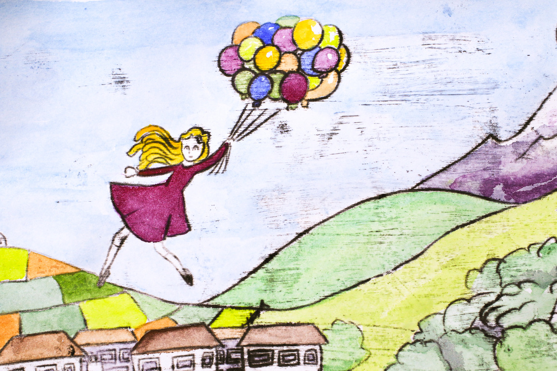
Penny Dullaghan has been a wealth of ideas in Sketchbook Skool this week. Another one of her printing techniques was oil transfer printing. It's the grown up version of the 'trace and transfer' technique you learn when you're a kid (trace something on tracing paper, shade on the backside of the paper with soft pencil then draw over your original lines to replicate the image. Another way to look at it is as grownup carbon paper. 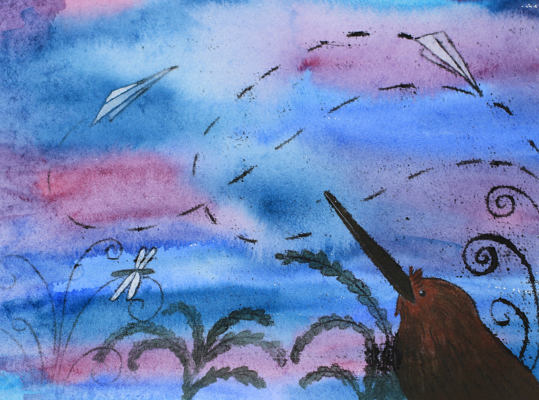 Memories of flight I started off by blobbing some black oil paint onto thin white cartridge paper (even regular printer paper would be fine, I just didn't have any). Then I used a thick brush to wash thinners over the paint, creating a black piece of paper. This was the stinky bit. I left it to dry- Penny recommends using a hairdryer to achieve this but I don't own one of those either, so I left it to fate and set off to draw my image. I'd made a wash of purples and blues on watercolour paper and so decided to use that as my first attempt. Our theme was flight- I got thinking about all the flightless birds that have evolved here in New Zealand, and wondered if they get any wistful pangs when they see other creatures flitting by on the breeze. And what about things that aren't even meant to fly? I drafted my image on another piece of paper, taped the transfer paper over the dry watercolour wash and taped my sketch over the top. Then I took a very sharp, hard pencil and traced. It was straightforward, and by only taping one side I was able to take peeks at what was going on. The oils transferred easily, with an expressive line. Even the pressure of my hand resting on the paper was enough to get smudges. When I was happy with the detail that had transferred over, I removed the tape and used some acrylic inks and acrylic paint to add some more colour and lift the design a bit. You can see how the dryer areas of the transfer paper gave a thinner, finer line whilst the wet areas gave some thick, expressive detail which worked well on the watercolour paper. Some of the oils also showed the grain of the watercolour paper, which I quite like here(I assume this is where my hand rested on it). Next up I tried (yes, you guessed it) a dinosaur. 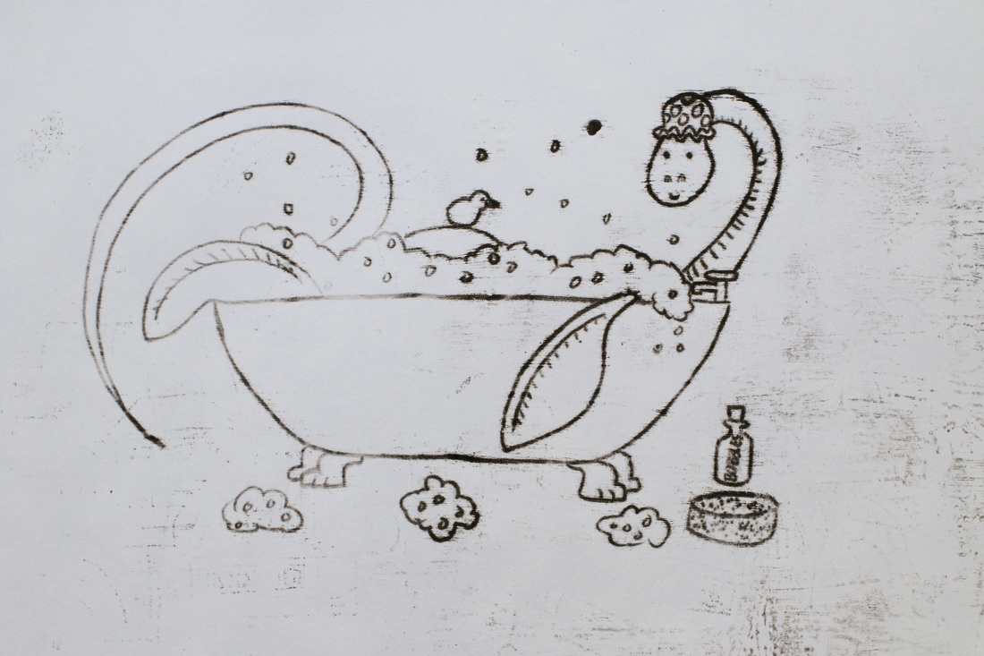 A little bit of drying time and a wash of watercolour perked him up nicely. I like the line quality and the speckles on the image, though I wouldn't mind cleaning up the grubby background (I may have to brave Photoshop!) 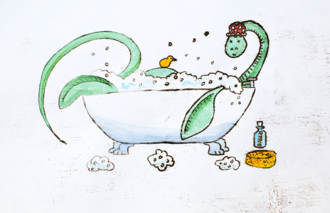 Plesiosaur in the bath, oil transfer with watercolour The transfer paper was good to go for a third attempt. I didn't preplan this one- and soon discovered that the lightest pencil touch would get printed! The lack of planning shows, and I think the oil transfer overwhelms all the tiny details. Note to self- plan a bit more next time! It would be interesting to try oil transfer printing over a bright, bold image or stencil. It's also got me thinking about going back in time by a couple of decades and attempting monoprints again.
0 Comments
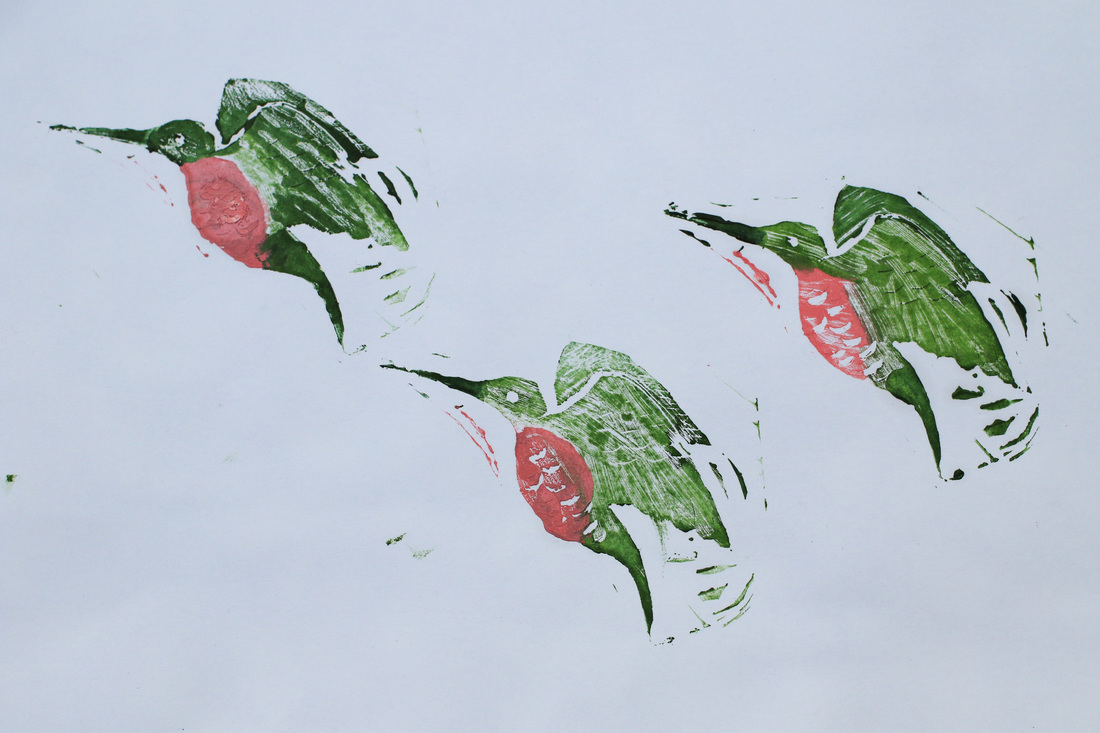
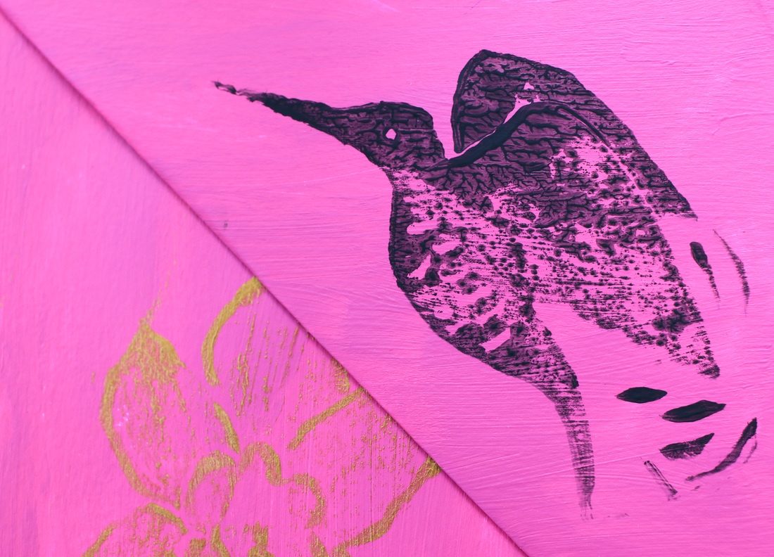
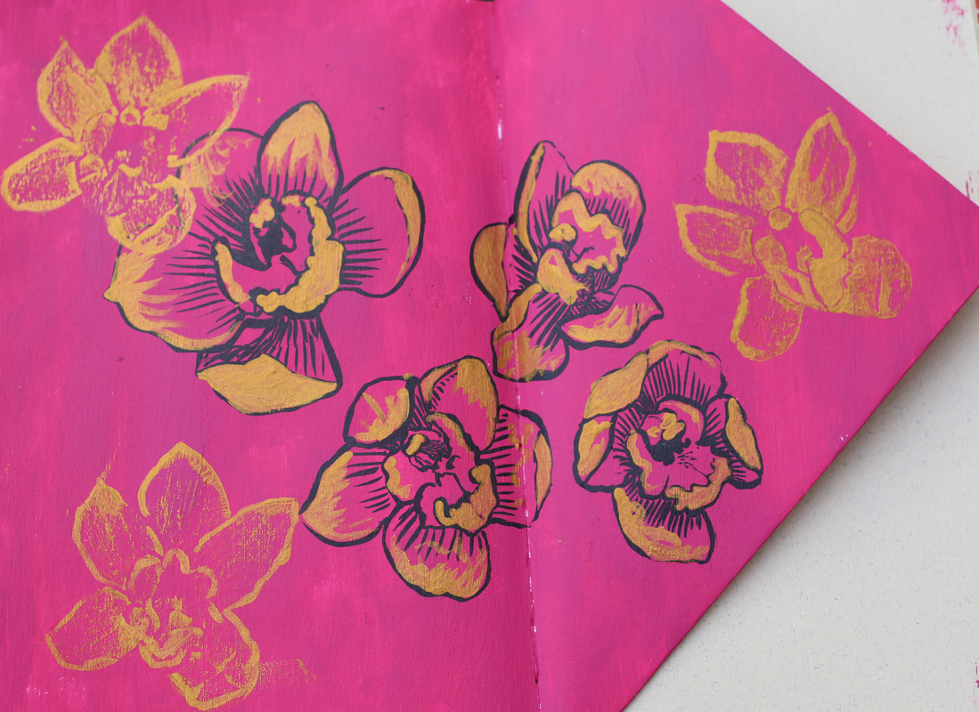
I've been playing with eco printing on and off for a year now, but have steered clear of the regular inky kind. I did enjoy monoprinting way back when I was at sixth form, and have been tempted to give it a try, but didn't get much farther than reading a book on my kindle and feeling that it was going to be messier and more complicated than I remembered. Then along came Penny Dullaghan. This week at Sketchbook Skool, for her week in the Expressing course, Penny showed us four different printing techniques, from using ink on tracing paper (effective but painstaking), to lino cuts and oil transfer (which creates a similar effect to that favoured by Paul Klee). Initially, I only owned the materials to try the ink transfer. I drew some pterodactyls using inktense pencils (yup, still in the dinosaur zone), traced them and set about printing them with black ink. This involves drawing a tiny bit at a time on the back of the tracing paper and quickly pressing it down onto the coloured image. This results in a gloriously grainy line, and the occasional smudge- and takes ages. I do rather love the results though. 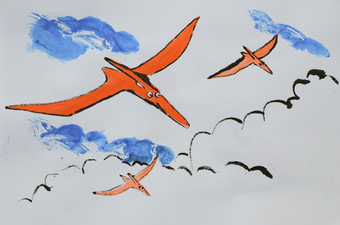 Pterodactyl Squadron I'd always thought that lino printing would be hard, and carry an unreasonable risk of losing a limb (or at least cutting my finger). Plus my attempts at using a craft knife usually lead to such dubious results that I assumed lino carving would be a straight road to failure. But Penny made it look so easy that I gave into the art supply shopping impulse and sprinted over to Gordon Harris, returning as the proud owner of a lino cutter, some lino and a set of oil paints. I decided to try a hummingbird for my first lino cut. This was probably an unnecessarily complicated embarkation point, but also felt more sensible that the dragon I first sketched out. I had some very soft EssDee lino- which lived up to its promise of being easy to carve. SO easy that even I could do it. No people or furniture were injured in the creation process and you could even tell what it was. Next step was to use it- printing with oil paint was a messy process, but I liked the effect. I then carved an orchid stamp, and tried printing in gold acrylic on an acrylic background. This was less successful and I ended up touching the stamps up with my brush (the black flowers are hand drawn). I think the roughness of the background layer was to blame, as later I got some lovely prints on white cartridge paper. My final attempts were made using Pitt brush pens to colour the stamps. The prints lost quite a bit of the fine detail, so were less effective than the oils, but much easier to handle! A few dots of gold acrylic and dash of fineliner pepped it up nicely. 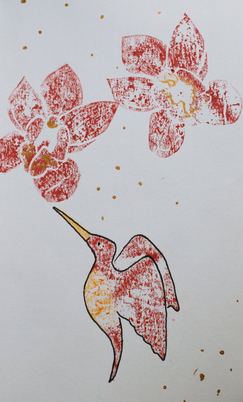 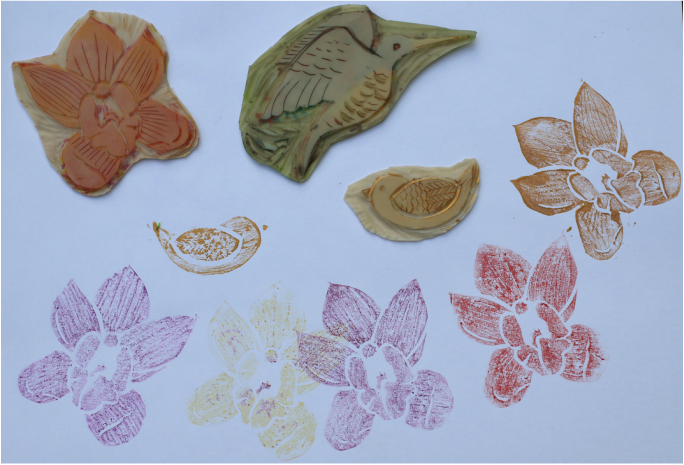 One final little bird and an orchid garden and I was done for the night. Definitely something I'll be trying more of!
|
Andrea England
An Artist Afloat- Painting the world one anchorage at a time. Archives
August 2020
Categories
All
|
 RSS Feed
