
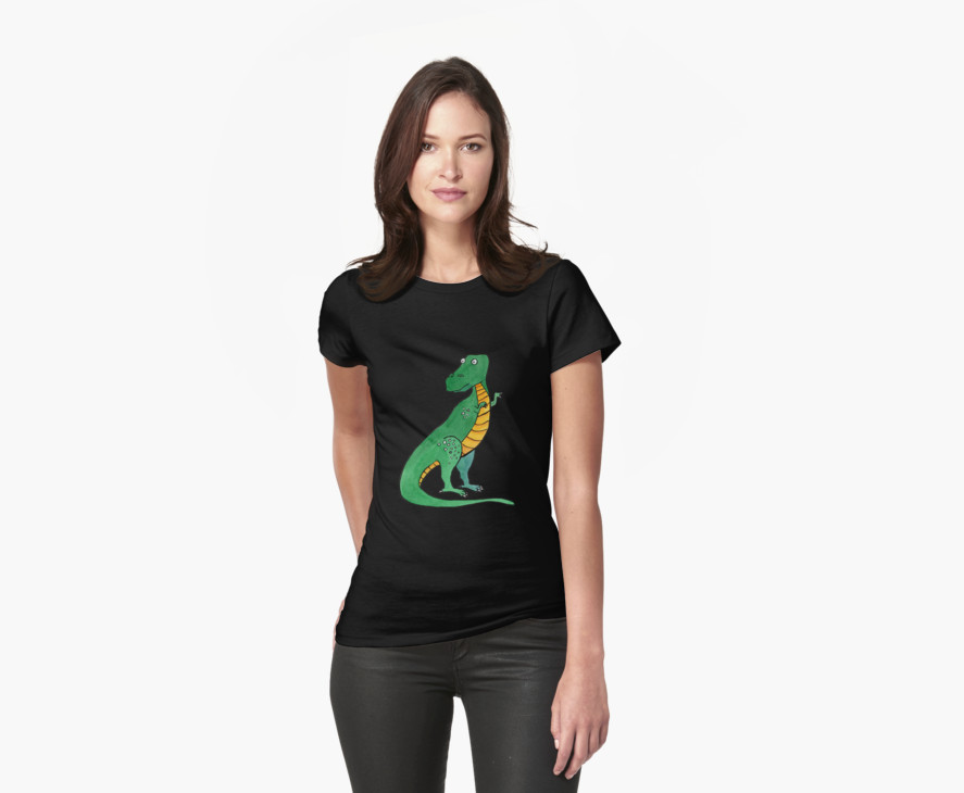
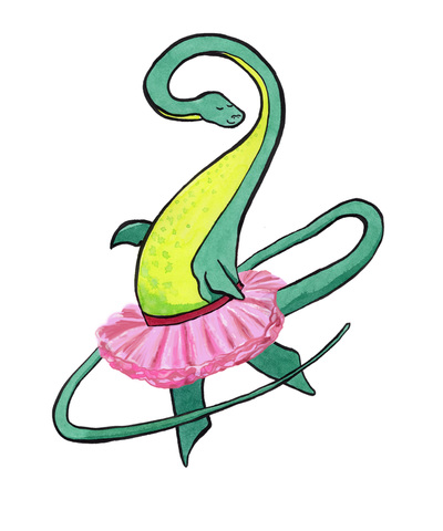
 The dinosaurs got out and are now running rampant over at Redbubble, where they can be found adorning stickers, t-shirts, hoodies, laptop sleeves and skins, bags, cushions, cards, wall prints and anything else they can get their claws into*. If you'd like to take a peek, or perhaps even adopt a dino, click on the photos here or go to the shop link at the top of my webpage. The 'Available Products' option under each dino on the site does pretty much what it says on the tin (or tab)- and for apparel you get a wide choice of styles and colours. The dinos are suitable for boys, girls or those of us who never totally grew up. * Brontosaurus and Plesiosaur would like to point out that they don't have claws, but this does not get in the way of them being loveable.
0 Comments
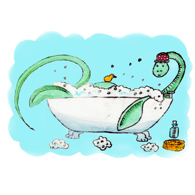
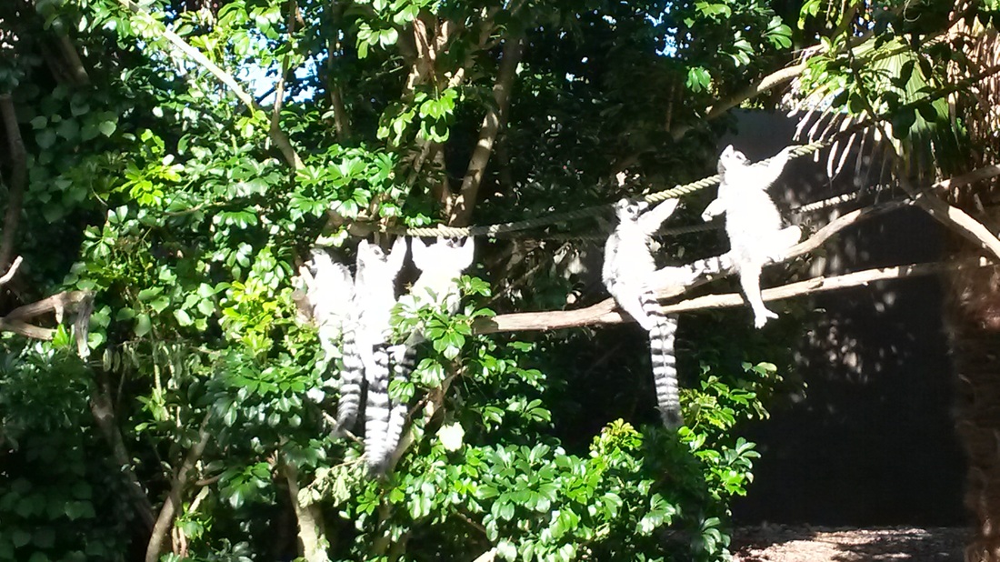
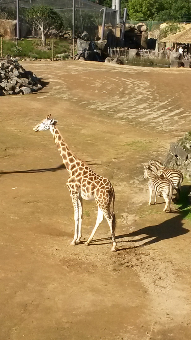
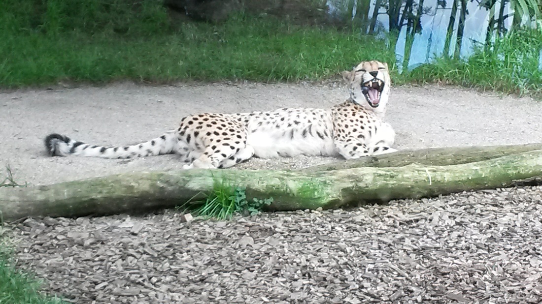
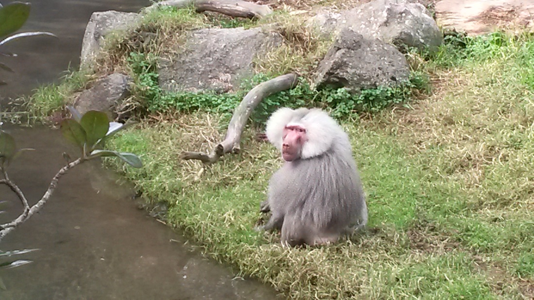
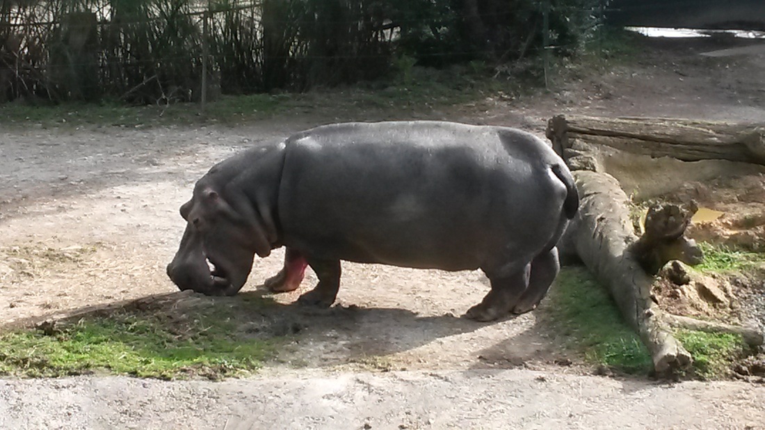
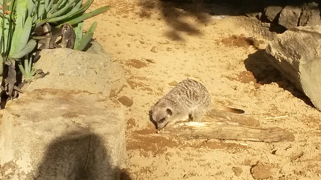
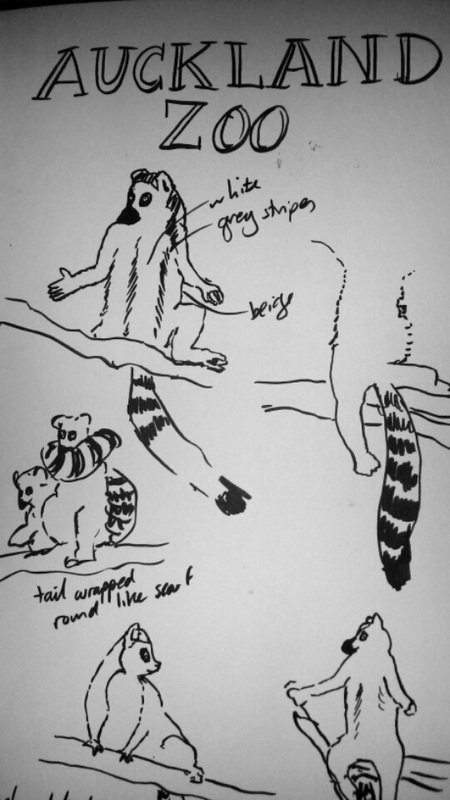
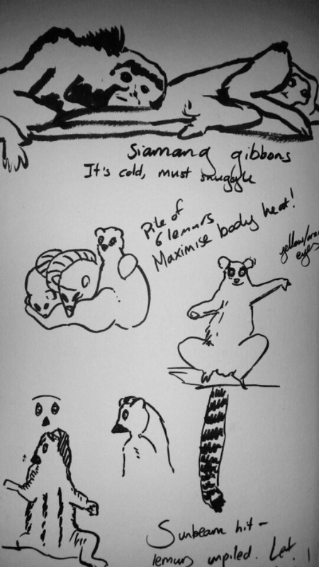
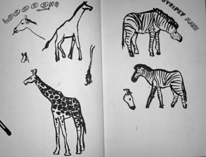
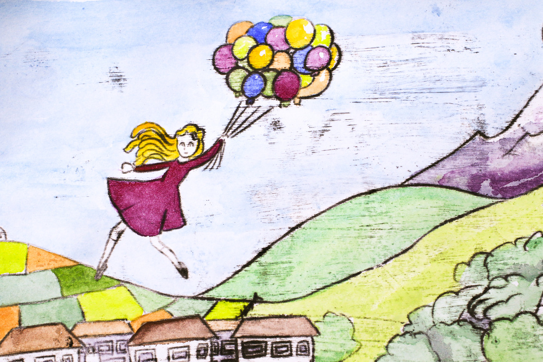
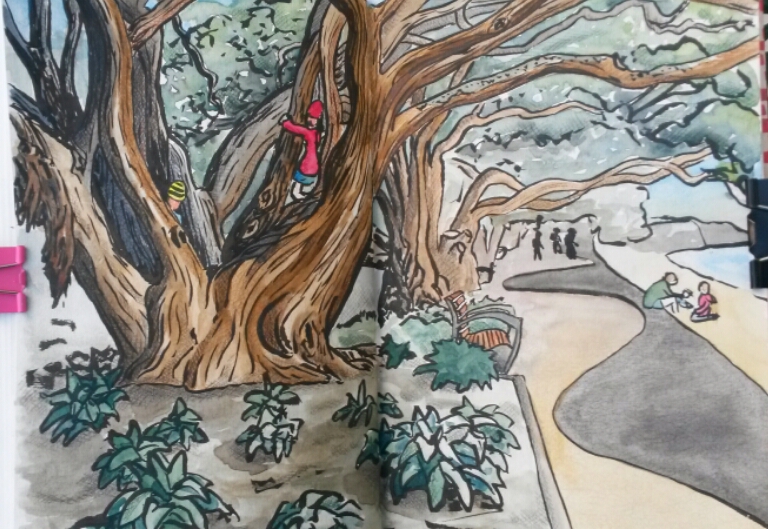 It's been an urban sketching kind of a weekend, despite the heavy rain and lower-than-I'd-like temperatures. I can blame Michael Nobbs for starting it off- our task for his class in Sketchbook Skool is to take a tiny adventure. I packed my sketchbook, pen and watercolours and headed down to Kohi Beach. A coffee from the Store was essential fortification against the rather chilly wind. I started off by sketching Rangitoto a couple of times, experimenting with how to use my ink brush to show waves and the lovely shimmer of the sun on the water. Then I spotted some kids having a tiny adventure of their own- climbing one of the pohutukawa trees which line the bay. I love the trees, so decided to do a quick drawing. Which turned into a more detailed drawing. Which turned into pulling out the watercolours then adding coloured pencils and being finished an hour or so later (JUST as it started to rain!). I'm not sure if it counts as a tiny adventure any more, but I really enjoyed it! 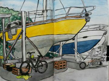 Sunday went a similar way- popping down to the boatyard to see Jimmie working on Island Prism led to a leisurely hour of drawing her. I've been happy with how my Pentel colour brush pen has been working for these sketches- I like the expressive lines I've been getting and have also got better at using it for fine details. The really wonderful thing is the ink dries quickly so I can use watercolours over the top. As I finished painting Prism, the clouds rolled in. There was just enough time for a quick sketch of Jim before the rain started to pour- which did at least lead to some beautiful rainbows on the drive home! 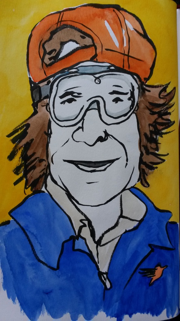 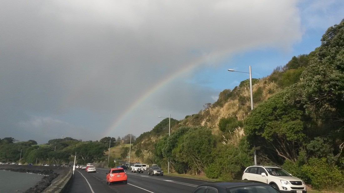 School holidays have rolled around. To kick mine off, I headed to Auckland Zoo with my friends Jill and Ethan. It was a clear and chilly day, with the side effect of upping the cuteness factor as we came across hugging gibbons, huddles of squirrel monkeys and a pile of lemurs. What looked like 3 animals in a tangle of tails and long legs turned out to be 6- who were overjoyed when the sun came out. They swiftly unpiled and began to bask in that wonderful sun worshipping way that lemurs and cormorants share. Despite looking like they were meditating, they didn't keep still for long and my brush pen and I had to work fast to get some sketches done! They weren't so keen when the sun went in. One even wrapped his friend's tail around his neck as a makeshift scarf. The cheetahs and tigers also graced us with appearances, and we were lucky enough to see three kiwi in the nocturnal house (plus an occasional frenzied flurry of bat). The kiwi were also on the move as they scurried round in search of bugs. They were surprisingly quick, but lots of fun to draw. The dark provided an extra challenge! Back home, the meditating lemurs stuck in my head. I drew one in a calm yogic pose, and decided that the monochromatic creature would look good in front of a warm coloured sun. I transferred the drawing onto acetate to create a stencil, then used a bowl to help me draw a circle. Cutting out the stencil was a little fiddly in parts, but no lemur limbs were lost. A lack of ink pads meant I ended up using acrylic paints for the stencilling. Either the material or my technique were not ideal- after three attempts I still seemed to get paint blobs under the stencil! It probably didn't help that I insisted on stroking rather than dabbing the paint- but I liked the effect more. 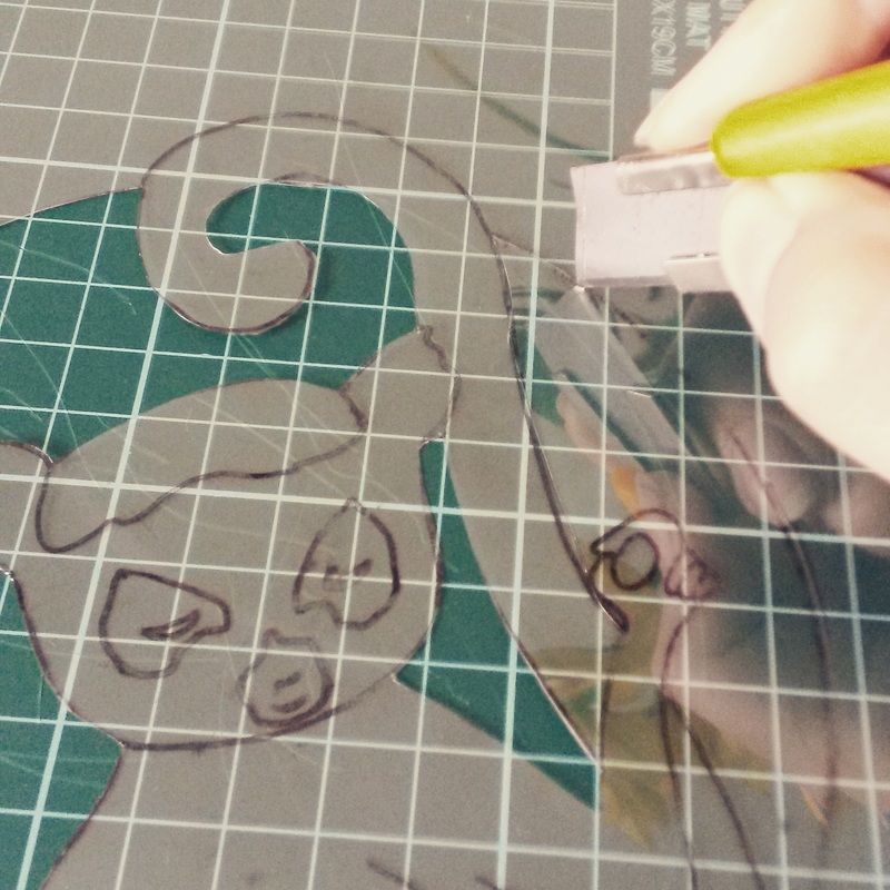 I had intended to try oil transfer printing over the top of my stencils, but the bright red and yellow suns seemed to call for something stronger- plus I wanted to hide the paint blobs if possible! I decided my Pentel pocket brush pen would probably be my friend. As hoped, I got lovely expressive lines and was able to hide the occasional blobby bit of paint. then I reached for my Pitt pens to add a relatively even grey. 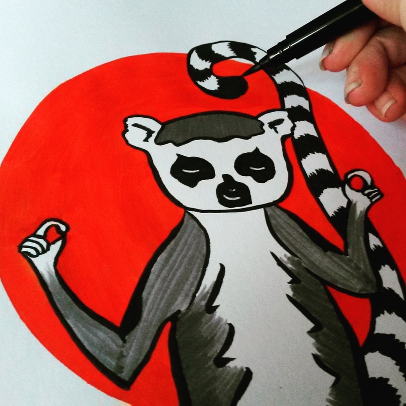 Meanwhile the idea of scarves as tails was rattling round my head. This time I went straight for the pen to create a little hat and scarf-wearing lemur. Somehow, giving him an ice cream felt right. He was also the perfect creation to try out my new wacom tablet- Photoshop is a bit of a learning curve but an extra layer and some playing with brushes gave him a little extra polish. 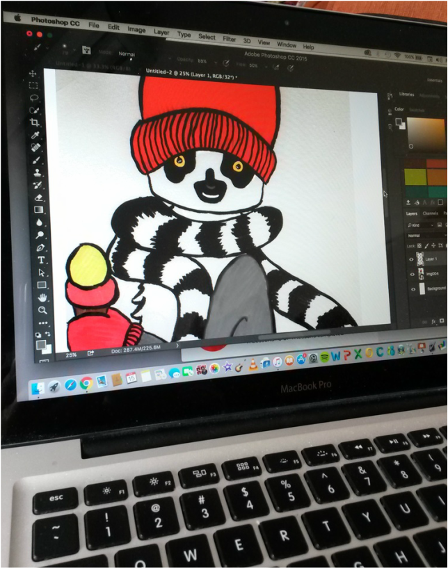 Penny Dullaghan has been a wealth of ideas in Sketchbook Skool this week. Another one of her printing techniques was oil transfer printing. It's the grown up version of the 'trace and transfer' technique you learn when you're a kid (trace something on tracing paper, shade on the backside of the paper with soft pencil then draw over your original lines to replicate the image. Another way to look at it is as grownup carbon paper. 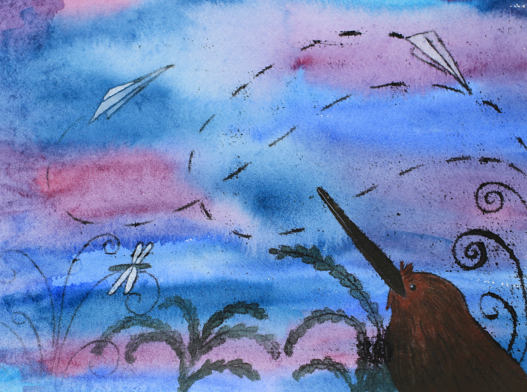 Memories of flight I started off by blobbing some black oil paint onto thin white cartridge paper (even regular printer paper would be fine, I just didn't have any). Then I used a thick brush to wash thinners over the paint, creating a black piece of paper. This was the stinky bit. I left it to dry- Penny recommends using a hairdryer to achieve this but I don't own one of those either, so I left it to fate and set off to draw my image. I'd made a wash of purples and blues on watercolour paper and so decided to use that as my first attempt. Our theme was flight- I got thinking about all the flightless birds that have evolved here in New Zealand, and wondered if they get any wistful pangs when they see other creatures flitting by on the breeze. And what about things that aren't even meant to fly? I drafted my image on another piece of paper, taped the transfer paper over the dry watercolour wash and taped my sketch over the top. Then I took a very sharp, hard pencil and traced. It was straightforward, and by only taping one side I was able to take peeks at what was going on. The oils transferred easily, with an expressive line. Even the pressure of my hand resting on the paper was enough to get smudges. When I was happy with the detail that had transferred over, I removed the tape and used some acrylic inks and acrylic paint to add some more colour and lift the design a bit. You can see how the dryer areas of the transfer paper gave a thinner, finer line whilst the wet areas gave some thick, expressive detail which worked well on the watercolour paper. Some of the oils also showed the grain of the watercolour paper, which I quite like here(I assume this is where my hand rested on it). Next up I tried (yes, you guessed it) a dinosaur. 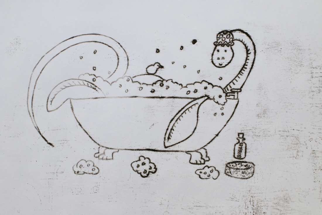 A little bit of drying time and a wash of watercolour perked him up nicely. I like the line quality and the speckles on the image, though I wouldn't mind cleaning up the grubby background (I may have to brave Photoshop!) 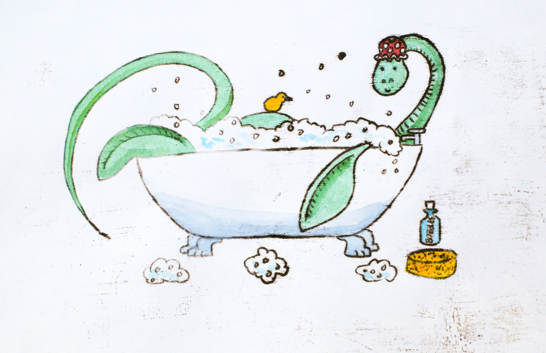 Plesiosaur in the bath, oil transfer with watercolour The transfer paper was good to go for a third attempt. I didn't preplan this one- and soon discovered that the lightest pencil touch would get printed! The lack of planning shows, and I think the oil transfer overwhelms all the tiny details. Note to self- plan a bit more next time! It would be interesting to try oil transfer printing over a bright, bold image or stencil. It's also got me thinking about going back in time by a couple of decades and attempting monoprints again.
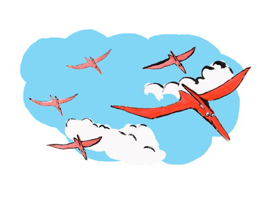
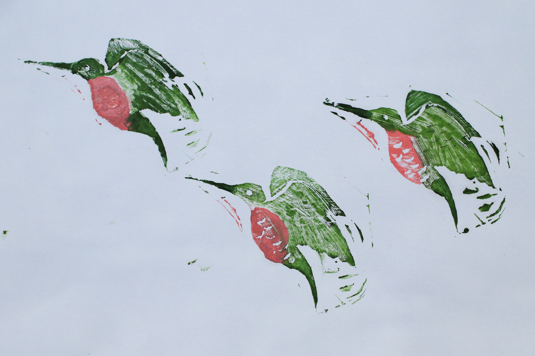
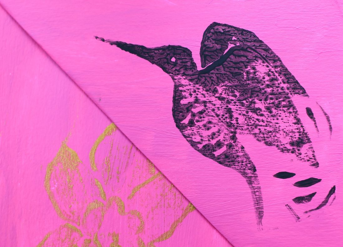
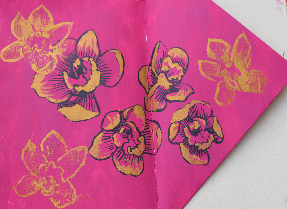
I've been playing with eco printing on and off for a year now, but have steered clear of the regular inky kind. I did enjoy monoprinting way back when I was at sixth form, and have been tempted to give it a try, but didn't get much farther than reading a book on my kindle and feeling that it was going to be messier and more complicated than I remembered. Then along came Penny Dullaghan. This week at Sketchbook Skool, for her week in the Expressing course, Penny showed us four different printing techniques, from using ink on tracing paper (effective but painstaking), to lino cuts and oil transfer (which creates a similar effect to that favoured by Paul Klee). Initially, I only owned the materials to try the ink transfer. I drew some pterodactyls using inktense pencils (yup, still in the dinosaur zone), traced them and set about printing them with black ink. This involves drawing a tiny bit at a time on the back of the tracing paper and quickly pressing it down onto the coloured image. This results in a gloriously grainy line, and the occasional smudge- and takes ages. I do rather love the results though. 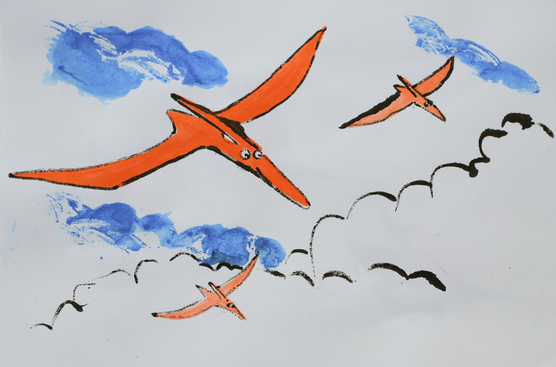 Pterodactyl Squadron I'd always thought that lino printing would be hard, and carry an unreasonable risk of losing a limb (or at least cutting my finger). Plus my attempts at using a craft knife usually lead to such dubious results that I assumed lino carving would be a straight road to failure. But Penny made it look so easy that I gave into the art supply shopping impulse and sprinted over to Gordon Harris, returning as the proud owner of a lino cutter, some lino and a set of oil paints. I decided to try a hummingbird for my first lino cut. This was probably an unnecessarily complicated embarkation point, but also felt more sensible that the dragon I first sketched out. I had some very soft EssDee lino- which lived up to its promise of being easy to carve. SO easy that even I could do it. No people or furniture were injured in the creation process and you could even tell what it was. Next step was to use it- printing with oil paint was a messy process, but I liked the effect. I then carved an orchid stamp, and tried printing in gold acrylic on an acrylic background. This was less successful and I ended up touching the stamps up with my brush (the black flowers are hand drawn). I think the roughness of the background layer was to blame, as later I got some lovely prints on white cartridge paper. My final attempts were made using Pitt brush pens to colour the stamps. The prints lost quite a bit of the fine detail, so were less effective than the oils, but much easier to handle! A few dots of gold acrylic and dash of fineliner pepped it up nicely. 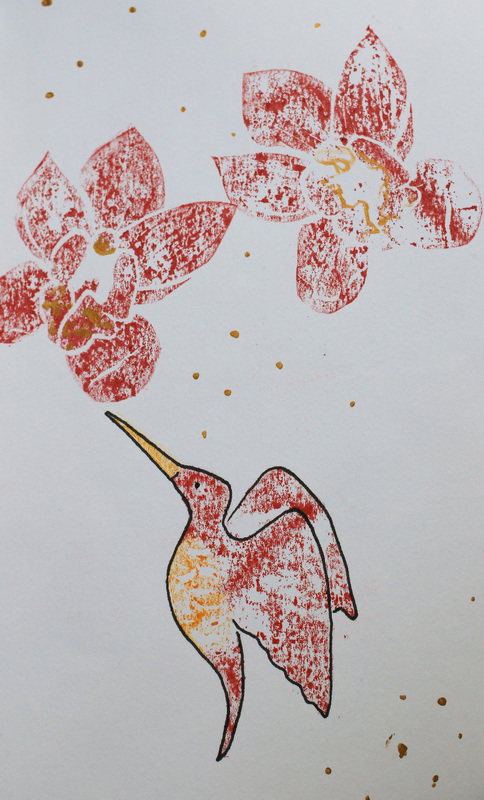 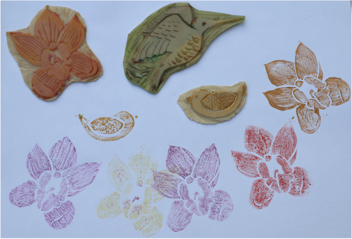 One final little bird and an orchid garden and I was done for the night. Definitely something I'll be trying more of!
I am still having fun with my politicians. But this week at Sketchbook Skool, we are studying infographics along with Sabine Wiseman. My first attempt were some dogs at the beach. And then inspiration (or insanity!) hit... 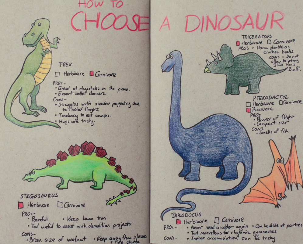 No, it's not veiled political commentary. I just like dinosaurs. Though it did turn out that the tyrannosaurus is a bit more flamboyant than he first appeared.  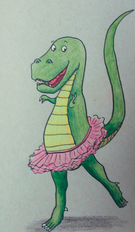 All done in Kuratake ink pen (my new favourite even if it isn't waterproof) with polychromos, on Strathmore grey tone sketchbook (which I am in love with). In my happy place... ('How to choose a dinosaur' is downloadable below. You are welcome to print it for personal use only).
Some of the UK and USA's more interesting political figures. Done with watercolour, ink and a sense of distaste. 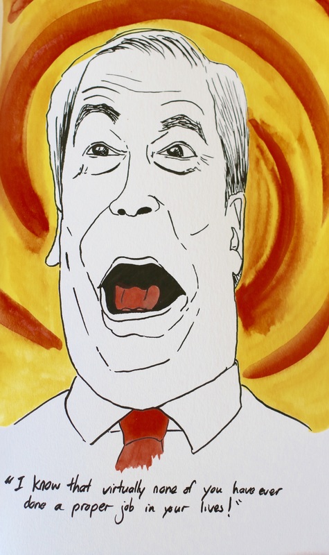 Pot. Meet kettle. 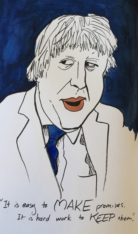 So we noticed. 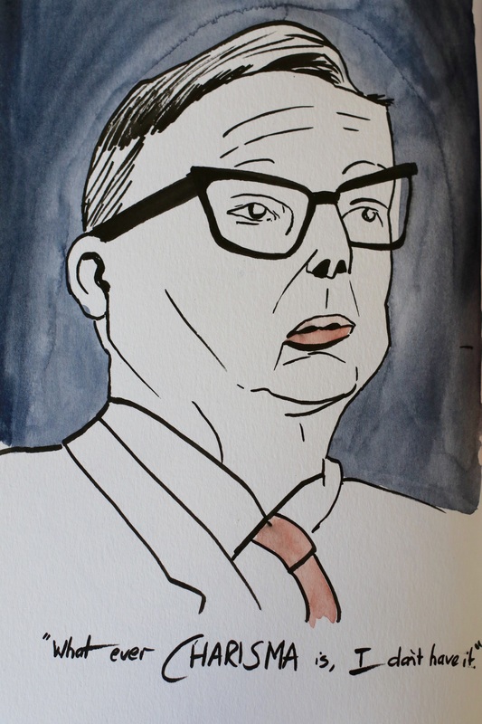 ... but I'll be a great prime minister. I promise. 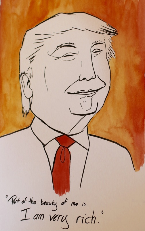 Everyone has a redeeming feature. 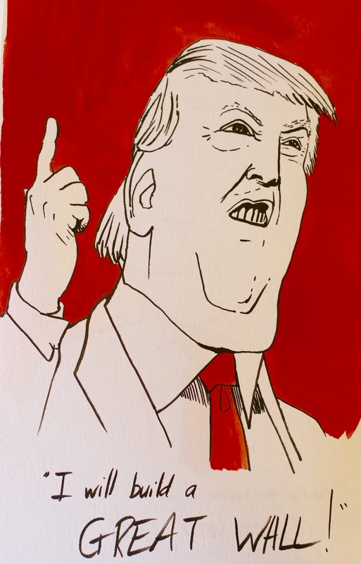 It's a fantastic idea. Really. 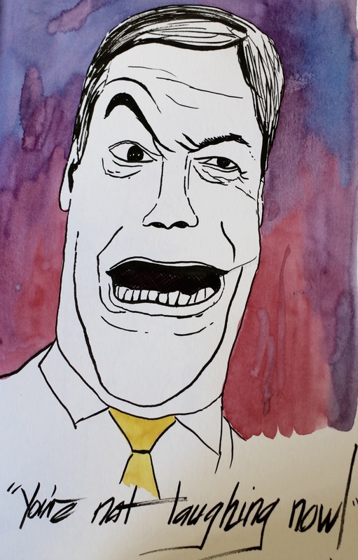 No, we're not. |
Andrea England
An Artist Afloat- Painting the world one anchorage at a time. Archives
August 2020
Categories
All
|
||

 RSS Feed
