
|
Prism and I are safely moored in Victoria’s Inner Harbour. With plenty of time on my hands, I’ve been busy painting and have been going through last year’s sketchbooks and photos to find inspiration for a new series of watercolours. At a time when sailing out to the Gulf Islands or remote West Coast communities feels irresponsible, my sketches let me travel and revisit some favourite haunts. I’ve also been experimenting with making videos of my process as I paint, including narration! I’m excited to share the first of them below. Please leave me a comment if there’s a particular concept or technique you’d like me to focus on in future videos, as I’d like to create some tutorials too.
1 Comment
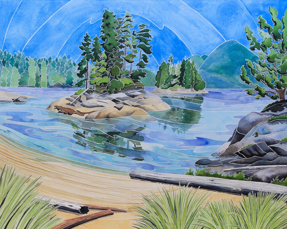
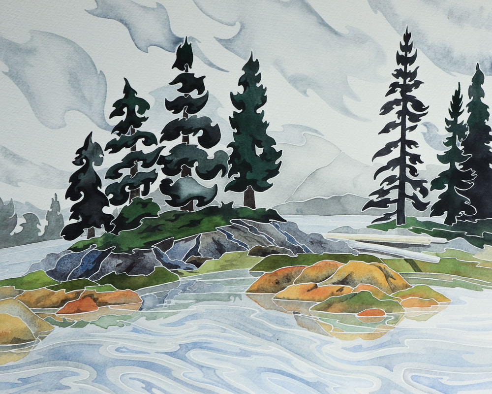 The Broughton Archipelago is a very special place. Tucked between the North East tip of Vancouver Island and the Coastal Range of mainland British Columbia, the area is a haven for wildlife from sea otters to orca and humpback whales. Wolves and black bears are abundant, whilst grizzlies maintain strongholds amongst the islands and mainland. It's an artist's paradise, and my watercolours and sketchbook were kept busy when we sailed around the region in the summer. 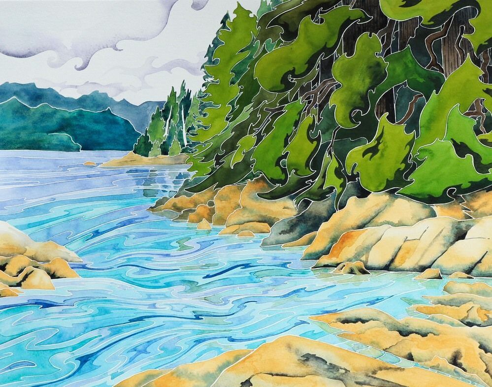 One of the most famous books about the area is called 'Following the Curve of Time'. Written by M. Wylie Blanchett, it tells of adventurous summers cruising with her five children on their 25' boat, 'Caprice'. Six people on a 25' vessel makes our life on 36' Island Prism seem capacious, especially during the summers when they added the family dog to the mix! As we cruised during the summer of 2019, Jim and I dipped into Blanchett's book. Her gentle prose is captivating, and we often found ourselves in the same bays. When we called into Monday Harbour, we even followed her anchoring advice, using her description to track down the lovely, sheltered Tuesday Cove. Named by Blanchett, you won't find it marked on any maps, but we spent days snug and safe, visiting the white shell beach, exploring the forest and watching herons and harbour porpoise in the bay.  I began a series of large paintings in the summer, based on the sketches I was making as we cruised. The third in the series was of Tuesday Cove, and I titled it 'Following the Curve of Time' in honour of Blanchett, whose experiences ninety years ago still rang true with us.  Moored back in Victoria Inner Harbour for the winter, I knew I wanted to do something special with my trio of paintings. At 20" x 16", they were too large for the winter shows I was submitting to. Rereading the Curve of Time once again, lines from the book brought images from my sketchbook to mind. Inspiration hit- I wanted to create a series of paintings inspired by our cruising and Blanchett's writing. I felt a connection with the book- at the risk of sounding overly arty, it was as if the author and I were reaching across that curve of time and sharing experiences in the past and present. From experiences with cantankerous marine diesel engines to descriptions of shimmering schools of herring and wheeling flocks of sanderlings- a wading bird still common in the Broughton- our summers of exploration had a lot in common despite the ninety years that separated us. Returning to my sketchbooks, I played with my paint to settle on a range of colours that could capture the warmth of a summer day or the mystery of rolling banks of fog. Pthalo Blue gave me the bright tones I needed and Indanthrone Blue was perfect for deep waters. Jadeite genuine, a watercolour paint made from the gemstone, created rich greens for trees. When mixed with Amethyst genuine, it made beautiful greys, perfect for mists and clouds. The tiny pieces of Amethyst adds a subtle lustre to some of the paintings, whilst others gain a gentle sparkle from blue-grey Kyanite genuine. Combined with natural siennas and umbers, I loved the idea of using earth and water to create my islands and seas. 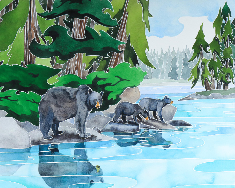 After a summer of inspiration gathering and months of painting, I am delighted to launch the Curve of Time collection. The collection is on display as my solo show in the Cedar Hill Arts Centre Cafe Gallery in Victoria, BC, where it will hang until 17th February 2020. I shall be at the centre demonstrating from 9.30 - 3.00 on Wednesday 3rd, Saturday 8th, Wednesday 12th, and Thursday 13th February. I'll also be participating in the Family Day programme on Monday 17th.
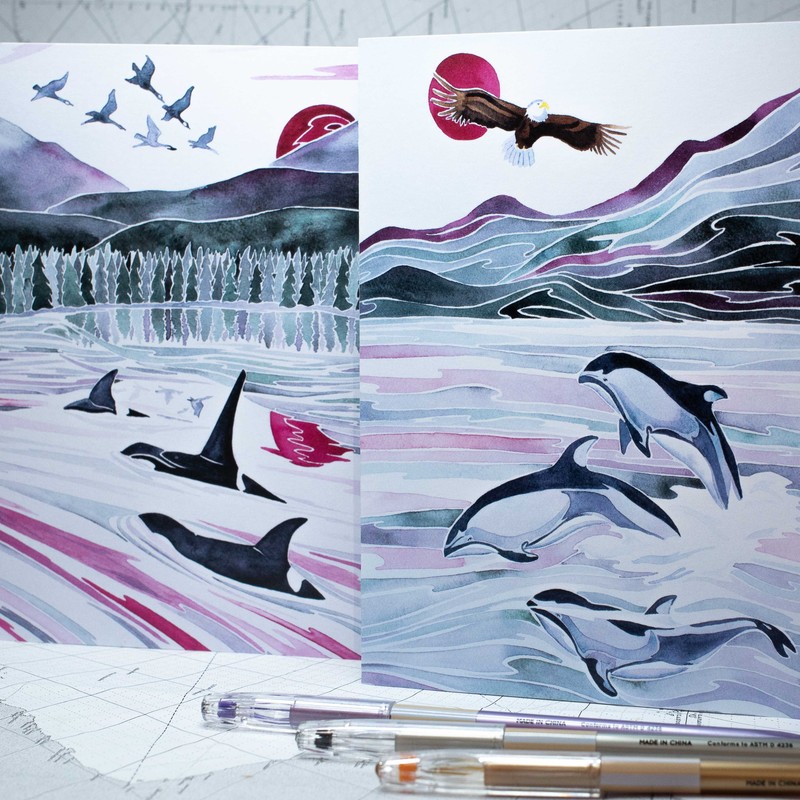
The Curve of Time Collection is also available unframed online- please click here to view available paintings from the series. 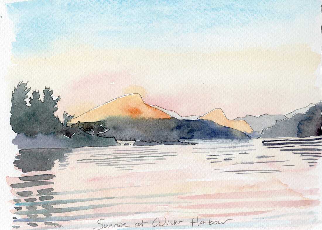 Saturna was a wonderfully sleepy, timeless island. It ticks along at its own pace, inhabited by retirees, holiday makers and the odd artist. This made it a wonderful place for cycling, as the roads were all but empty. We saw more deer than cars. Jim and his mountain bike conquered the big hills without me, but my little fold up bike and I were up for the ride to East Point. Jim described the route as 'flat', which was a bit misleading- 'gently rolling' would be more accurate. I got a bit more exercise than I'd expected, but bike and I made it intact to the little museum looking out over the Juan de Fuca Straight.  There used to be a lighthouse here once, but when it was decommissioned it was decided that the best course of action was to blow it up. The lighthouse and lighthouse keeper's cottage were soon demolished, despite the protests of locals. However, the instructions for explosion did not include a termination sentence for the little building that housed the fog horn. Some forgetful soul had missed it off the hit list, so the demolition crew left it standing. This sole survivor is now a tiny museum, packed full of interesting information about the history and nature of Saturna and the Gulf Islands. I read about the Pig War between the British and the US, sparked off by the shooting of an unruly British hog who had invaded an American's garden. The pig was the only casualty in the war, but the greater debate was who the islands belonged to- should the US or British be ruling on the pig's demise? After a period of military posturing by both sides, an arbitrator was brought in. It was decided that the Juan de Fuca Straight was the deepest of the channels that ran through the islands, and was therefore most navigable and the most suitable boundary. The islands south of the Straight would belong to the US and became the Juan de Fuca Islands, those to the north would be the Canadian Gulf Islands. This border confused my phone, which spent most of our visit determined that we were in the USA. 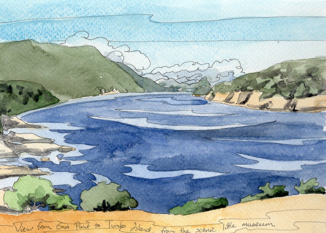 Looking round the museum was interesting. Looking at the museum was beautiful. Bright white against the golden grass and blue sky, it stood above the swirling waters of the aptly named 'Boiling Reef. To the south were the blues and purples of the Juan de Fucas. To the north we had a beautiful view of Tumbo Island. Beyond it, the Gulf Islands studded the sea off to the horizon. 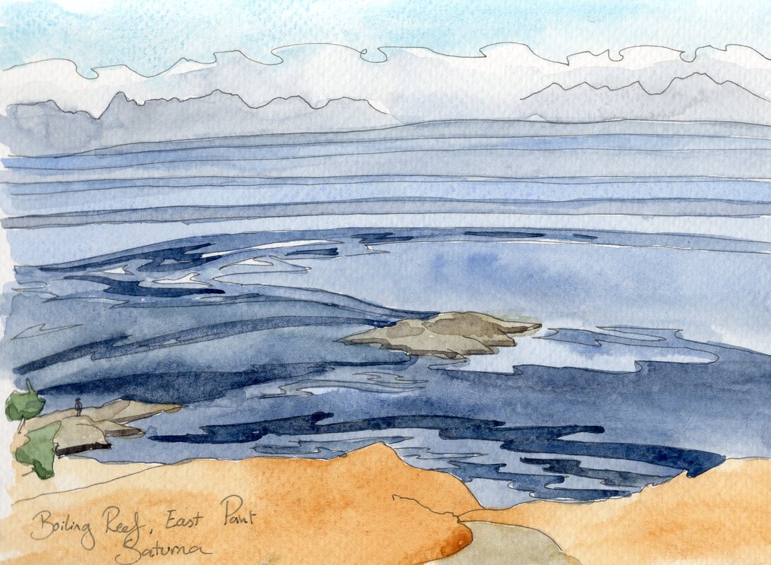 We had anchored Prism in Winter Harbour. When we arrived it was a busy mooring field but after Labour Day the call of work and school summoned the other boats home. Island Prism sat in the perfect spot to enjoy the wonderful sunrises visible through the harbour entrance, and with the shortening days I was often up early enough to see them. Evenings were spent ashore, enjoying the golden light and catching up with sailing friends. 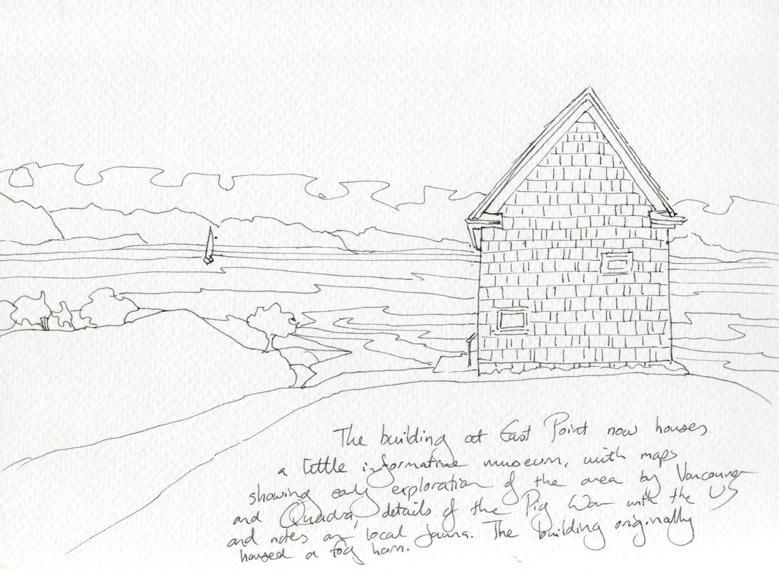 Inevitably, laundry time was creeping round. We sailed up to Ganges, on Salt Spring Island, and were most surprised to find out that there was not a laundrette on the island. The dry cleaners would wash clothes at the princely sum of $21 a load and one of the marinas had facilities we could use- but we had to take a berth with them, and their moorage rates were budget-blowing. So I had to resort to good old-fashioned hand washing. Salt Spring is known for its arts community, and there were plenty of galleries for me to explore. Gallery 8 was full of incredible work by masters in their media- Carol Evans' watercolours were particularly mind-blowing. I succumbed to the lure of a teal blue dress from Priestess and Deer and oggled cards at Inspiration. We thoroughly enjoyed the busy town but after a couple of days we were ready to move on from the bustling anchorage and steady stream of float planes. 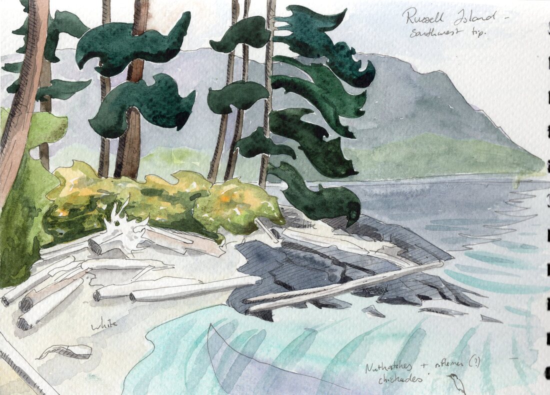 Russell Island was a gem. It's not big, but it's peaceful and very pretty. The little anchorage would get busy in the late afternoon with boats popping out from Sidney for a beer with a view, but they'd up anchor around seven to get home before dark. The little homestead on the island used to belong to a Hawaiian settler. The apple trees which she and her husband planted were heavy with fruit, and Jim picked a few to enjoy on the porch. The fruit of one tree was rather tart, but they'd go perfectly with the ripening blackberries. If only Island Prism had a decent oven for pie baking!  The trees were filled with birds, filling the air with music. I recognised chestnut-backed chickadees and the squeaky red-breasted nuthatches, but the little plain brown birds that darted between the bushes and hid amongst the leaves defied identification. The sandy beaches invited me to paddle as I searched for signs of the terraces once built here for clams. I couldn't see the submerged rock walls, and our dinghy explorations were equally fruitless, but it was fun to hunt. 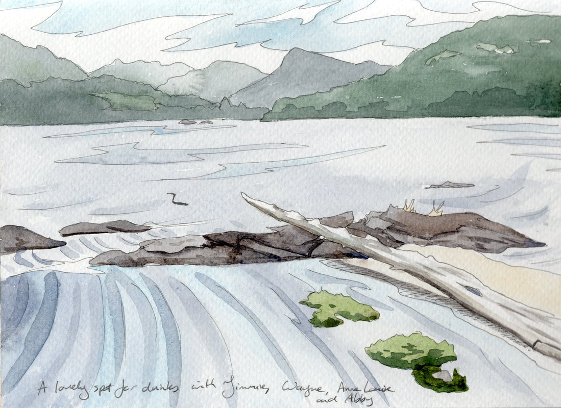 Shifting to Fulford Harbour, Jim dropped me off at the ferry to lug three framed paintings to Sidney for jurying for a fine art show. Thankfully Bill and his car came to our aid, and we left them in a hall with a thousand other paintings. Sadly I was unsuccessful and my ego felt a little bruised. Ultimately all I could do was remember that it wasn't personal, there was plenty of competition and as I have no way of knowing why my work didn't get in, there's no point dwelling on it. My best course of action was to pick up the brush and get back to painting. After all, creating is the main thing, practice makes improvements- and there's always next year! 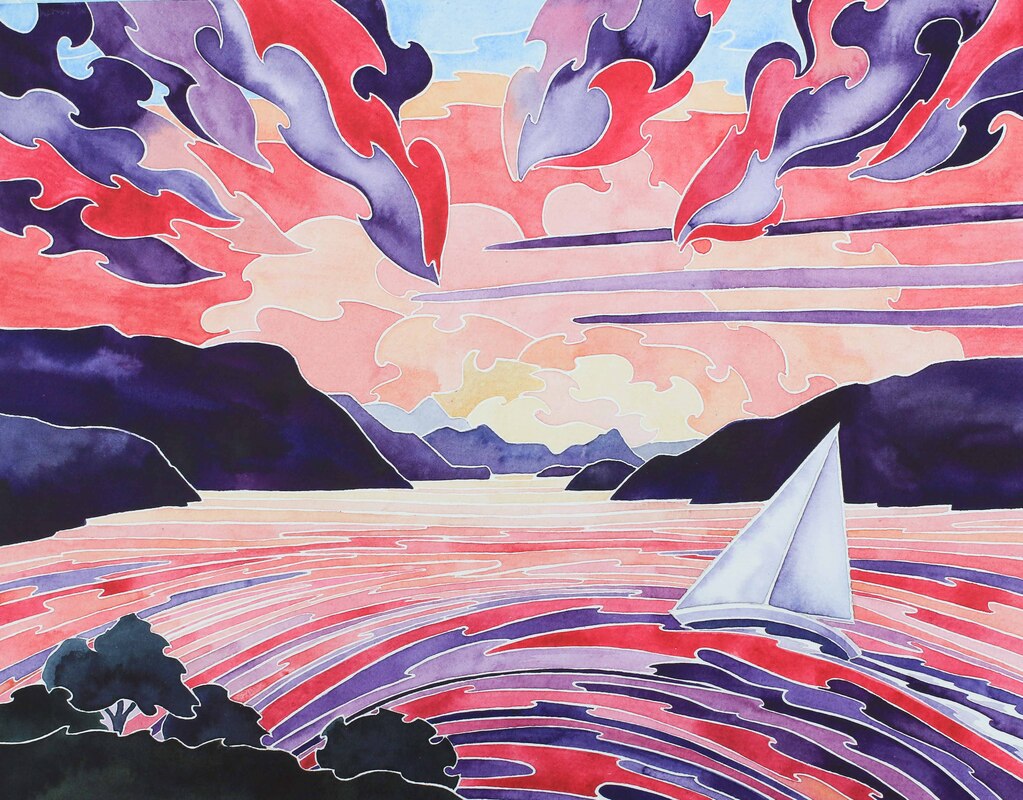 Saturna Sunset 11" x 14" watercolour 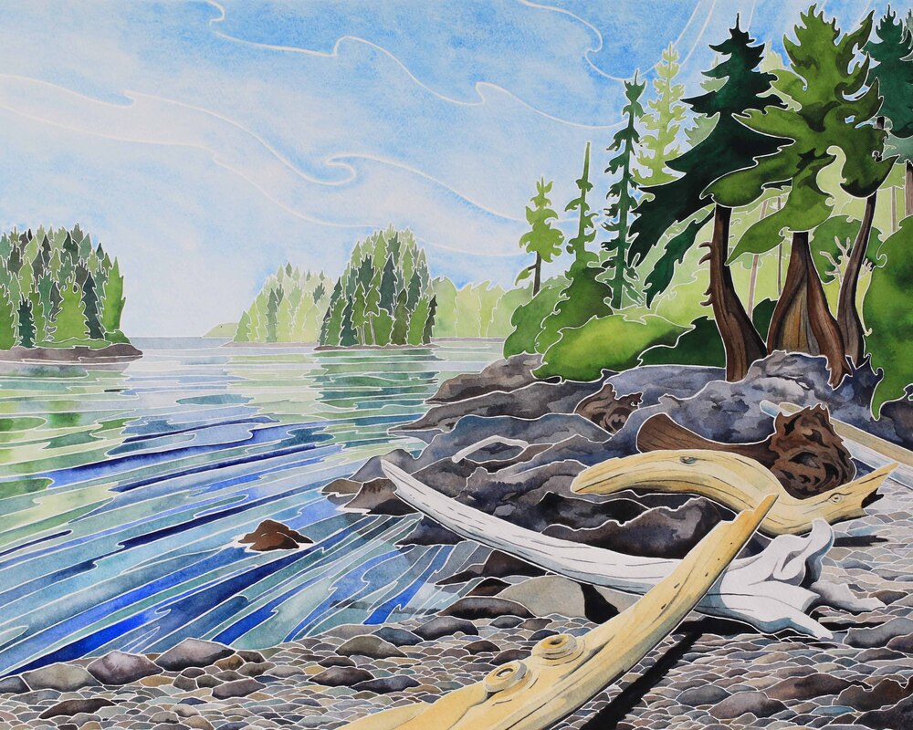 Harlequin Cove, 16" x 20" watercolour Inspiration flows when life slows down. I feel at my most creative when I have time to sit and watch the world, to paddle along in the dinghy, to poke around tide pools, search amongst the driftwood or hike through a forest. I stop to sketch or pause to take a photo that will refresh my memory later. As we cruised the Broughton Archipelago, the pace of life was perfect for creating. We had no time deadlines and the highly sporadic internet removed a distraction. Peaceful, secluded anchorages added to this sense of tranquility. Foggy mornings gave me time to paint on Prism each day, and when the fog lifted I'd pack up my art supplies and go exploring with Jimmie. 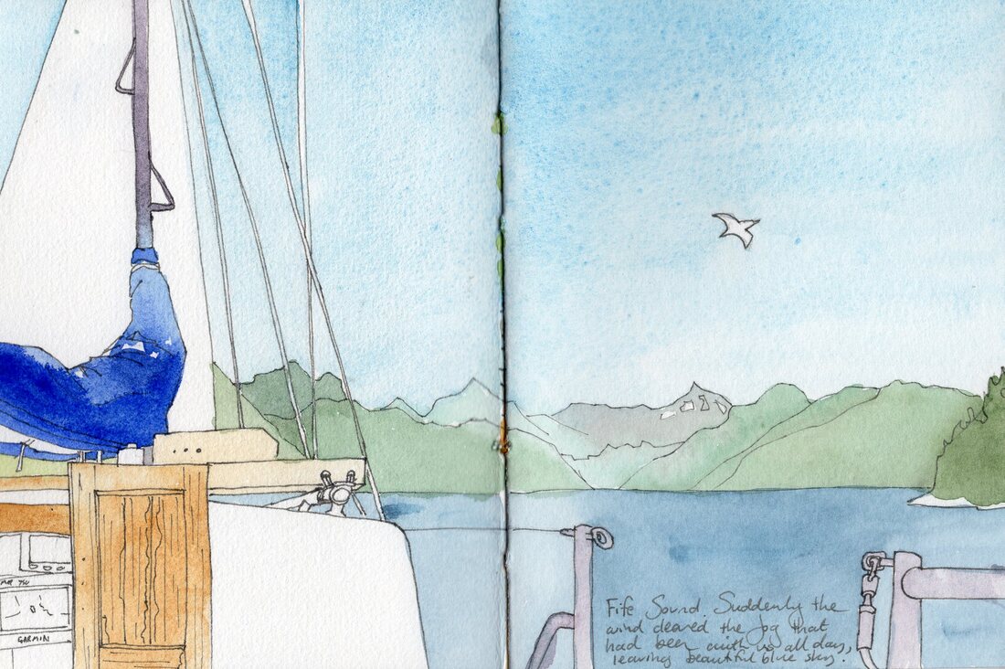 The fog had almost prevented us visiting Tuesday Cove, between Mars and Tracey Islands. In her book 'The Curve of Time', M. Wylie Blanchett gave a beautiful description of this idyllic little anchorage which she discovered when inclement weather forced her to move from nearby Monday Harbour. Despite the fact it isn't marked on any map, Blanchett describes the cove so well Jim was sure he could find it. But thick shrouds of fog meant we didn't dare enter the labyrinthine channels that would lead us there. Even with GPS, the narrow entrances, shallow patches, fast-flowing currents and numerous kelp beds would be hazardous if we didn't have a decent view. Ah well, the plans of sailors are written on the wind and tide. This wouldn't be the first time we've had to edit or rewrite because of meteorology. We were busy redrafting when the wind finally read our initial memo, sending a stiff breeze which gave us a beautiful downwind sail through Fife Sound as the fog cleared before us. The entrance we wanted was revealed and I helmed us through the narrow pass. Our route was clear, with wonderful views of steep-sided islands and kelp-fringed shallows. 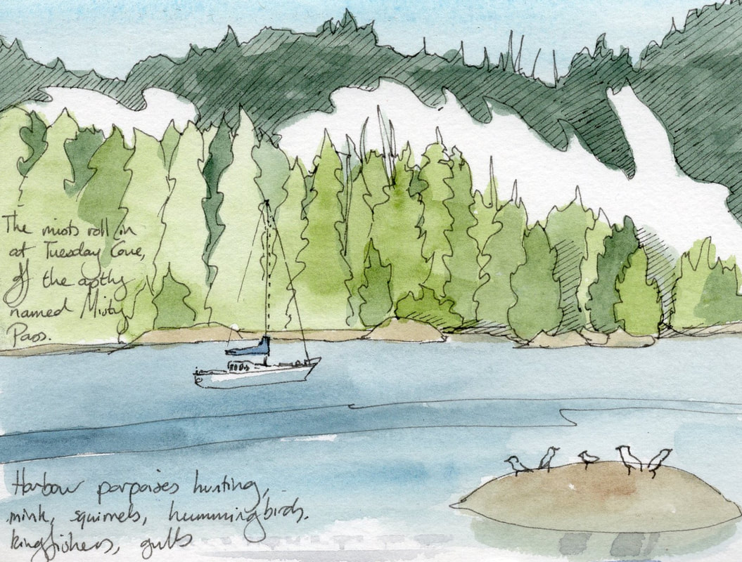 Entering Monday Harbour, we found the little nook between islets which formed Tuesday Cove. The thickly forested shore had a white shell beach, revealed at low tide, and the islets and the narrow drying inlet between Tracey and Mars Islands gave us plenty to explore. There was always something to watch. Hunting harbour porpoises chased their prey into the cove, herons landed in the fir trees (always a slightly ungainly sight) and cantankerous kingfishers defended their favoured twigs with noisy aerobatic antics. 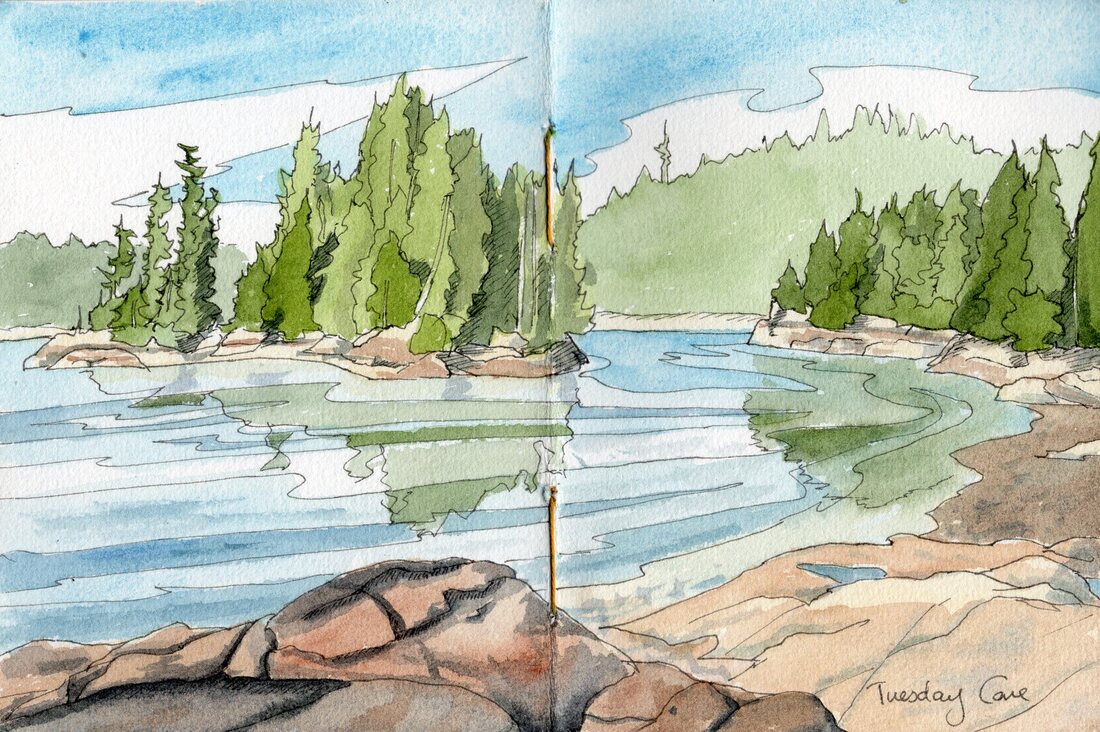 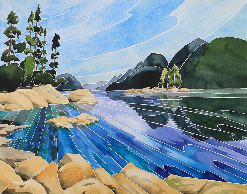 Monday Harbour, 11" x 14" watercolour After a few days there it was hard to persuade ourselves to up anchor, but we were glad we did. Our next day of sailing took us through the Burdwood Group. These little islands are currently uninhabited and unnamed. This wasn't always the case; the numerous white shell beaches and village sites indicate that a thriving First Nations community once lived amongst these islands. Perhaps the old names live on, and the map makers just never bothered to ask the right people. 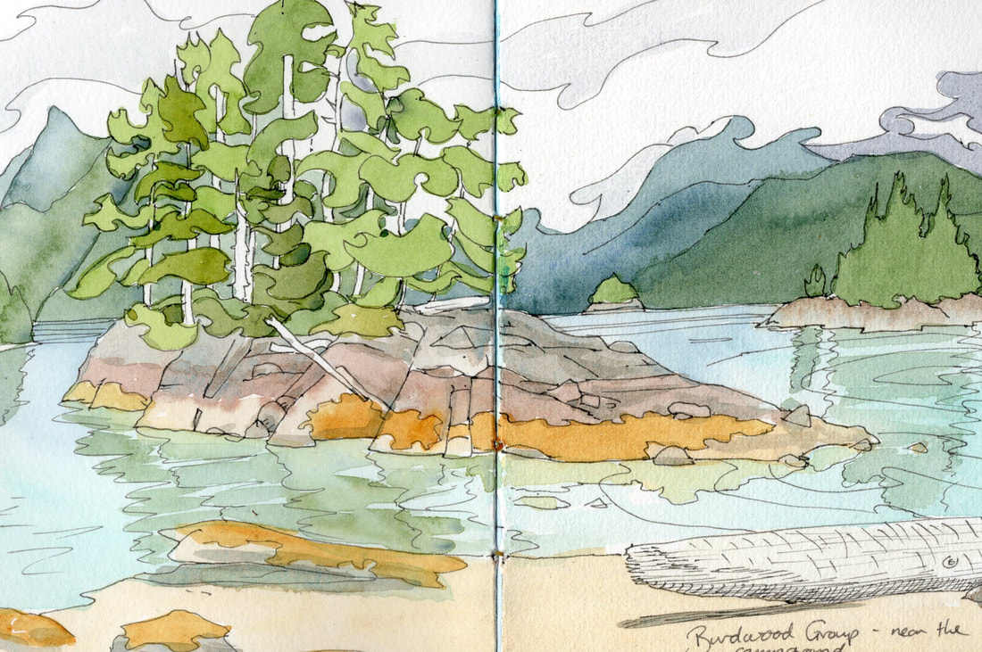 There is a small camp ground in the Burdwood Group, but no secure overnight anchorage for a sailboat. With a little poking around we were able to find a couple of reasonable day anchorages to drop the hook whilst we explored using the dinghy. The island with the campsite was a particular gem. In the sunlight, its long white shell beach looked almost tropical, and as the temperature finally rose above twenty degrees I began to seriously contemplate swimming. Trails through the forest invited exploration. No traces of long houses remained, but cedar trees with patches of stripped bark showed that visitors had brought some of the old traditions back with them. Red cedar is known as 'the tree of life' and its bark has many uses, from weaving baskets and ceremonial clothing to creating fishing line. It also smells wonderful. I didn't brave a swim as my togs were back on the boat and the afternoon was pushing on. Even on warm days the temperature tends to drop at about 6pm. Being cold and wet as we moved to a more secure anchorage wasn't going to be fun. So I sat on the shell beach, painting the summer blues and hoped that we'd make it back another day. We did return, and the Burdwoods were still beautiful even though it was cold and cloudy. On our second visit we returned to our idyllic white shell beach and also explored some of the surrounding islands. Most of them were pretty impenetrable and we couldn't leave the foreshore, but it was always a pleasure to just enjoy, breathe and be. Sometimes life doesn't need to be complicated! 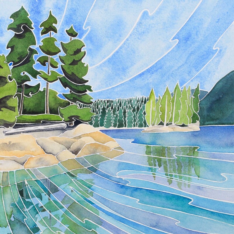 Summer Reflections, 8" x 8" watercolour 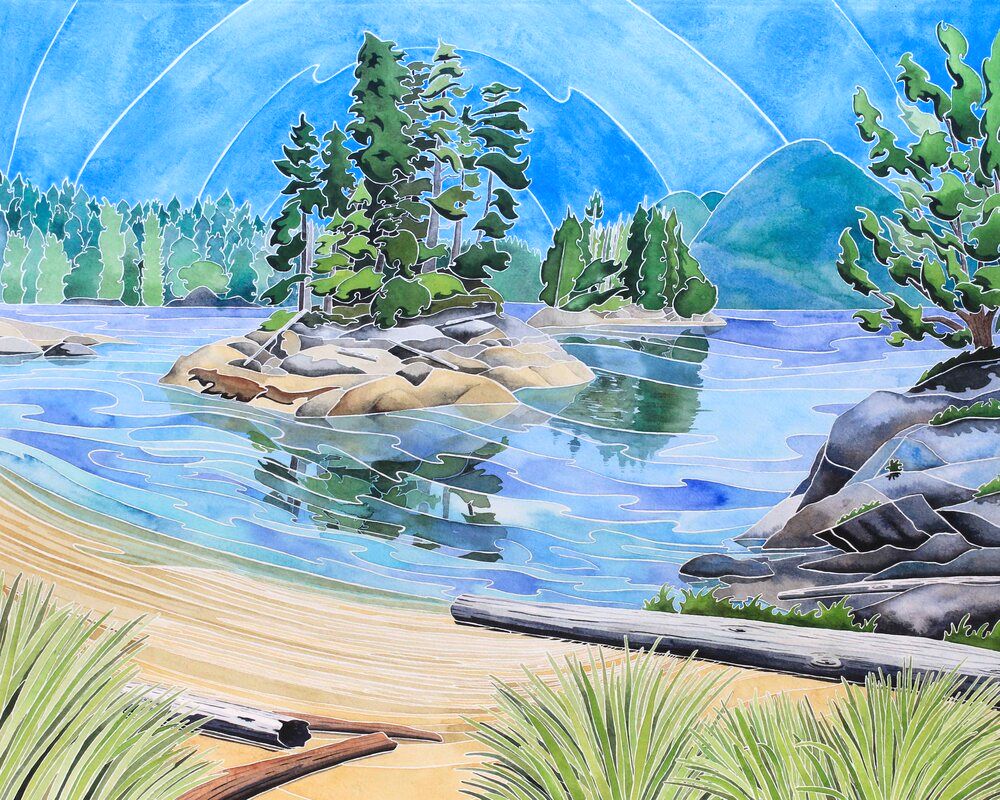 Paradise Found- The Burdwood Group. 16" x 20" watercolour Making our way up Tribune Channel, we passed Lacey Falls which pours down a steep face of patterned granite. Branches and tree trunks in the water indicated that there were logging operations in the area. The logs found favour with seagulls, who jauntily bobbed along on their mobile perches. We ducked into Watson Cove, which the cruising guide said was surrounded by waterfalls and was the access point to see a thousand year old cedar tree. This sounded wonderful and the cove was lovely but the anchorage was fairly deep, there wasn't much swinging room and little shelter from the forecast wind. The next option, Kwatsi Bay, was also deep but very well protected. We anchored beneath a low hill. The towering mountains to the east of the bay were breathtaking, but the scars on their steep sides spoke of landslides. We felt safer keeping our distance, and dropped the anchor in thirty metres with plenty of swinging room. 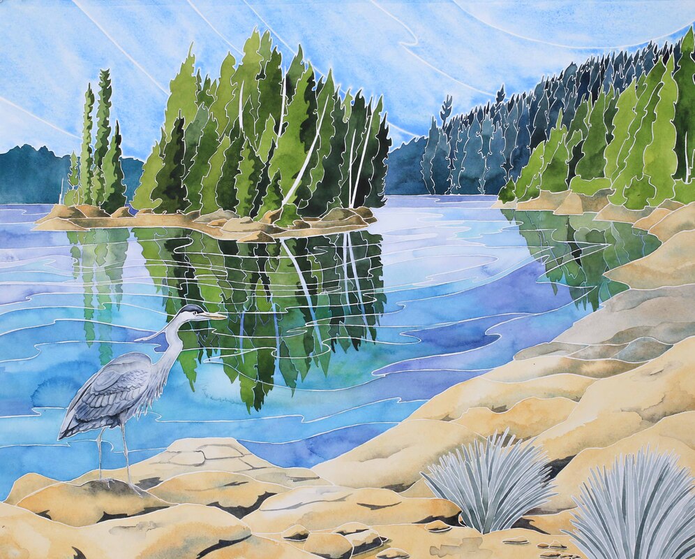 Following the Curve of Time, 16" x 20" watercolour I'd embarked on a series of three 16” x 20” watercolours. The first was of Harlequin Cove (which you can read about in a previous blog post), and for the second I'd decided to paint my favourite group in the Burdwoods. A painting of that size takes me a few days including planning and drafting, and I managed to make a good start during the wet and foggy morning. When the weather cleared, a group of Pacific white-sided dolphins entered the cove. They proved to be very distracting as they hunted fish around the anchored boats. The pod would split into groups, with one group driving the fish towards the shore and their waiting friends. In the shallow water the fish were easier to herd and pick off. After the feast, the dolphins stayed in the shallows, swimming slowly as if they were resting and digesting. Then came play time, with spectacular jumps and twists. When the calves tried to join in, the adults would show them how it was done. I'm sure the little one improved as we watched! We hopped in the dinghy and rowed a little closer to see if I could get some better photos. The dolphins decided to make us part of the fun, swimming towards us, diving under the dinghy and surfacing in unison. The acrobatics resumed, including some spectacular synchronised jumps as the dolphins showed off for their uncoordinated audience. We dragged ourselves back to the boat so I could wash my hair in the late afternoon sun. At sunset the dolphins headed off to do dolphin things, returning the following day. I managed to be a little more focussed on my artwork but still took regular dolphin breaks. It would have been rude not to!  The Burdwood Group, 5" x 5" watercolour 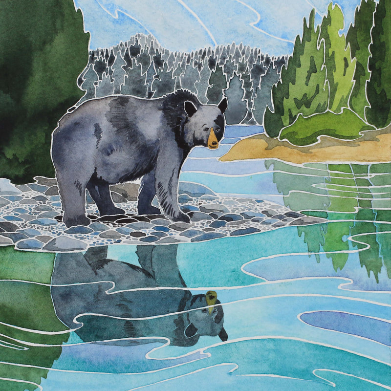 Queen of Shoal Harbour 6" x 6" watercolour We saw our dolphin friends briefly when we moved to Bond Sound. I like to think that they were checking up on us. We anchored just inside the entrance to the Sound, tucked inside where we hoped to be out of the swell. The waves had a habit of curving round to find us and the current sometimes pulled us broadside to the breeze, so it was a rather rolly spot and not one I'd choose in bad weather! Jim wanted to explore the Ahta River, which was reported to be pristine. We waited until just before high tide when we could get the dinghy over the bar at the river mouth, then went on an adventure. At this time of year the river was salmon-free, but in Autumn I can imagine the clear water being full of fish- and the banks being lined with grizzlies. The late afternoon summer sun filtered through the trees and sparkled on the water. Back out in the bay seals swam, waiting for the tide to drop so they could haul out onto the fallen tree trunks. Our need for supplies and laundry was calling us back to Alert Bay. I could have spent weeks more poking around, but instead we called in at the Burdwood Group one final time before spending a night at Shoal Harbour on Gilford Island. The harbour is well protected and a wonderful place to watch wildlife. A well-fed mother black bear and her two glossy cubs were padding along the foreshore. Mother was turning over rocks with a huge thud, slurping and gobbling up whatever molluscs and crustaceans she uncovered. The little ones carried out their own explorations, played and squabbled. Eating didn't seem to be too high on their agenda. We hopped in the dinghy and watched them until they reached a berry patch. Dessert! Much to the delight of the cubs, there were plenty of fruits and they spent a while munching. After they headed into the bush, we heard a wailing sound from the other side of the bay. Another cub was alone on the beach, crying for his mum. She took some time to find him, but eventually the sobbing stopped and we saw them walking together on the foreshore, much to the consternation of the dog in a nearby float home. All in all, it was a pretty happy ending.    'Trial Island- 16" x 20" watercolour commission It was wonderful to be back on the water again. Farewell beverages had been supped with cruising friends, Jim's family had joined us for happy hour at the Delta hotel, my exhibition had been packed away and we were ready to cast off the mooring lines. Our first day of sailing had blue skies and the current was in our favour. Brightly coloured whale watching boats zoomed past us as we left Victoria's inner harbour and made a port turn into the Juan de Fuca Straight. We didn't see any whales, though the watchers remained a featured for most of our journey. The tourist boats are supposed to keep away from the stressed and struggling resident pods, instead concentrating their tours on the plentiful population transient orcas which regularly pass through. Lucky boats have also started seeing humpback whales, returning from their winter holidays to Hawaii. Hopefully they'll be up in the Broughton Archipelago by the time we get there at the end of the month! Wind and tide carried us past Trial Island at over 8 knots; it felt like Prism was as excited to be sailing as we were. Other sailboats were making the most of the Saturday sunshine as we turned North through the Discovery Islands. As the wind died off, we gave the motor some exercise on the last part of our journey to Tsehum Harbour. We tied to a mooring buoy and settled in to the laid-back ambience. Eagles flew above us, calling in their tittering voices, and seals lounged on the rocks near the boat. We did our best to enjoy the golden evenings out in the cockpit, until the chill of the Canadian evenings drove us inside. 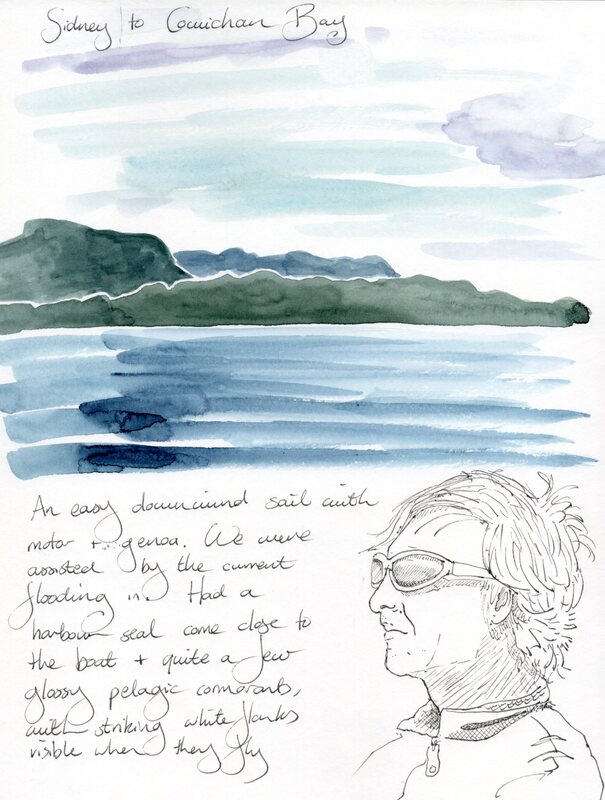 Tsehum Harbour was well-served by buses, so Jim popped back to Victoria to get some last things done whilst I spent a day volunteering at Coast Collective. Then the toilet needed some work, so whilst I got things done on my computer, Jim made the necessary repairs. You can imagine the four letter words he chose to describe the job... Our journey north then took us to Cowichan Bay. We moored at the Fisherman's Wharf then set off to explore. The little village was easy to fall in love with. It's worth a visit for the bakery alone, which bakes fresh bread and pastries from organic ancient grains, locally grown where possible. Their cinnamon rolls were amazing, and became part of our daily routine along with a cup of the excellent coffee. I sent Jim on a bike ride to give myself some time to investigate the pottery, boutique and perfumery, and drew some of the numerous wharves which stretched out into the bay. At low tide, the head of the bay would fill with dozens of herons, stalking the mud flats and snagging passing fish. 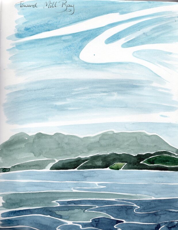 There were plenty of things to sketch, and I was glad I'd made a new sketchbook out of Bee cotton rag paper and some leather I'd picked up at Thrift Craft Victoria. My 'perfect sketchbook' requirements change quite often, and I think I'll always end up back with my travellers' sketchbook and homemade inserts, but after months of wrestling with a too-large Stilman and Birn Beta, I was ready for something new to kick start my summer sketching. My little hand-bound book has 48 pages, each 6” x 4.5”. Right now, these feel like a great size for sketching on the go. The Bee paper is 100% cotton and is a pretty smooth cold press, so my Pilot Metropolitan fountain pen works perfectly. Noodlers Lexington Grey ink dries quickly enough on it that it doesn't transfer between pages (the major down side of some other cotton papers I've tried to use in sketchbooks), and it handles washes beautifully. Some of my granulating mineral colours look a little strange on the smooth surface, so Serpentine and Green Apatite might be taking a holiday from my paint box for a little while in favour of the less romantic but more biddable Sap Green. 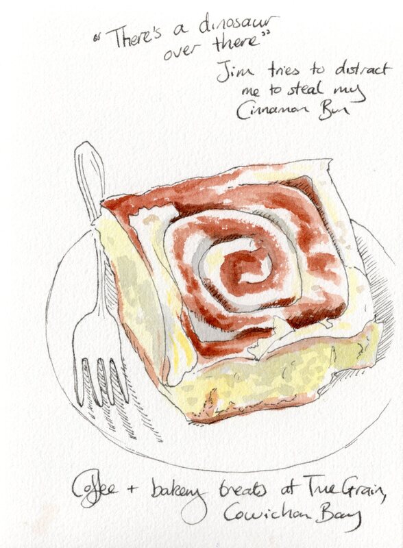 The area around Cowhichan Bay cried out to be explored, so we pedalled out to Maple Grove. I was surprised to learn that the eponymous trees are tapped for their sap, which is then boiled down to create syrup. I'd always assumed that sugar maples were confined to the east coast of North America but I'm sure the sugary stuff of the west is just as good. The trail took us through the grove of mature maples, festooned with trailing mosses, and along a river to a lookout with wonderful views of the bay. I soon wished I'd taken my bird book to identify the various species of swallows, blackbirds and colourful small darty things that we came across. Back on Prism, I looked up iridescent tree swallows, American blackbirds with their gaudy red flashes and little tufted titmice, whose blue-grey, buff and russet colour scheme feels very on-trend. The vegetation took me back to England, with briar roses, blackberry bushes and ox eye daisies (or their Canadian cousins) growing amongst tall grasses and thimbleberries. 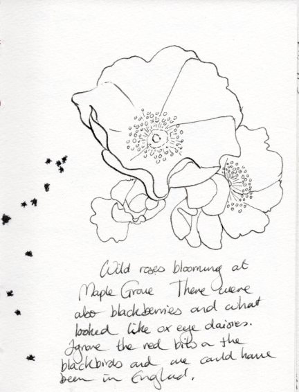 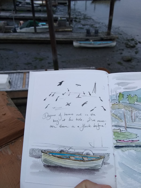 The village made a great base whilst I worked on a commission for a local couple. I'd been asked to paint their house, which is up on a hillside and commands stunning views over the bay and surrounding mountains. They wanted something big, so I splashed out on a full sheet of 600 gsm watercolour paper. Sometimes it surprises me how much of a difference paper can make. I love my usual 300 gsm Fabriano Artistico, but doubling the weight of the paper makes a world of difference. It can handle heavy washes without a ripple, giving even more control over how the paper behaves, and was stiff enough that I could still rotate it when painting. This was handy because the sheet was the same size as Prism's table! If I couldn't turn the sheet to reach different areas, I would need to paint standing up, which would get pretty uncomfortable as the table is quite low. 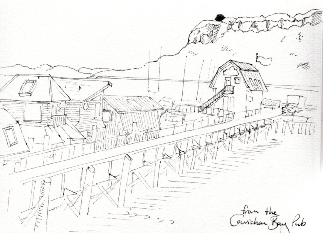 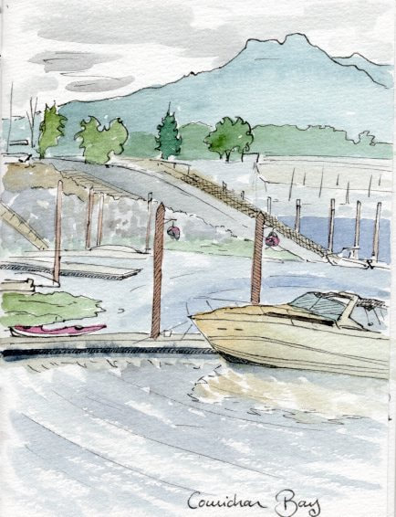 With the art finished to everyone's satisfaction, we had time to grab one last loaf of bread before turning towards Vancouver. The sun decided to shine upon us, though the north wind brought chilly air and the faint scent of narwhal. We'd timed the tides right through Samsun Straight and were swept through Portlier Pass. We pitied the other poor sailboat going nowhere fast as it tried to fight against the current. Whirl pools, tide rips, currents and upwellings kept me busy on the helm until I pleaded beautiful scenery and put Jim on the wheel so I could sketch. Afternoon light gave a golden glow to the rocks and illuminated the greens and reddish bark on the arbutus trees, whilst the mainland and the Olympic peninsula were shifting shades of snow-capped blue. My hand-sized sketchbook let me get multiple sketches finished throughout the afternoon, exploring the colours and how to capture the swirling currents and billowing clouds. It was midnight by the time we picked our way amongst the anchored freighters of Englishman Bay and found a spot to drop the anchor in False Creek. Being early in the season, finding an anchorage was straightforward. We set the hook, turned on the anchor light and put the engine to sleep. It didn't take long for us to follow it, and I fell asleep dreaming of how to mix mountain blues.  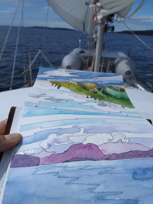 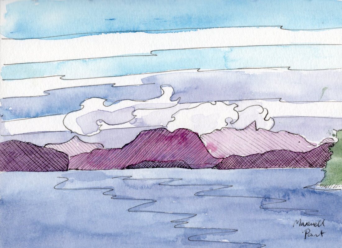 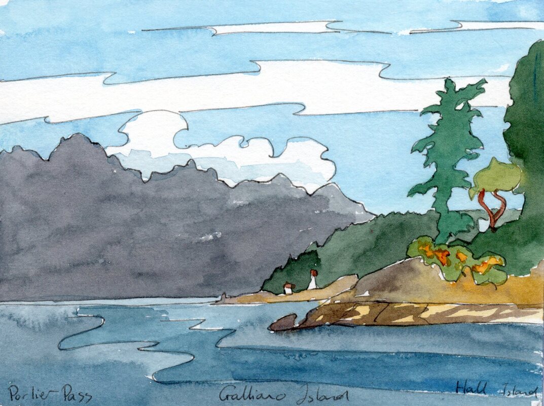 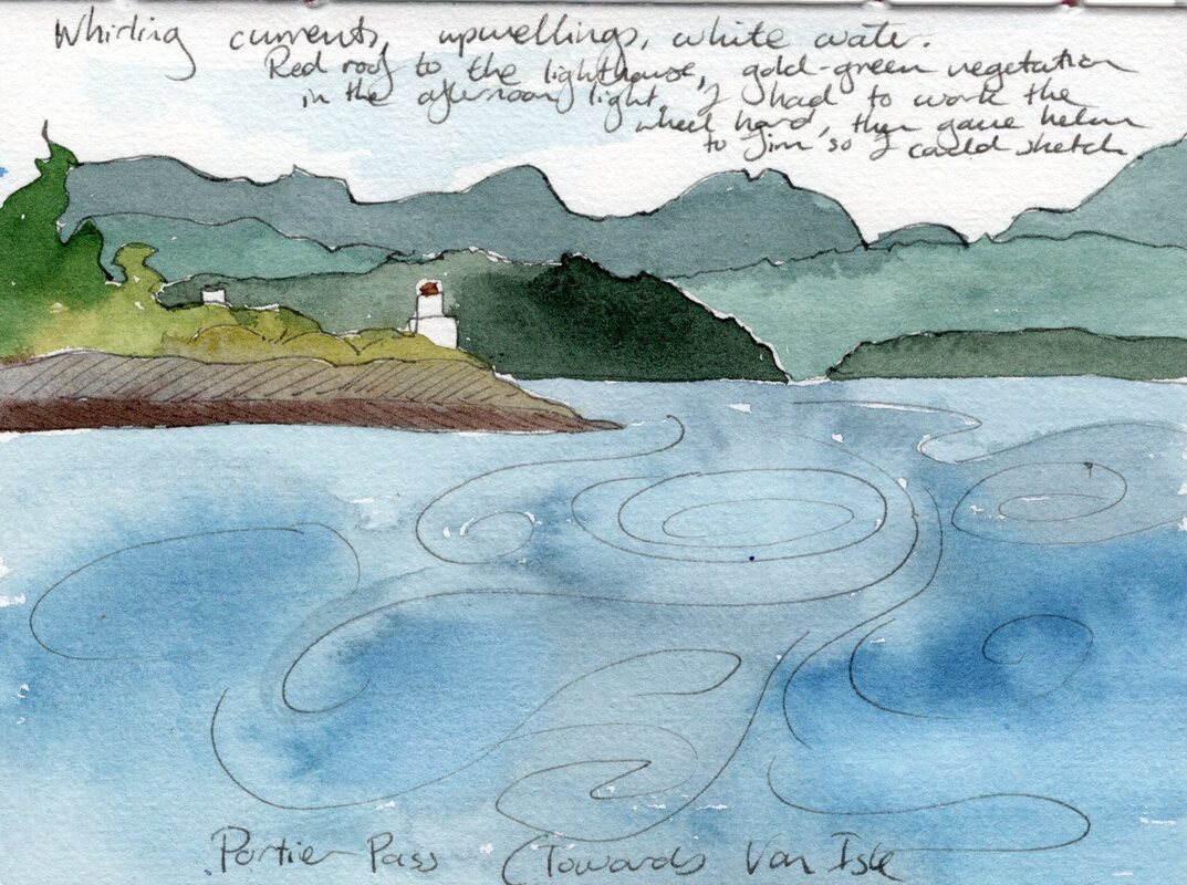 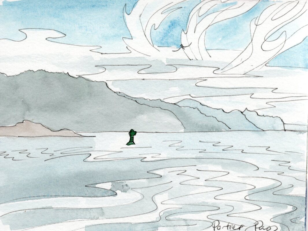  'I Must Go Down To The Sea Again'- 11" x 14" Watercolour- To be exhibited at Coast Collective in 'Oceans', June 26- July 14 May passed by in a blur of watercolour. Plein air events and an Etsy market kept me busy at weekends, and my artist residency at the Delta Ocean Pointe gave me more motivation to keep creating. I had a wonderful spot in the hotel's well-lit, airy lobby where I could display a selection of my paintings and demonstrate the art of watercolours.   'Sanctuary'- 11" x 14" watercolour- click to view on Etsy Painting in front of people can be a little intimidating, though the people I met were incredibly positive. I knew I needed to try to engage people, as many guests assumed that they'd be disturbing me if they talked to me whilst I was painting. However, hotel guests have many other things on their minds apart from looking at art, and not everyone passing by was going to be interested in or even like what I was creating. The purposeful walk of busy people was easy to recognise, but it was a little harder to get used to the up-turned noses of people who slowed to look at my art and were clearly unimpressed. I tried to smile anyway, and my artist's skin grew a little tougher. After a couple of days I had more of a feel for how long to let people look before I started to talk to them, and had to try hard not to get so lost in the flow that I forgot to register the people around me! I met some wonderful people during my month at the hotel. The staff were all very welcoming, and some were artists themselves. Plenty of locals stopped to say hello on their way to get coffee in the restaurant. I met business people from across Canada, spoke to students and educators visiting for conferences and chatted to travellers from all over the world. It was always lovely when other artists stopped by, whether they were looking for advice, had their own wealth of knowledge to share or just wanted to discuss the joys of Daniel Smith paints and Opus Allegro brushes. I was particularly amazed by the skills of Pat, a paper maker/ book binder who could name the paper I was using by looking at its colour and texture. I was also lucky enough to meet Roy Henry Vickers, whose art I really admire. He complimented me on my technique for painting currents pouring through a pass, and kindly overlooked the fact I was a bit star-struck. 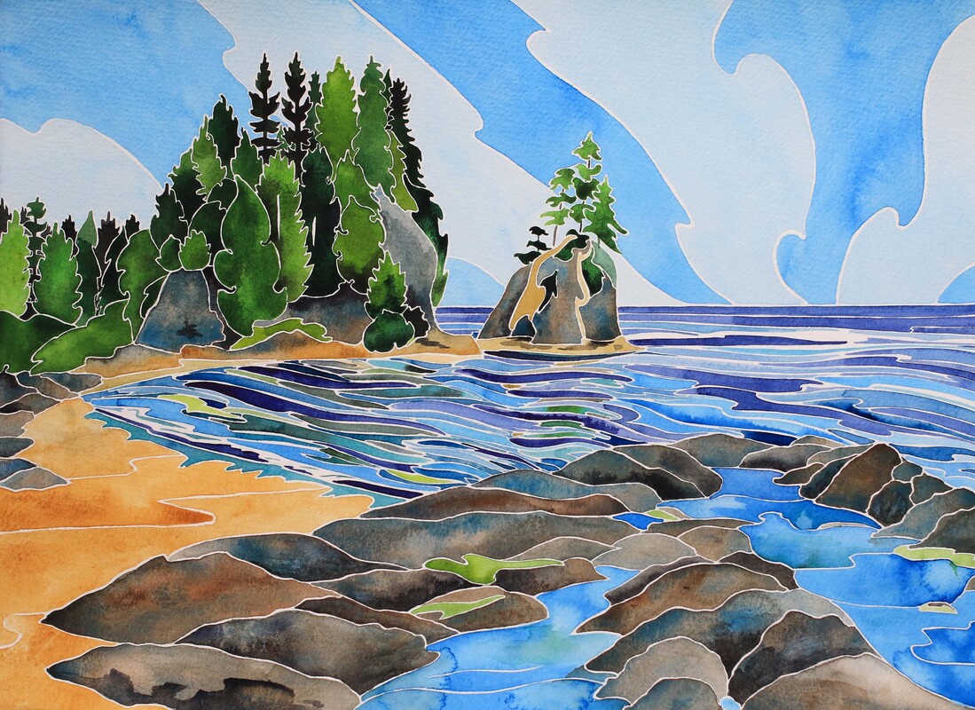 'Refuge'- 11" x 14" watercolour- click to view on Esty The trickiest part of the residency was keeping a stream of inspiration, especially when I finished a piece part way through a session. Sometimes the subject of my next painting would be ready in my mind, just needing my brush and some paint to carry it onto the paper. Other times, a quick flick through a sketchbook would present an idea begging to grow on watercolour paper. The hardest times were when the flicker of inspiration didn't come, and when I was aware of people flowing by wondering why I was doing nothing. I needed an 'I Am Thinking' badge, or maybe a flashing neon sign proclaiming 'Awaiting Inspiration'. I learnt to allow myself a little time out between paintings if I needed it. A fifteen minute walk along the inner harbour would often be enough to get my mind focused and back in gear, or relocated to the coffee shop to scroll through photos over a cuppa until I found something that clicked. Changing up my palette choices also helped to add some zap to my creativity, and a series in blue and yellow was a great refresher. Mental stutters aside, I was very happy with most of the paintings I'd created by the end of the month. The intense practise helped me hone my skill levels and made me more aware of why most of the paintings worked whilst a few didn't. Some of the art made it into frames as part of my display at the hotel, but I'd have liked to share them all. If I'm invited back next year, I want to figure out a way to display more of the paintings created during the residency, even if I can't frame them all, and I'll definitely rotate the art on display more to keep it fresh.  'Tranquility'- 14" x 11" watercolour- click to view on Etsy  'Drifted In'- 14" x 11" watercolour. Showing at Coast Collective in 'Oceans' 26 June- 14 July Now we're in to June, I've had time to get decent photographs of most of the art I created (apart from a couple of pieces which sold too fast to make it near my big camera)! Most of the paintings are listed on Etsy- the links are connected to each photo- and four of my West Coast paintings will be featured in Coast Collective's upcoming show, 'Oceans'. Scroll on to see the rest of the paintings- and I'd love to know which is your favourite!  'Flow'- 14" x 11" watercolour. Showing at Coast Collective in 'Oceans', 26 June- 14 July 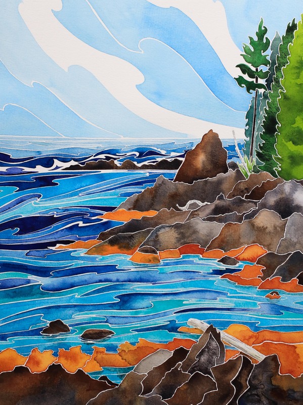 'Quietude'- 14" x 11" watercolour. Click to view on Etsy 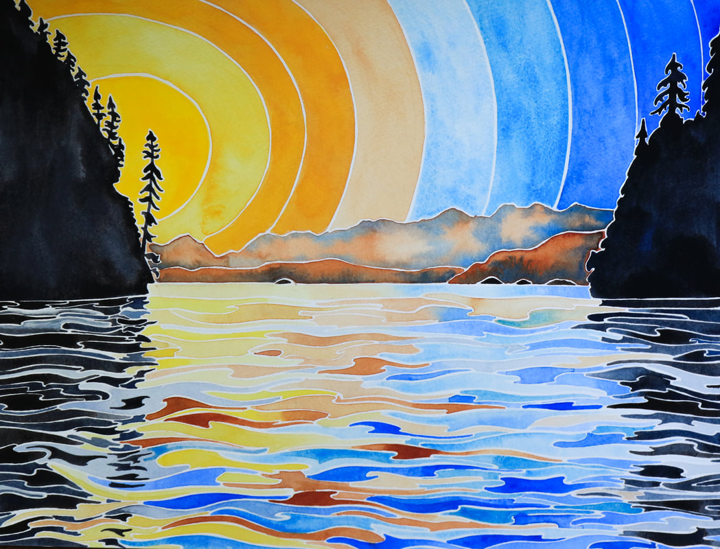 Serenity- 11" x 14" watercolour. Showing at Coast Collective in 'Oceans', 26 July- 14 July 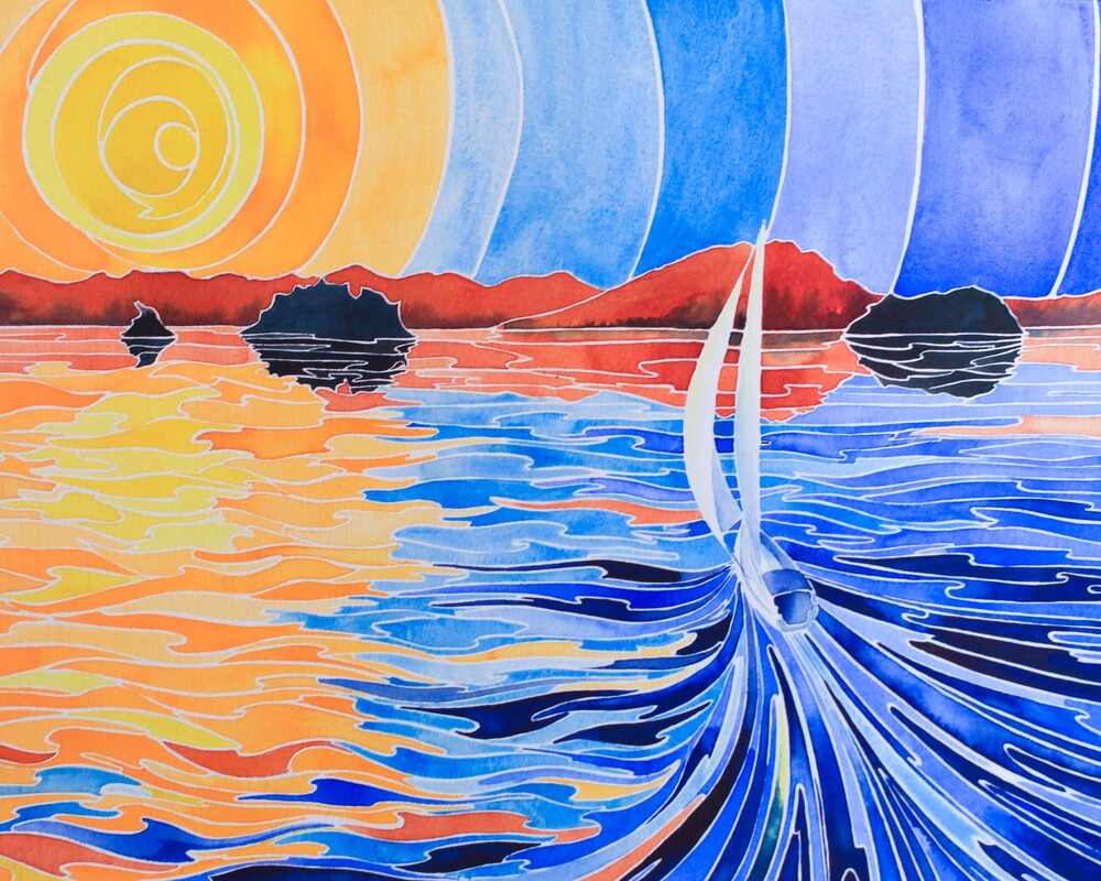 Adventure Awaits- 11" x 14" watercolour. Click to view on Etsy 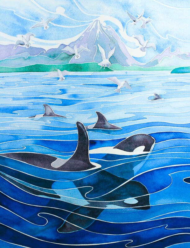 'Whales' Way'- 14" x 11" watercolour. Click to view on Etsy Beacon Hill Cherry Blossom- 11" x 14" watercolour. Click to view on Etsy 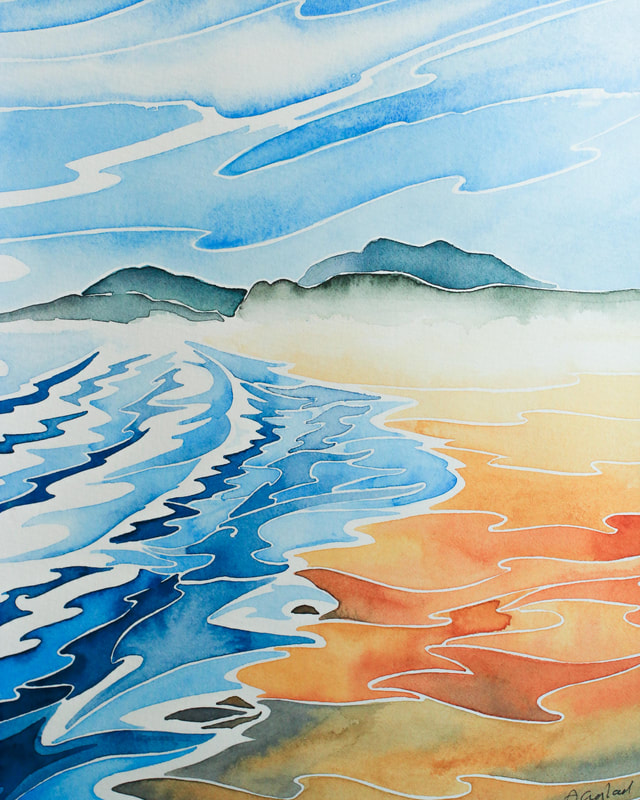 'Wickanninish Haze'- 10" x 8" watercolour. Click to view on Etsy  Plein Air at the BC Boat Show. Photo by Marcela Strasdas  'Sidney Race Day'- 8" x 10" watercolour. Click to view on Etsy 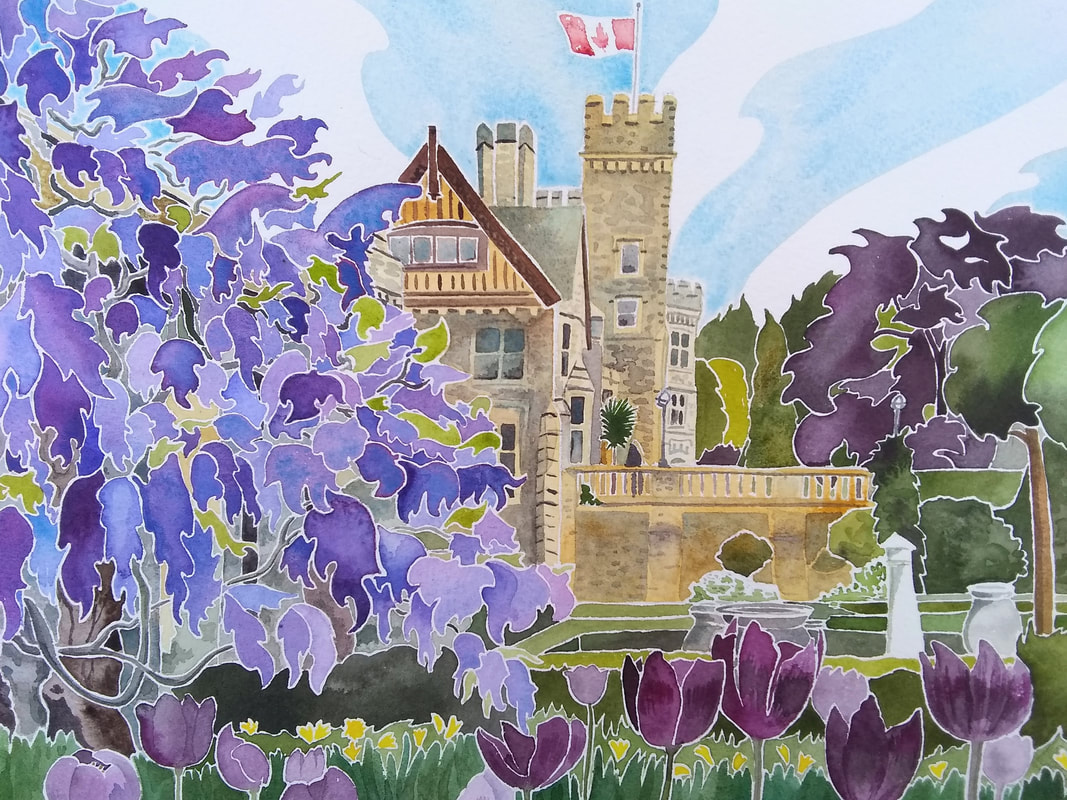 'Hatley Castle'- 8" x 10" watercolour- SOLD  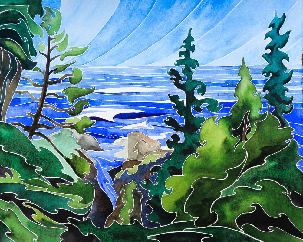 Joy, 11" x 14" sold It's been a busy few months for Island Prism's crew. We've been tied up at Causeway Marina, opposite the historic Empress Hotel. Prism's engine has been being difficult and cantankerous, requiring hoisting out and extensive repairs. Jim's replaced the leaky seals that were causing all the problems, and given an extensive overhaul that will hopefully (maybe? perhaps?) give us a summer of smooth operation. 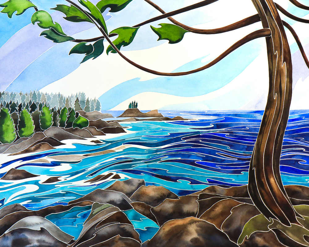 West Coast Spirit, 16" x 20", at the Delta Ocean Pointe My painting has been far steadier than my blogging over the last few months. The static boat, frigid weather and state of busyness led to a bit of a wordifying block. I have been creating regularly, especially with my watercolours, but my sketching has been pretty sketchy. Thank goodness for the local Urban Sketchers group, whose regular meetings stopped me from getting too rusty! The details of my creative flow over the last few months could (and probably should) be a blog post of its own, but my recent paintings have been a huge reminder of how important sketching is to my creativity. I've been pulling out my sketch books and revisiting my favourite West Coast spots by turning them into full sized watercolours. Some of them are on display at the Delta Ocean Pointe hotel in downtown Victoria, where I'm the resident artist for the month of May. I'm demonstrating watercolour painting every Wednesday, Thursday and Friday this month, so please pop in and say hi if you're in the area! I'll be joining in the Hatley Castle Paint-In on Mother's Day too. 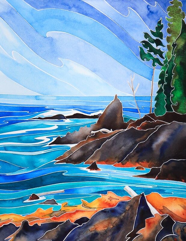 Rejuvenation, 11" x 14", sold We'll be in Victoria until the end of the month, when we'll untie the dock lines and embark on a summer of sailing! The sail plan is to make our way up to Telegraph Cove for adventures with friends and family, and then to explore the secluded nooks of the Broughton Archipelago. I'm sure there will be plenty to paint! 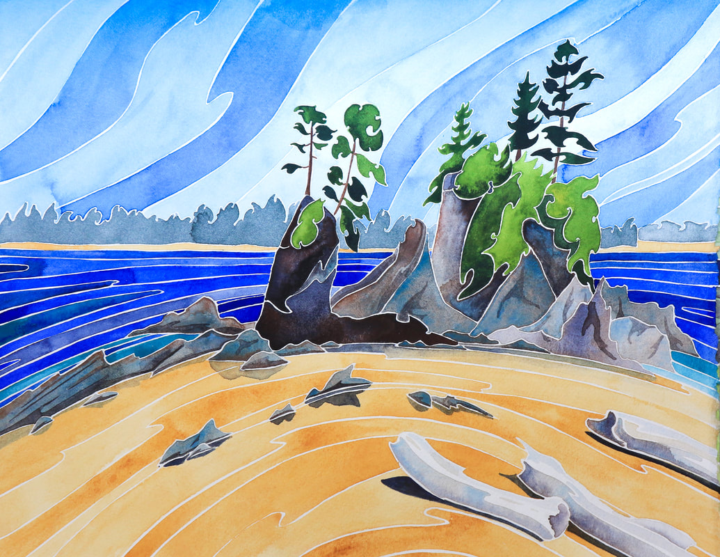 Bliss, 11" x 14", sold Whether it's spring or autumn where you are, I hope you're enjoying balmy days that are just the right temperature. I'll be back very soon with more details of boat repairs and arty life, and I'll leave you with a few more paintings to enjoy! 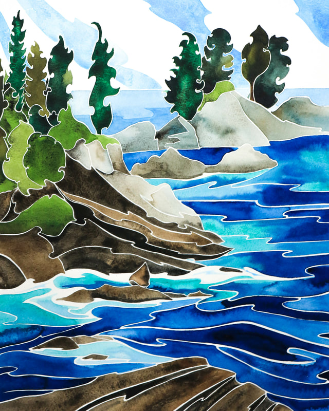 Inspiration Point, 11" x 14", sold 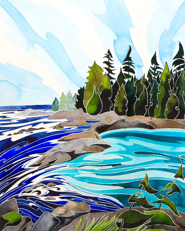 Ucluelet Summer, 11" x 14" sold  A Piece of Paradise, Tofino, BC 11" x 14", at Coast Collective  Eternity, Ucluelet. 11" x 14" sold 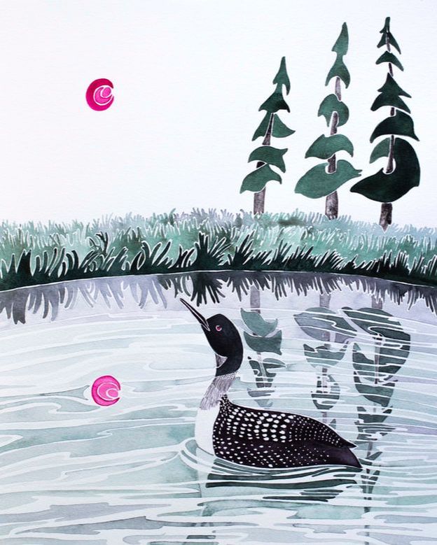 Still Remembering Our sail from Broughton Archipelago to Desolation Sound was beautiful- and required some very careful timing. The current carried the boat through a succession of narrows as our speed topped ten knots (unheard of for sturdy but heavy Island Prism)! The passes we went through were only to be attempted round slack tide- whirlpools and rapids made them treacherous at other times, and the currents were too strong for Island Prism to ever stand a chance of going against them. We took turns on the helm so that I had the opportunity to sketch as we cruised, though I had to move my brush fast as the landscape passed us by. Desolation Sound was the kind of cruising ground which could provide years of sailing all by itself. A maze of passes and islands stretch between Vancouver Island and the mainland, with the Coastal Range as a dramatic backdrop. We regularly saw humpbacks and bald eagles, and plenty of seals and sea lions cruised the waters or sprawled on the rocks along the shore.  Shoal Bay was a special little anchorage. The community there is tiny, but there is a wharf, and in the summer resident Mark opens his deck and living room as a pub. We dropped the anchor in 13 metres of water and rowed ashore for a glass of wine. The pub was full of yachties, and the communal tables create an easy way to meet people. We soon got trading stories. Tales of cruising Alaska caught my imagination, whilst bluewater-sailors-to-be Jake and Patricia listened to our stories of Polynesia and gave us some great information about local anchoring spots. We wound up on Prism with dinner and a night cap or two, and arranged to meet up again the next day in Phillips Arm.  Phillips Arm was part of the mainland, and was known to be a good spot to see grizzly bears- so much so that the local residents didn't recommend walking long distances ashore without bear bells and a rifle. We were keen to see a grizzly but preferred to do our searching from the water. We piled into Patricia and Jake's spacious tender and made our way up the Phillips River. A herd of elk were grazing in the grass just above the high tide line as we approached the river, and there was a healthy population of Canada geese. A shallow section by the river mouth, full of fallen trees, was a favoured haul out spot with seals, who 'mermaided' with nose and flippers in the air in what I always assume is an attempt to keep out of the water. Their poise and ability to maintain the pose for ages reminds me of yoga. 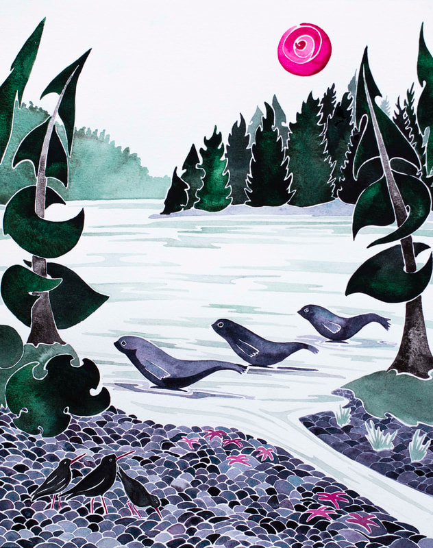 Seal Yoga Salmon jumped as we continued down the river, and we saw a couple of herons keeping vigil on the riverbanks. The bears were sadly absent, but we took a stroll along the shore to talk to some researchers and volunteers who has spent the day counting the annual salmon return. The day was rounded off very nicely with an excellent dinner cooked by Patricia, and they were kind enough to gift us with a cruising guide to the area. We next made our way to Cortes Island. Getting there was a little bit magical. Our day was carefully timed to get through the Yaculta Rapids at slack tide- the rapids would be so powerful that we wouldn't stand a chance of going against them, and we'd heard that they weren't a picnic even if we rode the tide through. Our timing meant that the experience was uneventful, and we were soon at a white sandy spit. It looked almost tropical, and was covered in sailing dinghys as there was a race meet on. The little anchorage was crowded with the sail boats and power boats that were accommodation for the competitors. We kept going as this wasn't our destination, instead approaching the steep cliff face of Cortes. Like something from Indiana Jones, as we got close the rock wall revealed a narrow opening. We squeezed through, painted rock towering above us on both sides, until the gorge opened out into a lagoon fringed with a few houses and a marina. 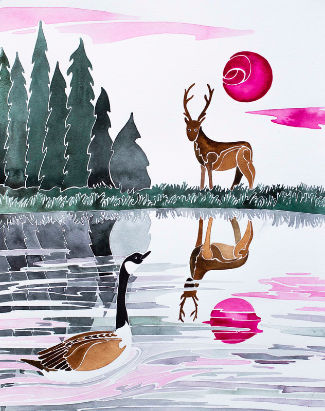 Connecting We anchored in front of the marina and campground, and rowed ashore. Here we found hot showers and a swimming pool. A few dollars bought us a day pass. It was late in the day, but we still had a few hours to soak- and the final hour was adults only. We had the hot tub to ourselves then, with a great view over the anchorage. When a live music performance began, we had the best seats in the house- and when the pool shut we moved to a bench to carry on listening and enjoy a dinner of local tomatoes, bread and goats cheese bought from the little store. We enjoyed it so much that we extended our stay by another day. There was lots to do- the island has a busy art community and I enjoyed poking round the galleries and excellent farmers market at Mansun's Landing. At Jimmie's suggestion, we went oyster gathering- carefully checking that the fishery was open and safe. Jim's fishing license let us collect twelve oysters a day- and these were beauties. Between the number of oysters and the huge population of sand dollars, it was hard to find space to put our feet as we selected our shellfish. They grow them big here- and with a bucketful of a dozen oysters bigger than my hands, we returned to Prism. I helmed as Jimmie shucked them, and I was treated to a late lunch of Jim's oyster burgers (especially excellent with bacon- but then, isn't everything)? 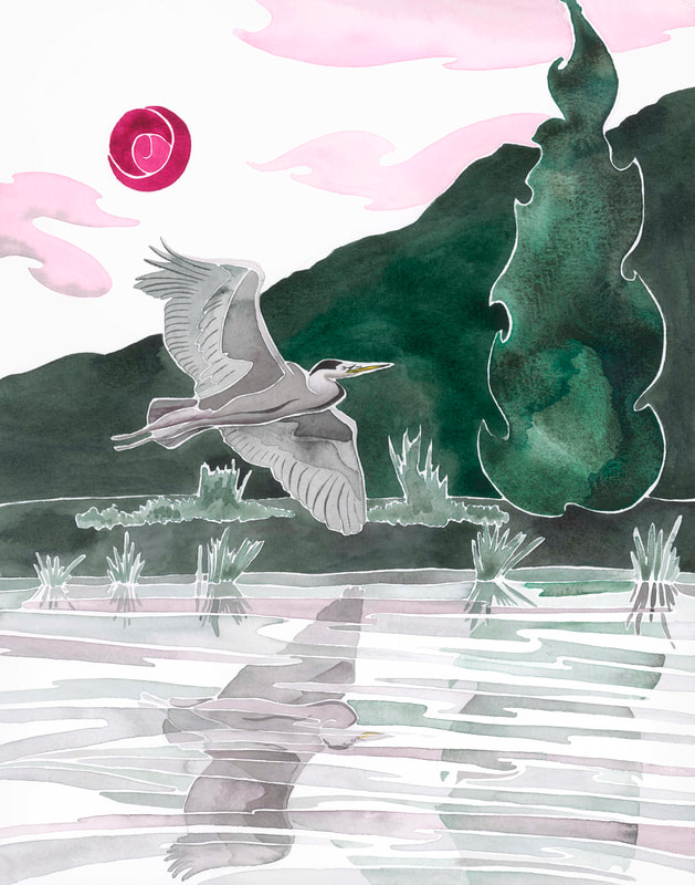 In Flight The wildfires burning around BC were still having an effect on the air quality. There was usually a slight haze around, and the sunsets were particularly pink. Combined with the wildlife we saw, the colour combination inspired a series of paintings. The first was of one of the loons from Village Island. I selected quin rose to achieve the bright pop of pink I wanted for the sun. I found quin magenta makes beautiful greys and blacks with jadeite and perylene green, so chose these to round out my palette. I'm not normally a particularly pink person, but the effect was very harmonious and I was able to create rich, deep blacks for the loon and a huge range of soft greys and greens for the vegetation and reflections. Part of my fascination with loons comes from a version of a West Coast Native myth called How the Loon Lost her Voice. It explains how gentle loon lost her beautiful song when trying to help Raven regain the stolen sun. Raven was ultimately successful, but Loon cries plaintively every day at sunset, saying goodbye to the sun and remembering what she lost. 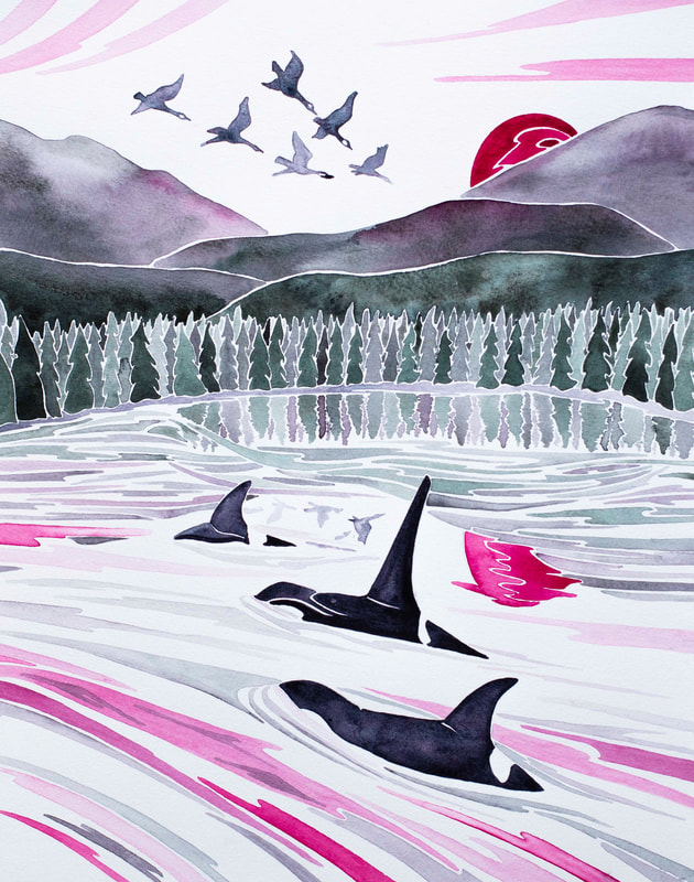 Together After my tribute to Loon, I got thinking about the elk and geese I'd seen. I wondered if they ever paid each other any attention when they share the same grassy swathes as they did in Phillips Arm. Adding a brown to my palette, I painted a meeting of species- 'Connecting'. In 'Together' I got thinking again about the close family bonds of flocks of Canada geese and pods of orca, and wanted to represent these. I snuck in Moonglow- a wonderful granulating watercolour paint which is perfect for orcas. It toned in beautifully, and I used it again for 'Exuberance'- a breaching orca of Telegraph Cove- and 'Seal Yoga'. 'Guardian' was a tribute to the bear we met in Mamalilikulla (see my previous blog post if you haven't read about that close encounter), and 'In Flight' was based on a photo I took of a great Gray Heron at Phillips Arm. 'Elementals' celebrates the Pacific white-sided dolphins and bald eagles of the Broughton Archipelago. 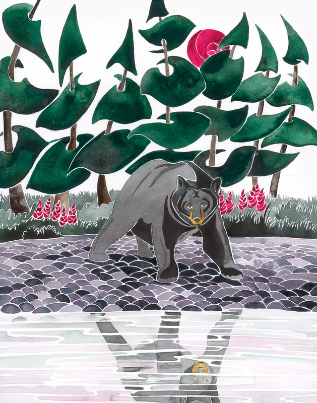 Guardian I found there were advantages to using a limited palette. Because the colour choices were already made, I could focus more on tone and composition. Bright colour couldn't save the day, and if I hadn't planned the picture well, nothing was going to provide a distraction. I worked on my colour mixing and my use of value (light and dark). I think the series has helped me become a better painter- and I've extended it beyond the initial series of five images I set out to create. 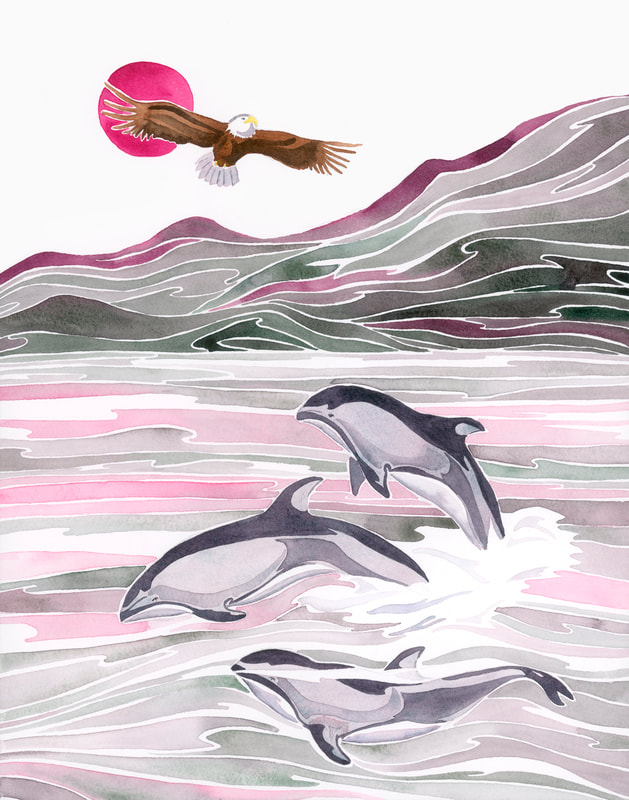 Elementals The original paintings from the series are currently being exhibited at Coast Collective's Gifts and Wishes show and Port Moody Art Centre's Winter Treasures exhibition. If you're looking for an extra special Christmas gift for a loved one (or a winter treat for yourself), limited edition signed giclee prints of 'Guardian', 'Elementals' and 'In Flight' are available from my Etsy shop. I've also had a range of blank greeting cards printed, with a range of designs suitable for winter birthdays, festive messages, or just to drop a note. There are also some new original paintings and limited edition giclees in the shop! Gift wrapping and world-wide shipping are available if you want to take the stress out of Christmas shopping and give a unique gift- or give the gift of a commission for an affordable yet truly personal gift. Finally, whilst I don't run sales often, as a thank you to my readers I'm giving 10% off all original paintings between 19 and 25 November. I hope you see something special!  When I was asked if I'd like to test and review the full range of Van Gogh watercolour paints on behalf of Royal Talens North America and Doodlewash, it was a bit like Christmas had come early. Van Gogh are made in the Netherlands by Royal Talens. They are intended for 'the serious artist', filling a niche for affordable quality paints that are less expensive than their Rembrandt Professional range but of a higher quality than student paints. I received an empty 24 pan plastic palette and 40 pans of colour. The brown box of delights caught up with me on Island Prism during our family invasion of Telegraph Cove, and the family were happy to help me unpack. First out of the box was the plastic travel palette. This is sturdy (an essential feature as it will be spending its life on a boat), and I found the curved design very appealing. The mixing area is large, and easy to clean with a cloth or by gently detaching it at the hinges to rinse. Like most plastic palettes, it gets stained by a couple of the pigments, but the marks are easy to remove with a tiny bit of cream cleaner. The sponge is a nice feature- perfect for removing excess moisture from a brush. I'm inclined to keep this as a studio palette rather than using it out in the field. There's no thumb hole or ring, suggesting that it's intended for table-top use rather than to hold. The palette is a bit on the large side, although that is one of the things I really like about it. The size allows the colours to be nicely separated, reducing the chance of the pans contaminating each other. The pans are a little loose, and fall out if the palette is carried on its side, though this is easily solved by popping a bit of blu-tack on the bottom (I'd imagine double sided tape would work too). If I was looking for something to carry in my bag all the time, I'd pick the metal palette or pocket palette also available from Royal Talens.   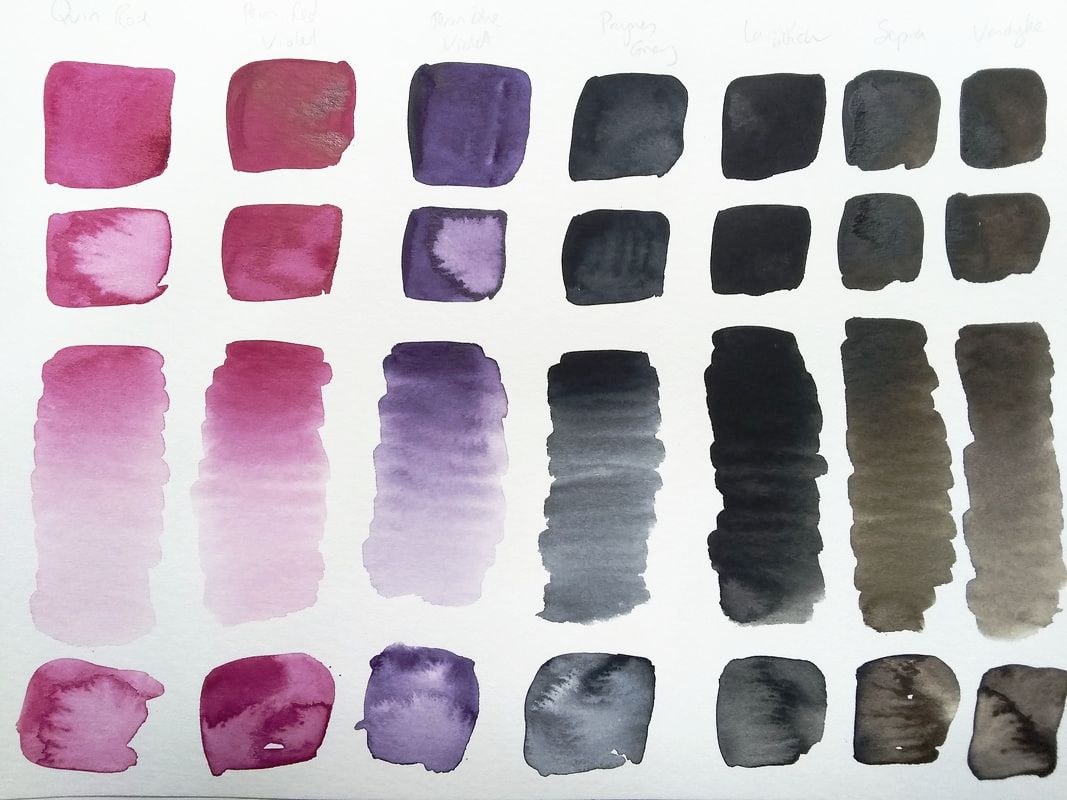 Fifteen of the colours are single pigments. This means that the colour is pure- ideal for mixing. The remaining shades are created from two pigments. Potentially this increases the chances of creating muddy colours when mixing, as it's best to have no more than two or three pigments in a mix. However, Royal Talens have thought carefully about their pigment selection- for example, the blended yellows and greens mostly use PY154, giving a good success rate when it comes to mixing these together. I was also happy to find that the viridian and phthalo greens are both single pigment, meaning I could use these as a base to mix more realistic shades from. I was very happy with the overall results. Most of the colours were bright, intense and translucent. After moistening them, it was easy to lift pigment from the pans and quickly get a rich colour. The yellow ochre and red iron oxide were opaque, as was the cerulean blue. This last pigment was made from phthalo blue blended with white. Although the pan had a slight white bloom when wet, the paint didn't appear chalky on paper. The colour is very intense and needs to be well-watered down for skies. The one disappointment was the phthalo blue pan, which produced a faint and insipid colour, although the Prussian blue made up for it with its warm intensity. 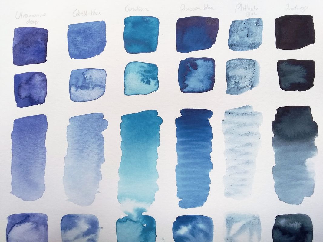 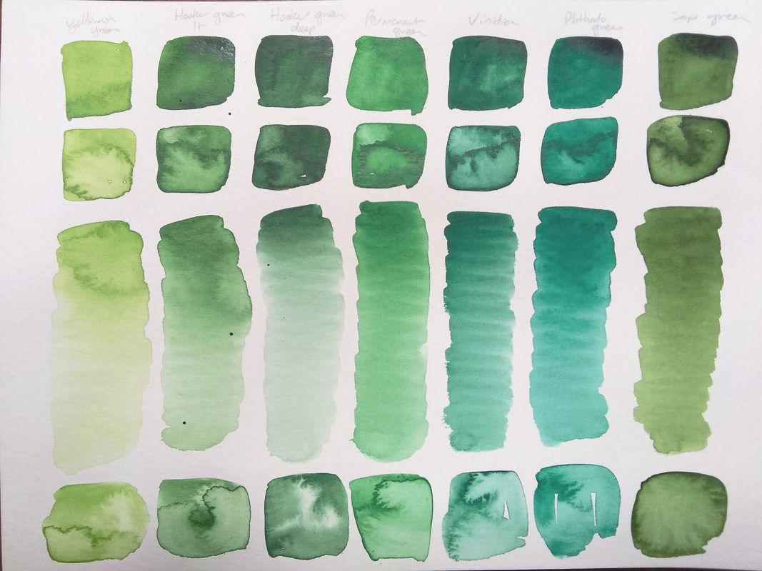 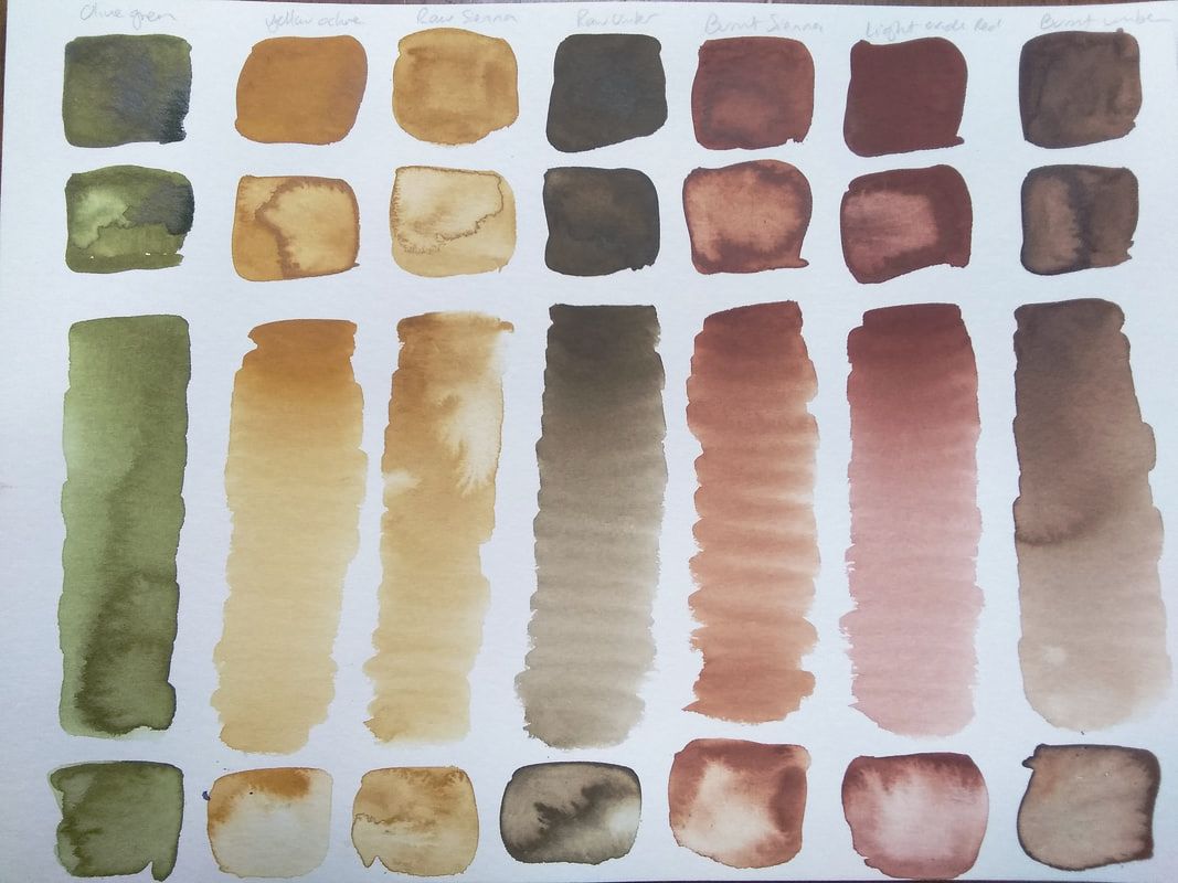 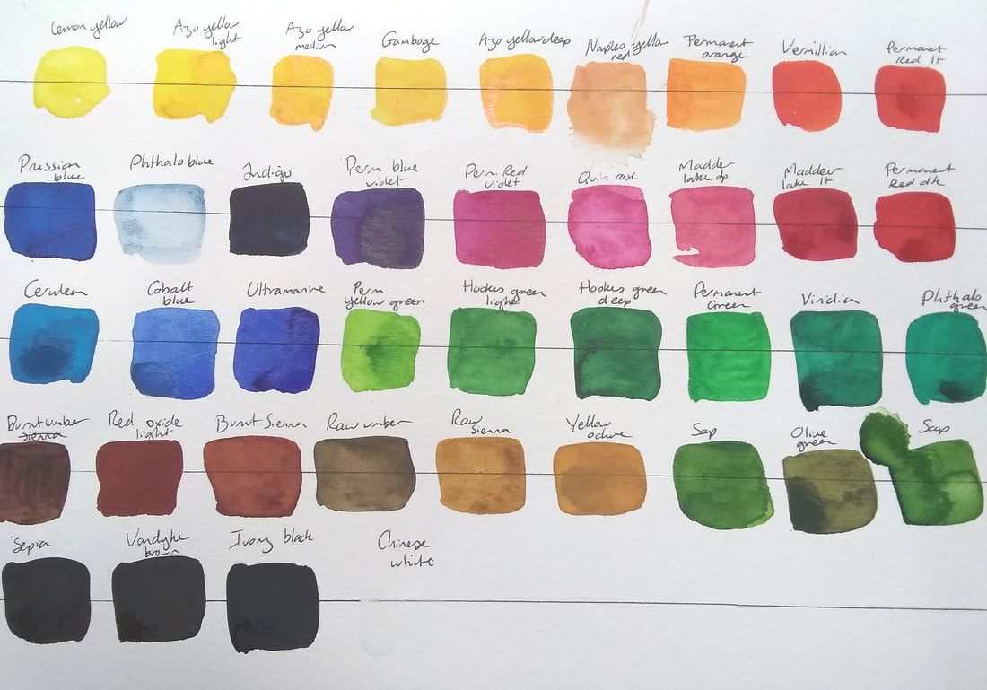 Once I'd tried out the shades individually, the mixing fun could begin. As I often paint the ocean, landscapes and wildlife, I wanted to make sure that I could mix a good range of greens and obtain mud-free neutrals. I started off by choosing some of the primary shades to make triads and see what happened as I mixed them together. Then I moved on to some less orthodox groups of three. I was delighted to find that the Prussian blue and burnt sienna created a wonderful sea foam green, and raw sienna made great greens when mixed with viridian or cobalt. I was extremely happy with the results- these paints let me create bright secondary colours, and I was also able to make gorgeous grays, rich browns and beautiful deep blacks. It's great to know that I'd still be able to mix a huge range of colours even if I was using a more limited selection of pans. 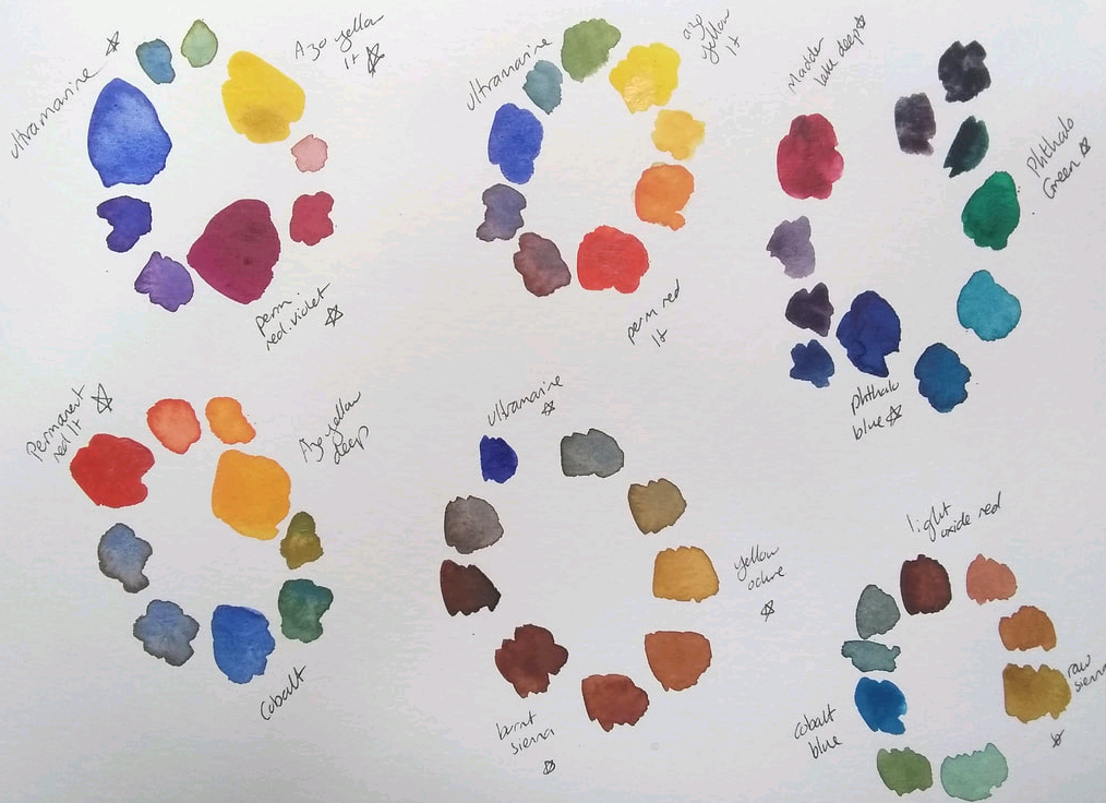 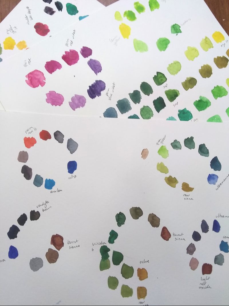 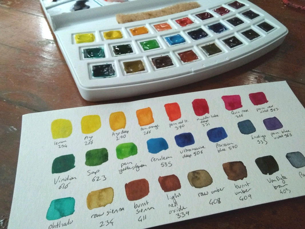 Then it was decision time. I loaded the palette up with the two single pigment yellows, and azo deep was a must-have as it's the same colour as the boat! Permanent red light created some beautiful warm and cool greys when mixed with different blues, and I'd fallen in love with the gorgeous quin rose and permanent red violet. Of course, I needed a good selection of blues and a few convenience greens, then raw sienna and a range of browns. 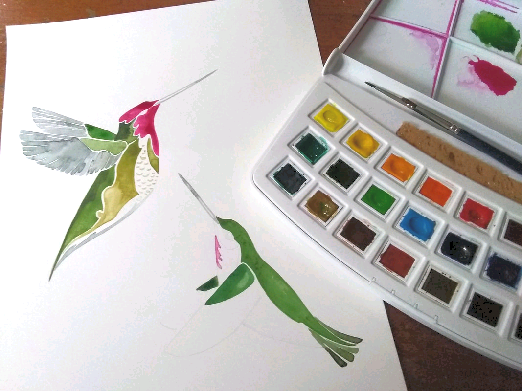 Finally the really fun bit- painting! First I tried the paints out on a pair of hummingbirds and a duo of seals. The paints flowed well, kept giving me the clear bright colours I expected from my trials and were fun to use. The browns gave me a little granulation in the kelp, and the colours of the hummingbirds glowed. 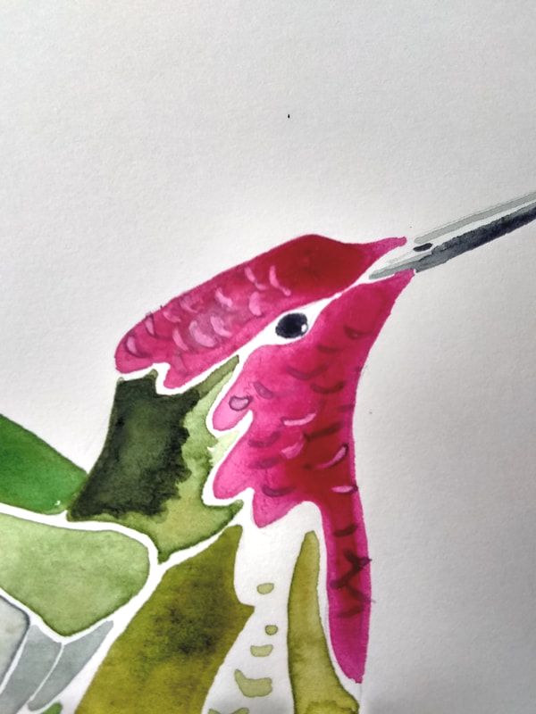 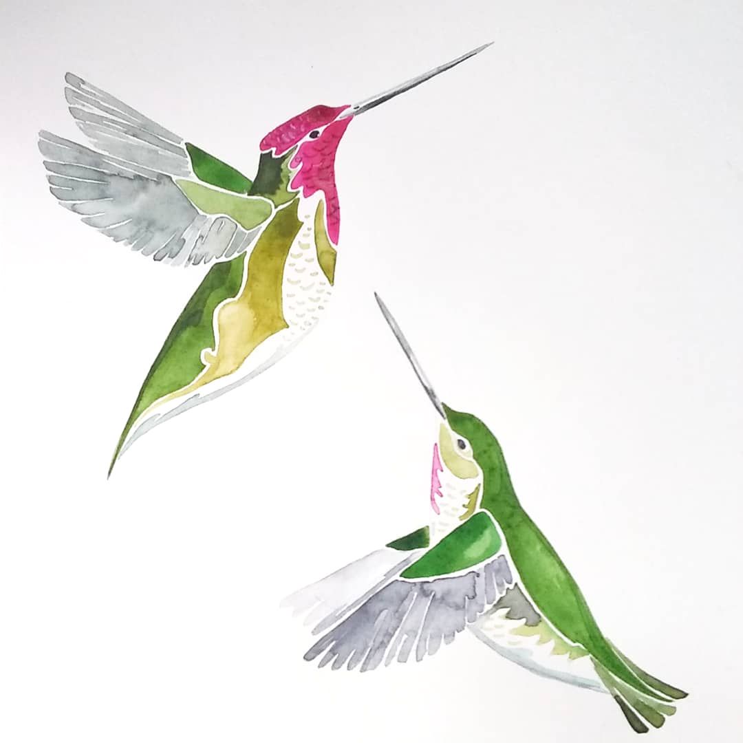 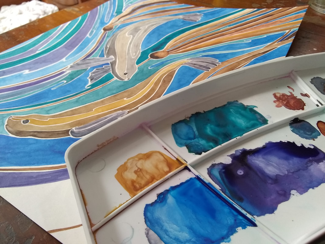 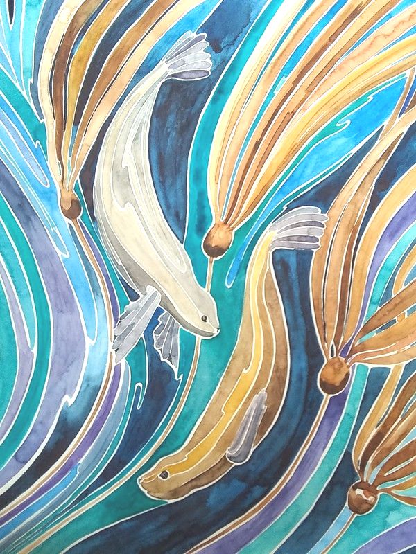 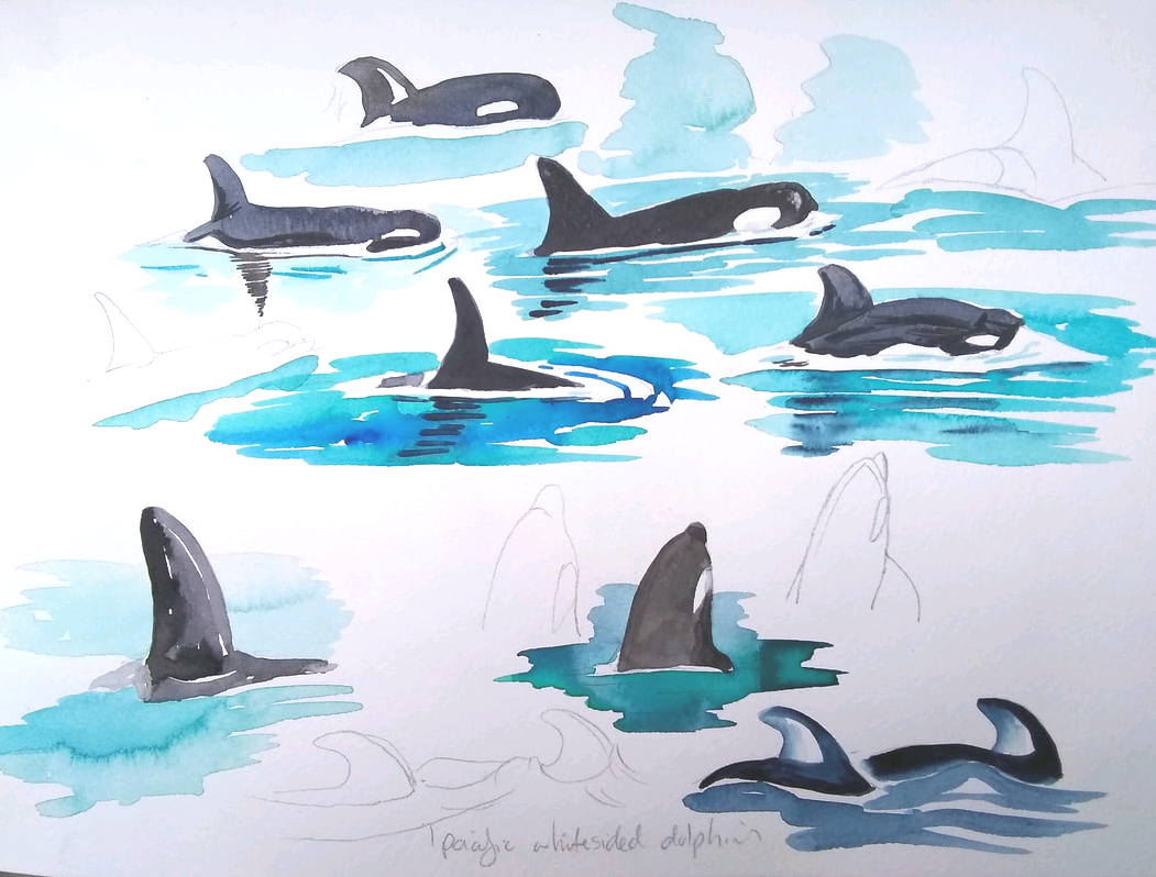 I then put them to the test in my Fabriano watercolour sketch books, colouring some whales I'd drawn. Viridian and madder lake deep created great blacks for the orca, whilst Prussian blue, phthalo green and indigo gave me the perfect shades for the ocean. The following day I took the set outside to paint as we cruised through Green Point Rapids. I mixed up a wide range of greens from viridian. The paints layered well without creating mud. I did fall into the trap of over-saturating the sky when I failed to water the cerulean down enough, but that was user error! 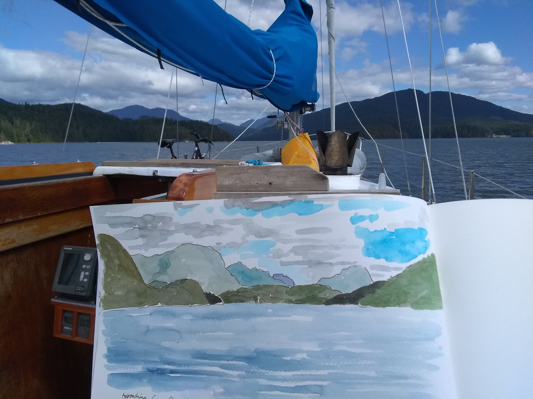 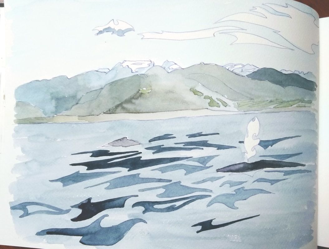 In conclusion, I was very happy with the results I obtained from the Van Gogh paints. Their quality pigments, uniform price and high lightfastness make them a fantastic starting point for students, beginning artists or for artists on a budget. They are far superior to any student line I have tried, which are often weak, chalky or impure. The use of standard artist quality pigments also means they will behave well with other artists' watercolour ranges. I really enjoyed the range of colours I could fit in the 24 pan, but the ease of mixing means that even the smaller travel set is very flexible. I'm not about to cast aside my Daniel Smiths (their vast range of pigments and beautiful granulating paints mean they're still my favourite), but Van Gogh does represent a vastly different price point and makes quality watercolour very affordable. I'm certainly going to enjoy playing with this set more in the future (and have in fact reached for it quite a few times whilst preparing this review)! Whilst I was given the paints to review by Van Gogh, I have not received any payment in return for testing them. The opinions contained within this article are wholly my own! You can find out more about Van Gogh paints here on the Royal Talens North America website. They are available from art stores including Opus, Amazon and Dick Blick. 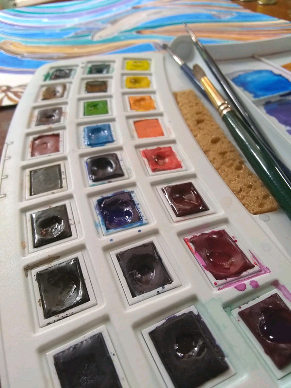 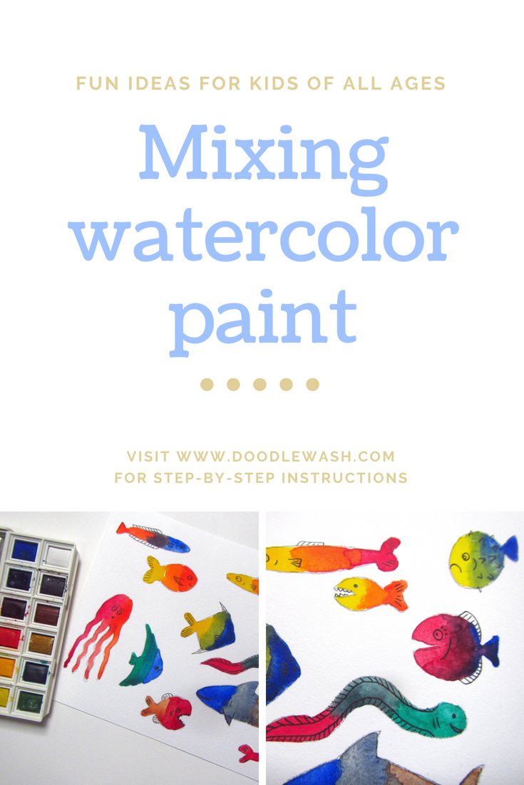 Depending on your hemisphere, your kids are either enjoying long summer holidays or a chilly, soggy winter... what better way to keep them entertained than by playing with watercolors?
I've put together a tutorial for a fun color mixing activity that will help your kids learn basic watercolor techniques as they explore a magical underwater world- and there are ideas for expanding the activity too. You can check it out on the Doodlewash website If you want to help disadvantaged kids to access their own creativity, as an Artist Ambassador for World Watercolor Month I'm giving 10% of all sales in July to the Dreaming Zebra Foundation. Treat yourself or a friend at my Etsy shop- and help change a child's life! |
Andrea England
An Artist Afloat- Painting the world one anchorage at a time. Archives
August 2020
Categories
All
|


 RSS Feed
